


TPF News & Announcements
Information on changes, updates, or general news related to TPF.
- Threads
- 101
- Messages
- 1.8K
Industry News
Camera News and Rumors
- Threads
- 161
- Messages
- 1.3K
Articles of Interest
A collection of informative articles submitted by TPF members.
- Threads
- 1.1K
- Messages
- 11.3K
TPF Member Spotlight
Interviews with our members by one of our Moderators.
- Threads
- 15
- Messages
- 182
👋 Welcomes and Introductions
If you are new to the site, please take a moment and introduce yourself! This is a good section to break the ice and meet our very friendly community! If you have questions on how to use the site, this is also the place to ask.
- Threads
- 16.3K
- Messages
- 88.6K
TPF Photo of the Month
A less formal contest than the TPF Challenge - nominate your favorite image every month, choosing new images posted by our talented pool of members!
- Threads
- 568
- Messages
- 7.3K
Photography Beginners' Forum
Don't be shy. Brushing up on some of the basics? The Beginner's forum is for asking basic technical photographic questions about things like shutter speed, aperture, ISO, white balance, metering modes, focusing modes. Use one of the forums in the Photo Galleries section of TPF if you want C&C or improvement tips on some of the photos you have taken. For equipment specific questions, use one of the forums in the Camera Forum section of TPF.
- Threads
- 53.4K
- Messages
- 584K
Beyond the Basics
Have you been at photography for awhile? This is the forum for more advanced discussion of photography, such as exposure methods, lighting, HDR, and other techniques and controls!
- Threads
- 16.5K
- Messages
- 173.5K
Photo Assignments & Technical Challenges
If you are looking to sharpen your technical skills, or just enjoy participating in group assignments - this is the place for you! Join other members in themed assignments, or start your own!
- Threads
- 1K
- Messages
- 24.4K
Photographic Discussions
A place to discuss what photography means to you: your influences, ethical challenges, abstract ideas, and other non-technical matters about photography and photographers.
- Threads
- 6.8K
- Messages
- 129.7K
Photography Equipment & Products
General discussions for all Camera Gear, Camera Equipment, Camera products and more. Talk about the latest photographic headlines and read - or give - product reviews. Also get advice on what equipment to purchase and get opinions from others about various products.
- Threads
- 23.1K
- Messages
- 219.7K
Lighting and Hardware
General Discussions for all camera Lighting and Hardware.
- Threads
- 2.4K
- Messages
- 24.8K
Cell Phone Cameras & Camera Phones
General discussions for all things related to Camera Phones, cell phone cameras, phone camera accessories, camera apps, mobile phone mounts and more!
- Threads
- 411
- Messages
- 3.6K
Mirrorless Cameras
Discussions for Mirrorless Interchangeable-Lens Cameras (MILC)
- Threads
- 519
- Messages
- 6K
Canon Cameras
Discussions for all Canon Cameras including Digital, DSLR, Point&Shoot, Bridge Cameras and more. (Canon Forum)
- Threads
- 4.6K
- Messages
- 44.7K
Nikon Cameras
Discussions for all Nikon Cameras including Digital, DSLR, Point&Shoot, Nikon Bridge Cameras and more. (Nikon Forum)
- Threads
- 6.9K
- Messages
- 94.6K
Pentax Cameras
Discussions for all Pentax Cameras including Digital, DSLR, Point&Shoot, and more. (Pentax Forum)
- Threads
- 255
- Messages
- 2.1K
Sony Cameras
Discussions for all Sony Cameras including Digital, DSLR, Point&Shoot, Sony Bridge Cameras and more. (Sony Forum)
- Threads
- 869
- Messages
- 8.9K
🏢 The Business District An area to discuss the business of photography and share your professional work
The Aspiring Professionals Forum
A forum for those who need information on the challenges and rewards of going professional or who have recently turned pro! Do you want guidance from current working pros? This is the place! Discuss equipment needs, developing business plans and more!
- Threads
- 927
- Messages
- 12.4K
General Shop Talk
Already in business? This is the place for you. Discuss marketing, pricing, legal issues and other ideas relating to the business of photography.
- Threads
- 6.7K
- Messages
- 76.3K
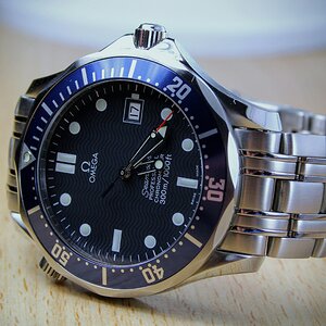
Commercial/Product photography
Share your commercial & product photographs here.
- Threads
- 1.1K
- Messages
- 10.8K
The Professional Gallery
This is a Gallery for our working photographers! Show off your latest wedding, portraiture, or any work you've done for your clients.
- Threads
- 6.7K
- Messages
- 68.8K
🎞️ Film Photography A place for all lovers of analog photography!
Film Discussion and Q & A
Questions or comments about film photography belong here! Plus, discussions and how-tos on various films, film cameras and other analog-based products.
- Threads
- 4.9K
- Messages
- 51.3K
Collector's Corner
A place to discuss the collection of classic cameras and related equipment.
- Threads
- 2.1K
- Messages
- 18K
Alternative Techniques & Photo Gallery
Take a walk on the alternative side...view photos and get information on techniques for image transfers, film infrared, pinholes and more! Using a classic film camera? Post your photos here!
- Threads
- 1.1K
- Messages
- 9.7K
The Darkroom
Discussion on developing, printing, and working in the dark!
- Threads
- 1.8K
- Messages
- 15.8K
💻 Digital Photography A place for all lovers of digital photography!
Digital Discussion & Q&A
Questions or comments on all things digital! Discussion and advice on the latest techniques, plus all digital-related products.
- Threads
- 6.7K
- Messages
- 54.2K
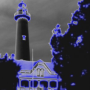
Graphics Programs and Photo Gallery
A place to show off your post processing skills, with explanations on how you achieved the results, including specialty images such as HDR. Share information and techniques using Adobe's Photoshop and other popular graphics software.
- Threads
- 5.6K
- Messages
- 43K
Aerial Photography
Aerial Photography and Drone discussions and photos
- Threads
- 196
- Messages
- 1.2K
HDR Discussions
High Dynamic Range Imaging (HDRI or just HDR) is a set of techniques that allows a greater dynamic range of luminances between light and dark areas of a scene.
- Threads
- 3.3K
- Messages
- 27.3K
📹 DSLR Video A forum section for all discussion pertaining to DSLR Video
DSLR Video Discussion
This is the place for all your DSLR video discussions
- Threads
- 709
- Messages
- 3.8K
🖼️ Photo Galleries Photos submitted by members for general display or critique.
Automotive Photography
A section dedicated to all Automotive Photography
- Threads
- 142
- Messages
- 823
C & C Gallery
Like the name says...this is the Gallery to post the photos you would like to receive specific comments and artistic criticism. Keep an open mind and enter here in the spirit of learning - both to give and receive C&C.
Don't post in here if you don't want it - take those photos to the Just for Fun Gallery.
- Threads
- 97
- Messages
- 1.1K
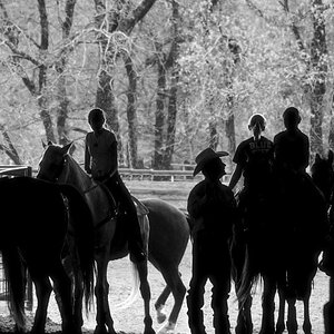
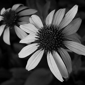
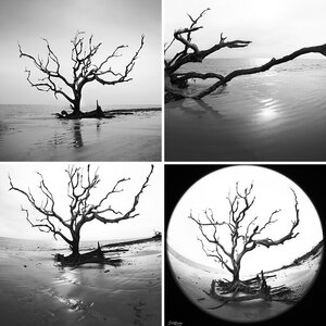
The Black & White Gallery
A gallery for showing all of your B&W images - film and digital alike - and for general feedback and critique.
- Threads
- 14.3K
- Messages
- 90.2K
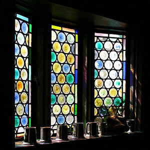
General Gallery
A gallery for sharing photos and getting feedback, including general critique.
- Threads
- 63.6K
- Messages
- 455.9K
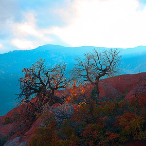
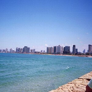
Landscape & Cityscape
A gallery for sharing your landscape/cityscape photos and getting feedback, including general critique.
- Threads
- 31.3K
- Messages
- 219.1K
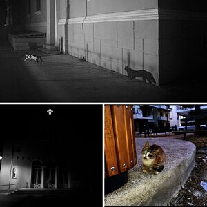
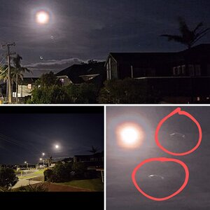
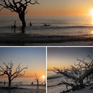
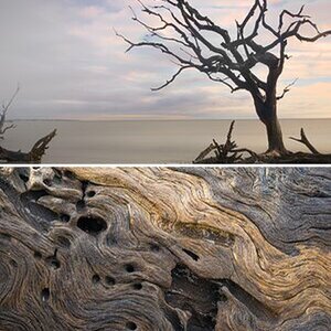
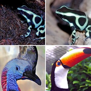
Nature & Wildlife
For all your outdoor shots, which may include your encounters with wildlife. Post for discussion and feedback, including general critique.
- Threads
- 31.6K
- Messages
- 218.1K
Macro Photography
Forum dedicated to discussions and photos of Macro Photography
- Threads
- 6.4K
- Messages
- 39.7K
People Photography
A gallery for sharing photos of the people in your life, from informal portraits & candids, to your home studio shots or street photography. Post for discussion and feedback, including general critique.
- Threads
- 22K
- Messages
- 198.3K
Photojournalism & Sports Gallery
A place to tell us stories of events with pictures. This is your place to not only show us your photojournalistic style, but your action and sports shots, too. Post for discussion and feedback, including general critique.
- Threads
- 4.6K
- Messages
- 35.7K
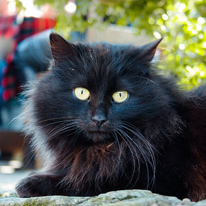
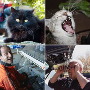
Just For Fun!
This is the place for your less serious work. Post pictures of your pets, funny images - or maybe something that just happened to catch your attention! Not intended for serious critique.
- Threads
- 10.3K
- Messages
- 75.7K
Photo Themes
Submit your photos to various themes created by our members, or create your own!
- Threads
- 2.1K
- Messages
- 72K
🏪 The Marketplace A place to buy, sell or promote your services!
Personal and Professional Photography Websites
Promote your personal and professional photography web sites by posting information about them here!
- Threads
- 3.8K
- Messages
- 15.4K
Buy and Sell
Consider this the TPF Classifieds! Looking to buy or sell photographic equipment? Read the disclaimer before you post here!
- Threads
- 10.6K
- Messages
- 44K
Locations & Meetup forum
Interested in meeting other TPF.com members? Find or request a gathering with other photographers in your area!
- Threads
- 1K
- Messages
- 15K
Off Topic Chat
A place to talk about anything outside the topic of photography - but please keep your political and religious views to yourself. Enjoy!
- Threads
- 16.8K
- Messages
- 458.7K
The Creative Corner
A place to share artwork that is not photography. Post your Poetry, Music, Paintings, etc.
- Threads
- 711
- Messages
- 5.6K
Test Forum
Please use this forum to test things like attaching photos or links, or just to become more familiar with the board.
- Threads
- 1.1K
- Messages
- 3.9K
Feedback and Suggestions
Please post forum feedback, suggestions and ideas here. If you are having trouble or need help on the site, this is also the place to post.
- Threads
- 1.4K
- Messages
- 15.7K


Forum statistics
Recommended Websites
Staff online
-
 SquarePeghear me roar
GalleryStats
- Categories
- 16
- Albums
- 1,560
- Uploaded media
- 36,776
- Embedded media
- 41
- Comments
- 4,436
- Disk usage
- 13.4 GB
Most reactions
-
 394
394 -
 306
306 -
281
-
 265
265 -
 247
247 -
 196
196 -
 190
190 -
 183
183 -
 180
180 -
 158
158 -
 152
152 -
 132
132 -
 125
125 -
 111
111 -
 94
94