I don't usually comment on anything but in the last one the only thing I notice is the giant road work ahead sign in bright orange, the writing on the top of the white building to the left and the random dark item in the top almost center of the image. I wish I had something more constructive to say, thought I'd share what I'd noticed anyway though
her feet are chopped off in the one of them in the street.
football field one is kinda nice.
the one of them in the backyard(?) of their house(?) lacks location to me. it might have signicance to them if that;s where they live, but to be honest (and no offense meant) it doesnt look like a great place.
i get what youre trying to do in the first one, but it almost looks like he is using her shoulder for emotional support, and she doesnt look as ecstatic as she could for a newly engaged woman. i get sadness out of that one.
nice sentiment behind the second one, but i wish the fence rail wasnt at her head level. looks a bit akward.
looking at #5 again...i like it a lot...def winner!:thumbup:
please keep in mind, my comments are purely opinion...
I like 5 alot, even though he didn't put my into it.
There are a lot of kissing photos, even for an engagement session. and the dipping kisses always hurt my back when I look at them haha. But that's just personal preference.
At least photoshop the BankO.A. sign out of the last one; can't do much about the const. sign.
Lots of critiques on this one, but I think the couple will like them for sure.
I think 8 is your best imho, she seems to be uncomfortable with the camera by her expressions,
just a couple of things i noticed was #5 her face seems squished against his, and as mentioned very odd sunburst/ light halo's.
I think you have great idea's and alot of wonderful poses though.
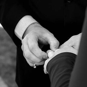
For an engagement session, I'd think the ring should at least be visible in some of the shots. In the first shot it is visible, but it's turned sideways on her finger. Straighten that puppy so we can see it!
The one where she's leaning on the pillar makes her chin look fat (and she looks uncomfortable, and the foot raised up onto the pillar is awkward)... burn that one before she sees it.
Maybe try to get a little less sun in the second to last one, I like the concept, it just needs tweaking.


![[No title]](/data/xfmg/thumbnail/33/33422-d1097b04586502aba932c8d5409d8026.jpg?1619735961)

![[No title]](/data/xfmg/thumbnail/33/33421-38d09827e584b8381c5e3a468cdf0159.jpg?1619735961)