3 Completely Different Shots of Capitol Peak 14er in Colorado

Which one do you like best?

  • 1)

    Votes: 0 0.0%
  • 2)

    Votes: 0 0.0%

  • Total voters
    5

joshua kasumovic

TPF Noob!
Joined
Aug 28, 2017
Messages
26
Reaction score
14
Location
Aspen Colorado
Website
jkasumovic.com
Can others edit my Photos
Photos OK to edit
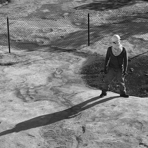
Which one do you like best and why?

1)

IMG_0913.JPG

2)

IMG_0922 2.JPG

3)

IMG_0923.JPG
 
Not 1. The blank foreground leaves it like an empty stage waiting for the play to start.
2 has some nice criss cross lines, but nothing in particular happening. The shadows on the mountain are too harsh.
Probably 3 because the rocks and water add some interest.
 
#3 but I would work on it a bit.
Crop to square, adjust white balance (dial down blue and green), adjust the luminance of the blue (darker) and green (lighter) tone curve, add mid-tone contrast (clarity) and vibrance, light global sharpening.

A quick and dirty edit:
IMG_0923.JPG
 
I like #3 the most. I like the color palette and the depth. The first one is a bit flat, and the composition feels unbalanced. The second one is better - solid composition, good saturation of the colors... but it's sort of...postcardy.

The third one is an interesting color palette and a more interesting composition than the others. The lines are much stronger, leading up to a more dramatic sky.

I prefer KmH's crop (the foreground rocks in the original composition make the frame a little front-heavy) but I prefer processing closer to your original - not because I don't like his edit, but because I generally respond more to subdued processing.
 
Yes, #3, but with different processing.
 
#3 but I would work on it a bit.
Crop to square, adjust white balance (dial down blue and green), adjust the luminance of the blue (darker) and green (lighter) tone curve, add mid-tone contrast (clarity) and vibrance, light global sharpening.

A quick and dirty edit:
View attachment 146045


Thanks for the feedback and cool edit! I'll see what I can tweak ;)
 
I like #3 the most. I like the color palette and the depth. The first one is a bit flat, and the composition feels unbalanced. The second one is better - solid composition, good saturation of the colors... but it's sort of...postcardy.

The third one is an interesting color palette and a more interesting composition than the others. The lines are much stronger, leading up to a more dramatic sky.

I prefer KmH's crop (the foreground rocks in the original composition make the frame a little front-heavy) but I prefer processing closer to your original - not because I don't like his edit, but because I generally respond more to subdued processing.

Awesome! Yeah 3 is my fav too. Thanks for checking them out :)
 
#3 for sure.. much more foreground insterest.

Personally, I'd like to see it with a bit longer exposure to give it a more dreamy, dynamic feeling in the water and the clouds. But that is 110% personal preference.. many people don't agree with me.
 
#3 for sure.. much more foreground insterest.

Personally, I'd like to see it with a bit longer exposure to give it a more dreamy, dynamic feeling in the water and the clouds. But that is 110% personal preference.. many people don't agree with me.

Yeah I agree that long exposure would look cool too! For this one I wanted to capture the dramatic scene of the detail in the clouds.
 

Most reactions

New Topics

Back
Top