5 pics for C&C; Emily

McMommy

TPF Noob!
Joined
Apr 8, 2010
Messages
168
Reaction score
1
Location
Seaside, Ca
Can others edit my Photos
Photos OK to edit
I think I've decided that I LOVE people photography, specifically the little bitties. The colors and the bright eyes, and the cute clothes, prints, backgrounds, etc.... it all really appeals to me!

Here are 5 from Emily's shoot Saturday. I am new at this, but I feel like I have a good eye... obviously still need tons of practice, but I have lots of that coming up thanks to my mom's group!

If I'm posting too many pics please let me know. I don't want to be annoying, I'm just so excited and really love having a place to go to for feedback. All I get on Facebook is "Wow! Nice pics!" even if they aren't! :lmao:

Emilye032-1.jpg


Emilye135.jpg


Emilye092.jpg


Emilye286.jpg


Emilye082.jpg


That last one... while I loved it in color, it just brings out so much more to me in b&w. This time I did adjust tones and such so that it brought out the little flowers drifting down.

The fourth one is coming across greenish to me on here... maybe I didn't save it after adjusting the tones. Ooops. Anyways, I just fixed it on my computer, so it's not greenish anymore!
 
#1 is very shadowed and i don't like that very much
#2 is out of focus
#3 is kind of crooked but the lighting and exposure is good
the last 2 are good
 
#1 is very shadowed and i don't like that very much
#2 is out of focus
#3 is kind of crooked but the lighting and exposure is good
the last 2 are good


Could you please elaborate on how #1 is shadowed, if you have the time? I thought that was the best of the bunch and liked the lighting on her face... it's not crazy harsh, but it's not dark either. I am new at this, any helpful advice is super appreciated!

Thanks!
 
#1 Sky is blown right behind her head, the lighting on her face is low and flat. The expression also screams snapshot (was she about to say something?)
To fix, I would have exposed for the background and then used full flash to light your subject, ideally off camera at an angle to create some shadow (depth).

#2 Missed focus, pretty dark underexposed
#3 Sepia tone? What about getting down to her level with the camera and not pointing it down at her? That might give it more appeal.
#4 Green? You already have her support hand cut off, why not pull it in tighter. At the point you're at now, it can only get better by a tighter crop.

The last one is by far the best shot.

I cut off her hand on purpose... I still don't understand why that's a "rule." It works for me, but maybe that's my untrained eye? I don't want the focus on her hand, I want it on her face. That's a concept I don't quite understand yet, and while I've asked here before, nobody has been able to tell me why it's always a bad thing to do.

What do you mean about the sepia? Put it into sepia? I'm not a fan of sepia usually, especially with such vibrant colors around her. I did warm up the photo a little bit, but I didn't do a whole lot to that picture at all. I could fix the tilt though, I didn't notice that one since the path is crooked anyway. Thanks for the feedback,
 
#4 Green? You already have her support hand cut off, why not pull it in tighter. At the point you're at now, it can only get better by a tighter crop.


PS... I didn't really understand this comment and took it as you saying that basically the whole picture is bad and the only way I can make it better is to leave out most of the picture. I hope you didn't intend for it to be totally rude... and that I'm just at the end of a long day. I appreciate your feedback, but keep in mind... I'm REALLY new at this and looking for constructive criticism. Thanks! :sexywink:
 
#1 Sky is blown right behind her head, the lighting on her face is low and flat. The expression also screams snapshot (was she about to say something?)
To fix, I would have exposed for the background and then used full flash to light your subject, ideally off camera at an angle to create some shadow (depth).

#2 Missed focus, pretty dark underexposed
#3 Sepia tone? What about getting down to her level with the camera and not pointing it down at her? That might give it more appeal.
#4 Green? You already have her support hand cut off, why not pull it in tighter. At the point you're at now, it can only get better by a tighter crop.

The last one is by far the best shot.

I cut off her hand on purpose... I still don't understand why that's a "rule." It works for me, but maybe that's my untrained eye? I don't want the focus on her hand, I want it on her face. That's a concept I don't quite understand yet, and while I've asked here before, nobody has been able to tell me why it's always a bad thing to do.

What do you mean about the sepia? Put it into sepia? I'm not a fan of sepia usually, especially with such vibrant colors around her. I did warm up the photo a little bit, but I didn't do a whole lot to that picture at all. I could fix the tilt though, I didn't notice that one since the path is crooked anyway. Thanks for the feedback,
The basic answer is because when you cut certain parts of the body off it looks awkward and psychologically causes the viewer to feel something is wrong/missing with the photo. IE cutting someone off at the knees vs say the thighs.

What I was saying is your white balance looks off to me, and I was wondering if you did a mild sepia tone or something. I was trying to say your WB looks off in a subtle manner.
 
Last edited:
#4 Green? You already have her support hand cut off, why not pull it in tighter. At the point you're at now, it can only get better by a tighter crop.


PS... I didn't really understand this comment and took it as you saying that basically the whole picture is bad and the only way I can make it better is to leave out most of the picture. I hope you didn't intend for it to be totally rude... and that I'm just at the end of a long day. I appreciate your feedback, but keep in mind... I'm REALLY new at this and looking for constructive criticism. Thanks! :sexywink:
Read into **** much?
I was saying if you cropped it, it would make the photo better by drawing the attention away from the outstretched arm with no hand.

If I intended to be rude, it would have been painfully obvious. If you are posting here, then you are looking for feedback. This isn't your facebook page with friends and family, so be prepared for people to call it as they see it. Your experience is of no real importance to me, you wouldn't gain anything from warm/fuzzy/what you always want to hear comments.
 
#1 Sky is blown right behind her head, the lighting on her face is low and flat. The expression also screams snapshot (was she about to say something?)
To fix, I would have exposed for the background and then used full flash to light your subject, ideally off camera at an angle to create some shadow (depth).

#2 Missed focus, pretty dark underexposed
#3 Sepia tone? What about getting down to her level with the camera and not pointing it down at her? That might give it more appeal.
#4 Green? You already have her support hand cut off, why not pull it in tighter. At the point you're at now, it can only get better by a tighter crop.

The last one is by far the best shot.

I cut off her hand on purpose... I still don't understand why that's a "rule." It works for me, but maybe that's my untrained eye? I don't want the focus on her hand, I want it on her face. That's a concept I don't quite understand yet, and while I've asked here before, nobody has been able to tell me why it's always a bad thing to do.

What do you mean about the sepia? Put it into sepia? I'm not a fan of sepia usually, especially with such vibrant colors around her. I did warm up the photo a little bit, but I didn't do a whole lot to that picture at all. I could fix the tilt though, I didn't notice that one since the path is crooked anyway. Thanks for the feedback,
The basic answer is because when you cut certain parts of the body off it looks awkward and psychologically causes the viewer to feel something is wrong/missing with the photo. IE cutting someone off at the knees vs say the things.

What I was saying is your white balance looks off to me, and I was wondering if you did a mild sepia tone or something. I was trying to say your WB looks off in a subtle manner.


Obviously photography is subjective in it's artistic nature, but with that said... is it never okay to cut off limbs? Is it okay sometimes but not others? I like to crop my photos a certain way, depending on what I'm cropping it to, to bring focus to exactly what it is I want people to see. Is this just a rule for portraits that are close up? Or everything?

I don't get it, the limb thing, or cropping part of a head off in a close-up. :scratch: Maybe in time...;)
 
I cut off her hand on purpose... I still don't understand why that's a "rule." It works for me, but maybe that's my untrained eye? I don't want the focus on her hand, I want it on her face. That's a concept I don't quite understand yet, and while I've asked here before, nobody has been able to tell me why it's always a bad thing to do.
It's more of a guideline. You don't want to crop a picture in such a way that it calls attention to what is missing. And that's kind of what's going on here. Her missing hand was the second thing I noticed after her face.

Although sometimes it is done artfully, like cropping out half a person's face, or their eyes. It can make an image very powerful. Same principle applies. The viewer's eye is drawn to the unusual crop.

So it's kind of like you want the picture to feel like it's "complete?" I can see that now. So where would I crop it? Her wrist? Is it just the half-hand that is weird? I played around with the crop, and maybe it's because the white on her sleeve is so bold, but it seems like the more I crop, the weirder it looks to me.

Thank you very much for explaining it this way! I get it now!
 
Well for that particular photo I think you're screwed because the ideal crop is one that includes her whole hand. ;) Anything else will probably look unnatural.

Just keep it in mind for next time.
 
I've had a play with the crop in PS and I can't seem to find a decent one.

If there was something interesting in the background I think the eye would allow you to crop her entire arm, but there isn't unfortunatly.

I do really like the one of her sitting down though. Good colour, good composition, good picture.


It's that damn bokeh :lol: There's actually a whole dock of old sailboats in the background! Can't see it through all the blur though. I'll remember next time to get the whole arm, hand, leg, head... etc., in the photo!
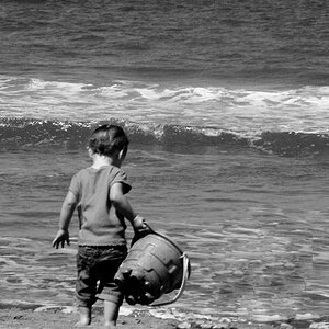
 
I've had a play with the crop in PS and I can't seem to find a decent one.

If there was something interesting in the background I think the eye would allow you to crop her entire arm, but there isn't unfortunatly.

I do really like the one of her sitting down though. Good colour, good composition, good picture.

I just gave it a go as well, and I concur that there is no way to crop that photo without it looking awkward. If she was looking to the right, maybe, but the way it is the whole hand really needs to be in there.

Re: Cutting limbs off, in general. Sometimes it can work and sometimes it just looks awkward - this photo falls into the second category.
 

Most reactions

Back
Top