50s style: colour & BW versions - which do you like?

guitarmy

TPF Noob!
Joined
Nov 3, 2006
Messages
211
Reaction score
0
Location
Edmonton, AB
Can others edit my Photos
Photos OK to edit
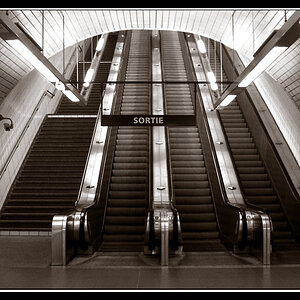
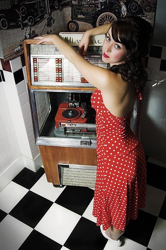
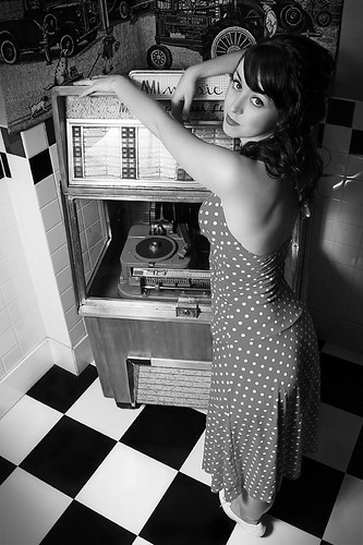
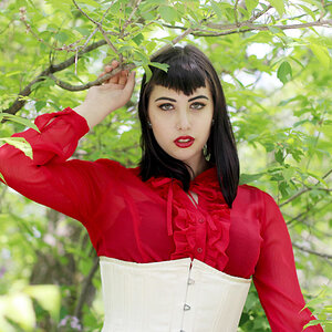
Which version do you like better? Also, other crit is always appreciated.

1 Colour
1508500854_e45cec0464.jpg


2 B/W
1507645667_ab5670a598.jpg
 
I like the first one. The red color of her lips and dress are also in the buttons and the player, so it works well. :)

Marian
 
Yeah, I tried both desat and oversat, but settled on the one I had posted as a personal preference. I do think I like the color better than the bw though.
 
I like the super sat and the regular color too. THe black and white is nice but it seems to be missing something.
 
The scene is pretty monochromatic to begin with considering the only real color is in the dress and jukebox.
Might be a decent candidate for selective color.
 
The scene is pretty monochromatic to begin with considering the only real color is in the dress and jukebox.
Might be a decent candidate for selective color.


I think that is why I like this one so much. I dislike selective colored photos,
but when it is done for real and not is photoshop, its pretty cool.
 
It's a neat shot - the girl is attractive, there's a cool period vibe happening, and there's a TON of contrast.

I haven't touched photohiop in years, but I took it out and buthchered the shot (pretty dang embarassing, I tell you!) and I found that silly way of going super contrasty BW with JUST the dress red. It's well framed for it, too. I screwed it up so bad I can't post it, but a talented photoshopper can do it!

P.S. - Sometimes I hate those shots BW shots with color details. I think I'm out of touch...
 
I think for a shot like this the reds should definately be there and mabye the reds should be even a little oversaturated but overall I would say nice shot.
 

Most reactions

New Topics

Back
Top