6 month old :)

woojiebear

TPF Noob!
Joined
Mar 20, 2009
Messages
387
Reaction score
1
Location
Kelowna, B.C.
Can others edit my Photos
Photos OK to edit
Hey everyone!
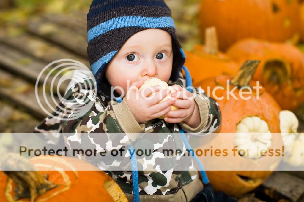
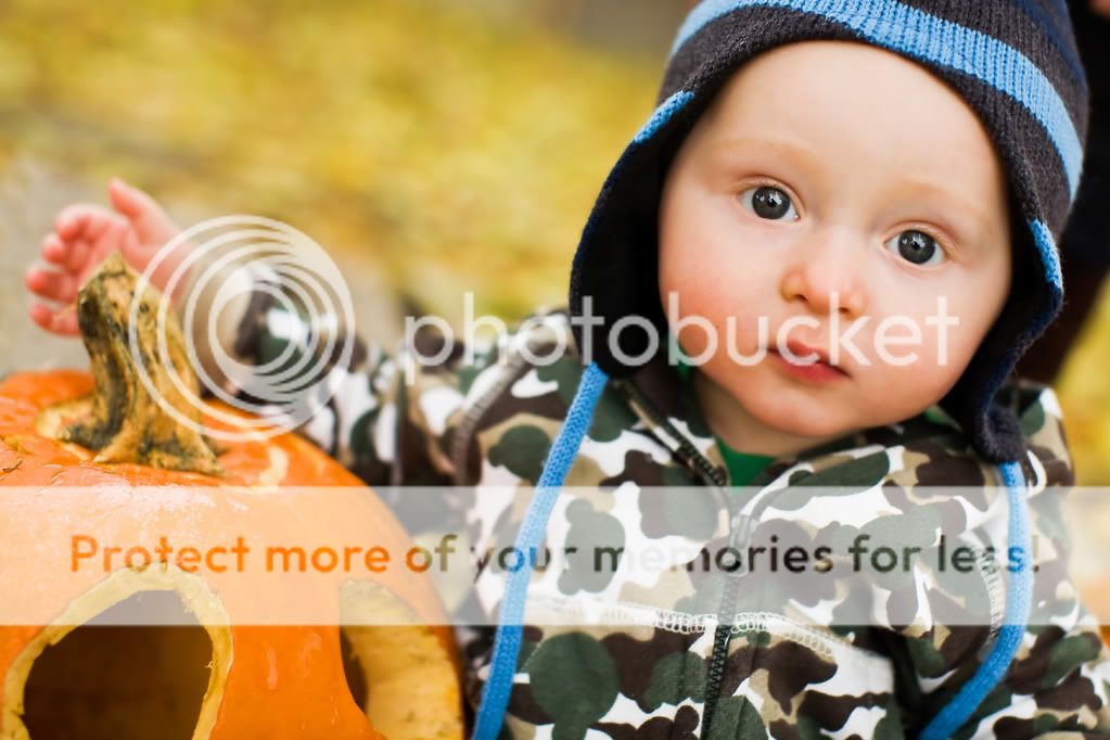
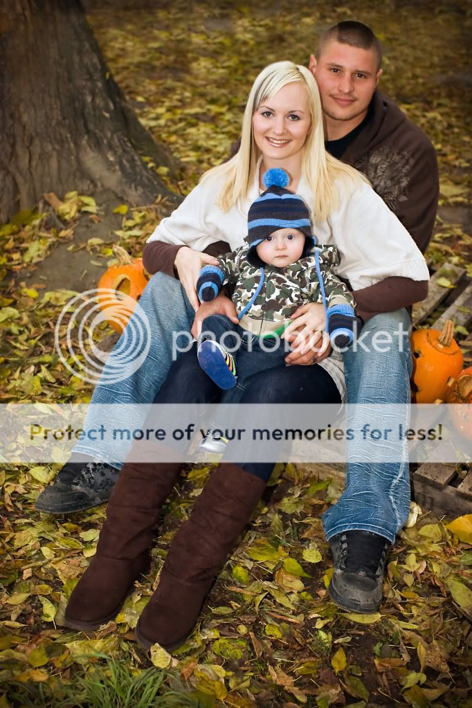
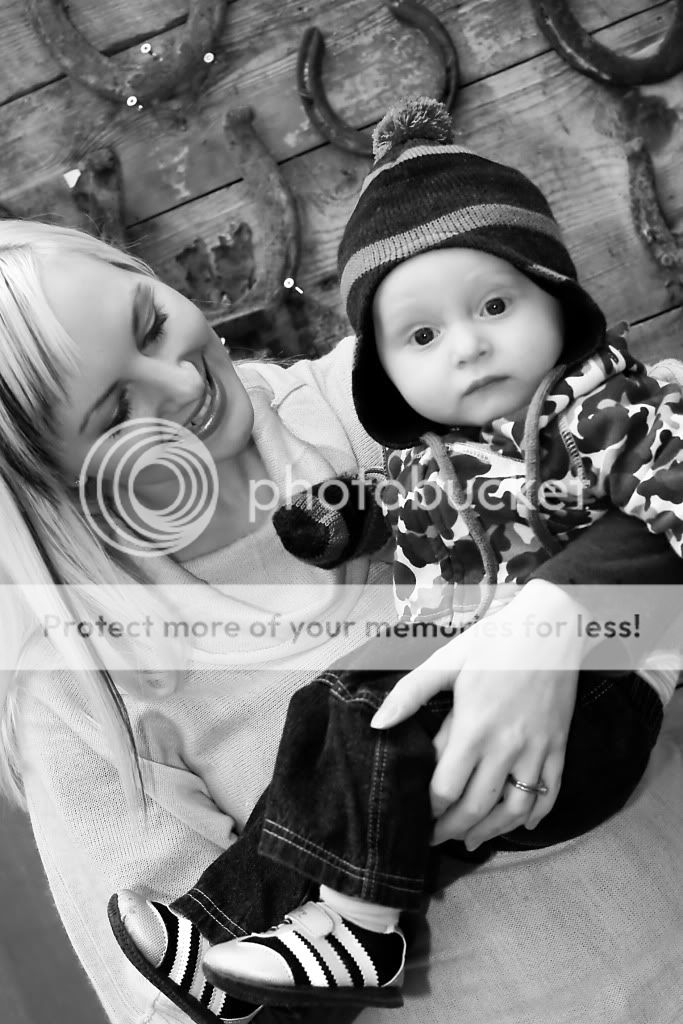
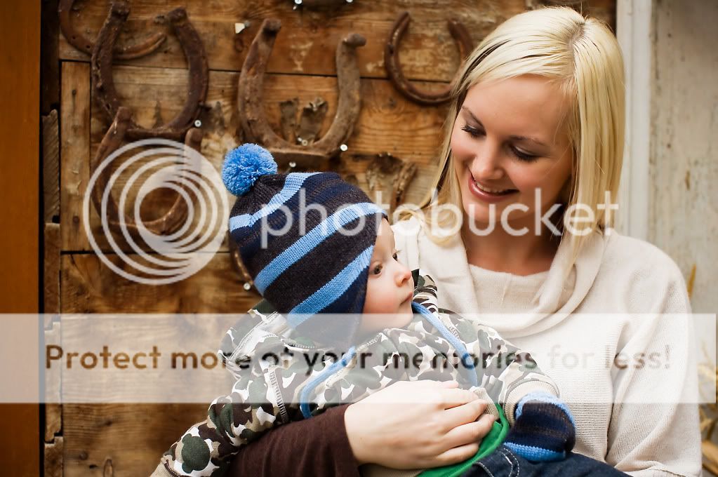
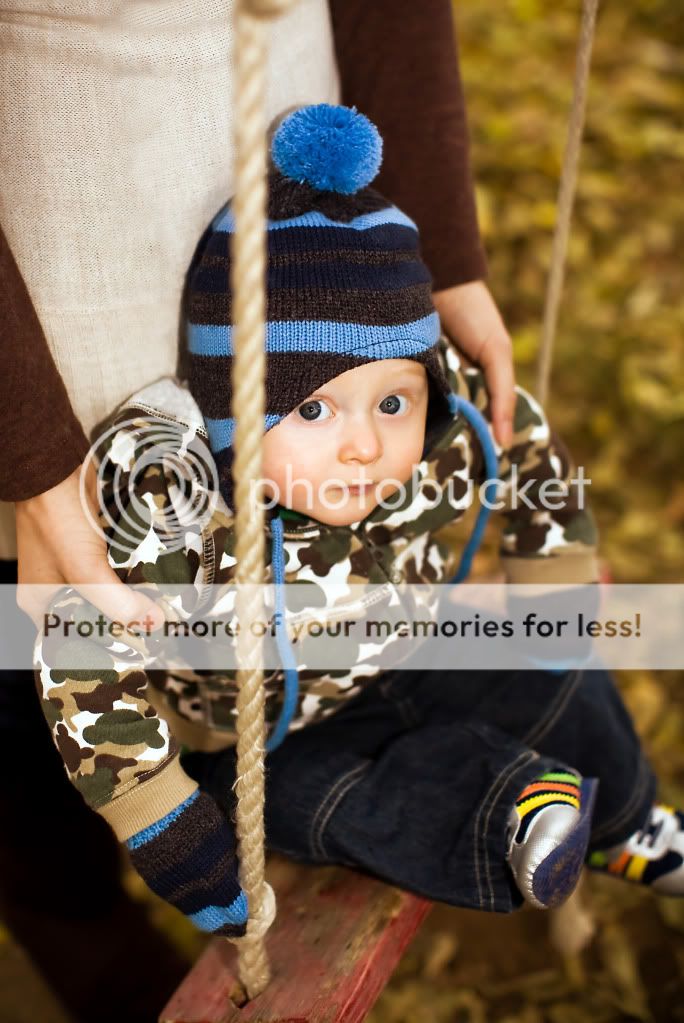
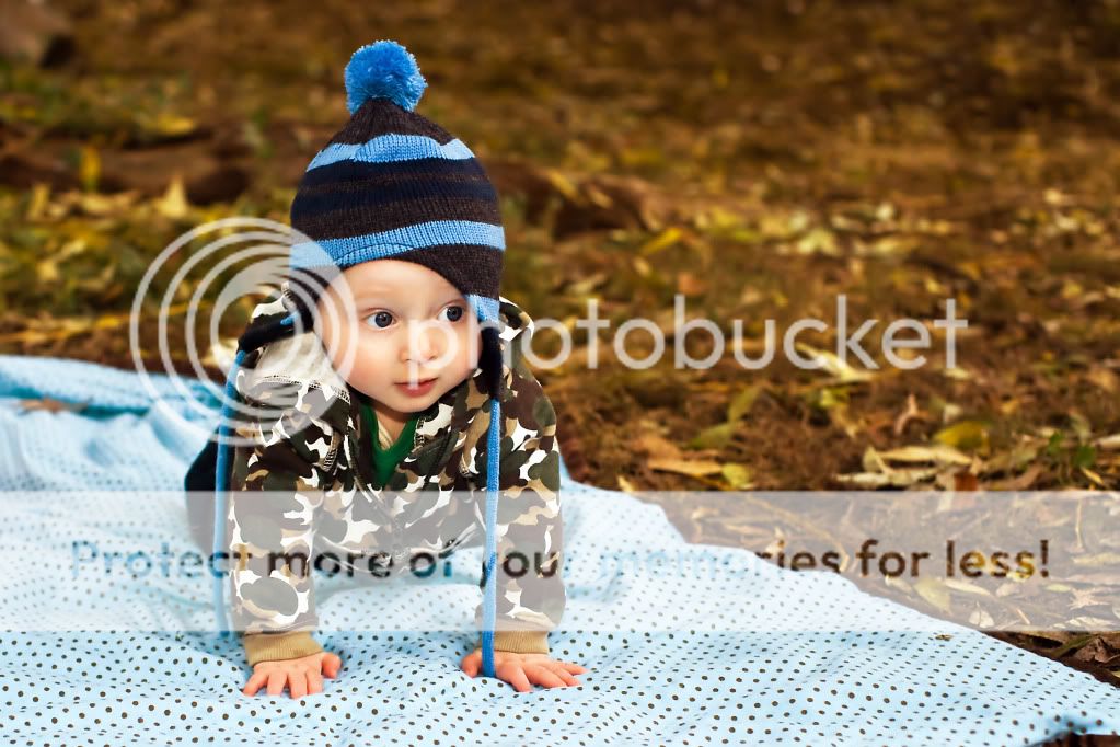
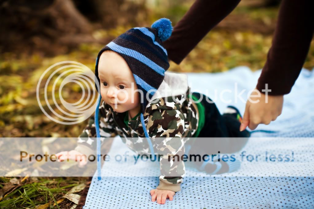
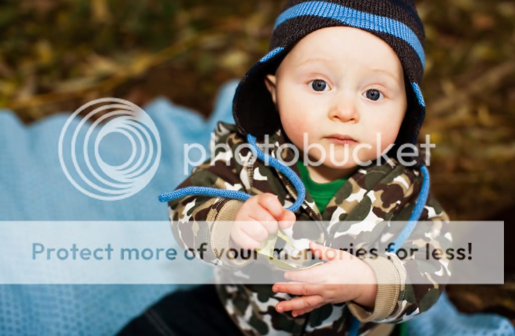
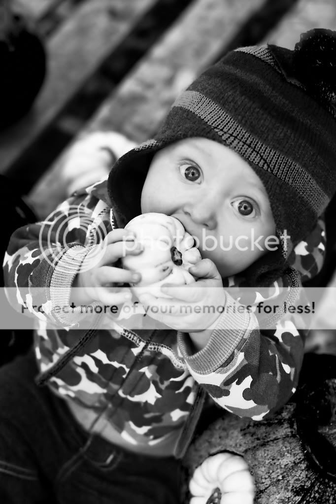
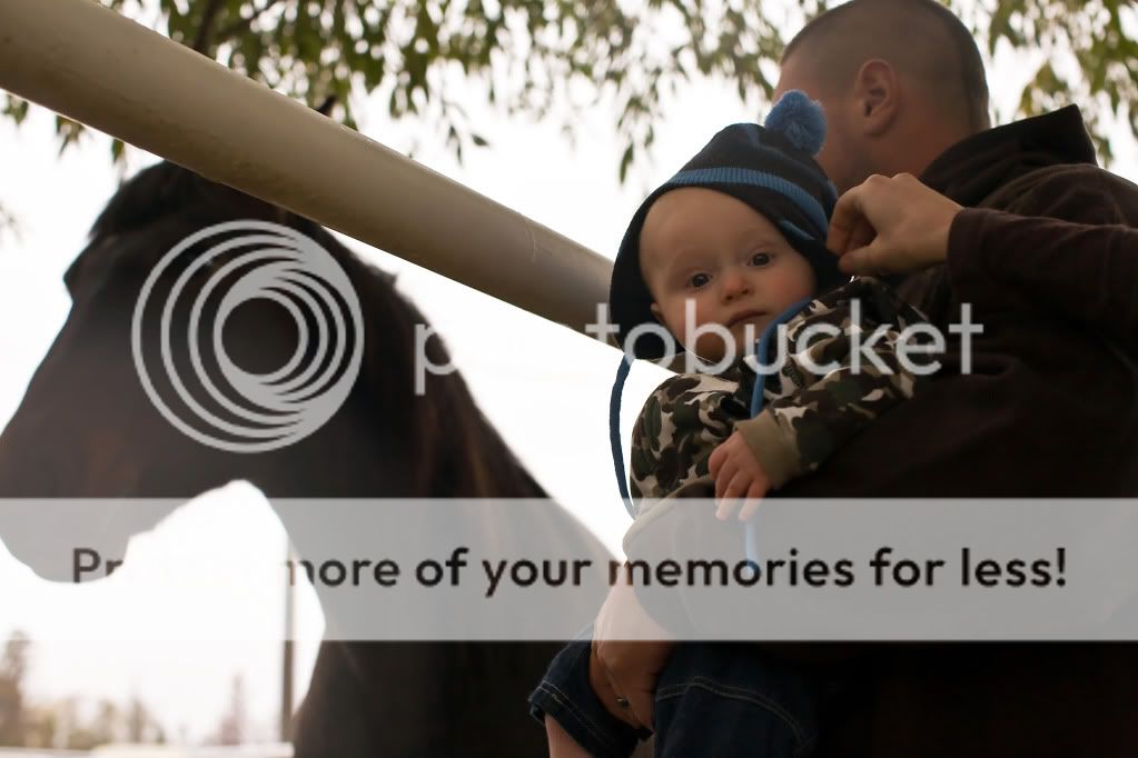
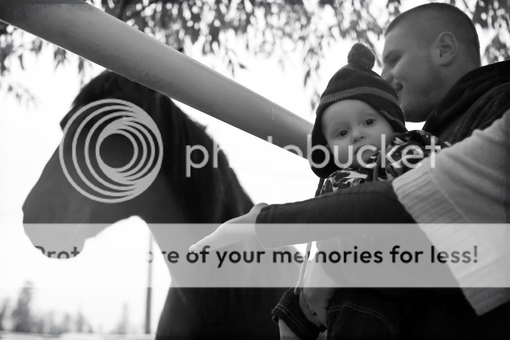
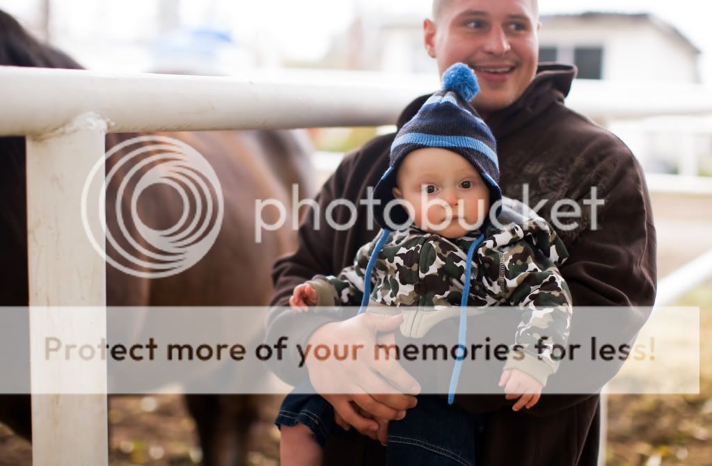
Really would like some feedback on these before I hand them over to my client. We were rained out about 30 minutes into the shoot so we have to still shoot part 2 of it. I feel unsure about them...
Much appreciated!

1
IMG_0049-7.jpg


2
IMG_0059-10.jpg


3
IMG_0075-15.jpg


4
IMG_0086-17.jpg


5
IMG_0112-24.jpg


6
IMG_0119-25.jpg


7
IMG_0042-1.jpg


8
IMG_0204-43.jpg


9
IMG_0165-33.jpg


10
IMG_0176-35.jpg


11
IMG_0070-14.jpg


12
IMG_0127-28.jpg


13
IMG_0129-30.jpg


14
IMG_0140-31.jpg


i've got a few more to go through and edit still
but thanx again!
 
There are a lot of photos to go through on there. I will pick my favorite three and review those...

1. He's a cute kid, but it really does look like someone just put him down and then stepped back and took a picture. Since you were standing above him shooting down, the photo sort of looks like he's about to fall over backwards. I think this photo would have been better if you were down at his level.

3. I like the composition of this one better, but what ever that is behind him I find distracting. I'm assuming its his mom's leg. Too bad. Nice photo other than that.

8. I think is the best photo of him. But I do find the blanket distracting and it doesn't look set up to me. It was sort of "put him on the blanket and get him to crawl" moment. Not sure why it bugged me on that one, but I think it could have been done using the same idea, but could have been set up better.

Overall, its a ok set. Sorry. I find most of the photos with the parents in the photos taking away from them. The one with the three of them sitting down is the best of the parent/kid photos,but I don't like that you were shooting down on them. A level shot would have been much better.
Also, it might just be my work computer, but some of the skin tones look a little too orange for my liking. I like the fact that you have these nice warm fall colors, but the skin tones seem off to me.

Hope that helps a bit.
S
 
The white balance definitely feels too warm for me on most of these. Also the lighting seems really flat. I see that you used natural light on most and flash on a few (like #10) and the flash is direct and somewhat harsh which is adding to the flat look. I'm wondering if maybe adding some contrast and maybe a tad of saturation would help. As it sits, the first few b&w's are my favorites as they don't appear as flat and dull to me.
 
Similar comments to everyone else!

1. Too warm. Experiment with adding a combination of cyan and blue. Or go into selective color, choose yellow on the drop down screen, and pull some yellow out with the yellow slider. A combination of all this will help.

2. I would love to see him interacting with you more. Try singing to him, getting Mom and dad to tickle him adn then run and hide behind you, etc. The more shoots you do the more comfortable you will get in acting silly and getting smiles. It's tough at first. If you check out my blog you'll see a few poses that help get smiles for little ones. Link in my sig.

3. Agree about the flash. Never flattering for subjects and looks amauterish.

Now with this all of this said, I think you have a good eye, I love you wide DOF, and I think you will have a bright future with practice! I hope that you're doing portfolio building right now and not charging as it will make you a better photog in the long run.

Thanks for sharing and admire your learning attitude.
 

Most reactions

New Topics

Back
Top