A Begginner with 6 Pictures!!!

Gsurf1029

TPF Noob!
Joined
Mar 16, 2008
Messages
101
Reaction score
0
So i just picked up my d40 again for the first time in about 6 months. Before then i only had about a week of experience. What can i say im in love. I posted a couple in the general gallery but wanted to see if i could get some help here since i am indeed a beginner. These photos were taken in south beach. I also included an experimental light painting photograph as well as one from down town.

Let me know what you think!
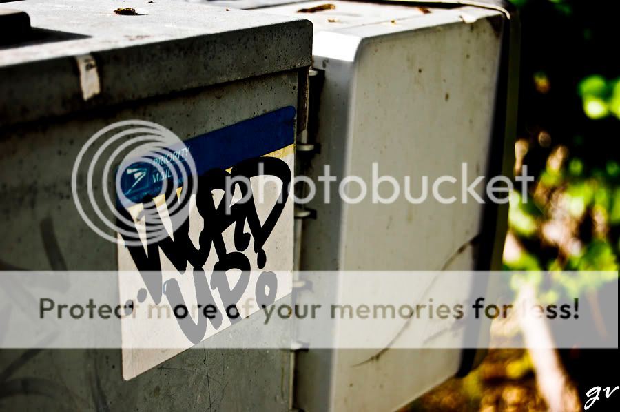
1.
LightPaintReTouch2-.jpg

light painting in my room
just messing around

2.
AllyWay.jpg

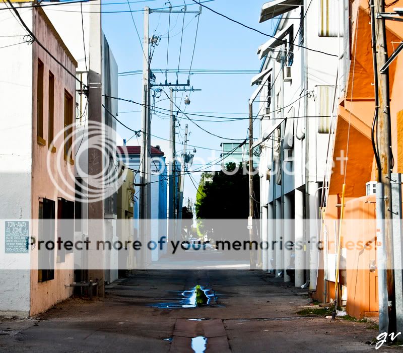
ally way that caught my eye


3.
SouthBeach022-1.jpg

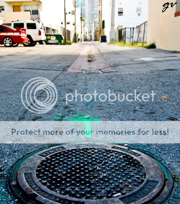
same ally way, but going the opposite way.
i wish the arrow came out more vivid.


4.
SouthBeach006.jpg

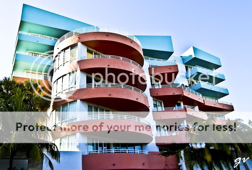
a hotel i always wanted to shoot.


5.
SouthBeach014.jpg

my personal favorite i think, i like the urban ish feel. :)


6.
SouthBeach029.jpg

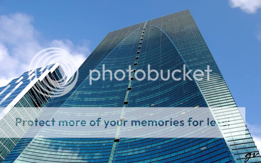
lastly a building down town that i always thought looked neat.


I hope there aren't too many images to be critiqued .
Any comments would be awesome!
Thanks!

:mrgreen:
 
Last edited:
I'll just say that I'd like for you to take a thousand pictures that I could look at because you live in a place that looks intriguing, and you take interesting shots....
 
1. Blurry. Could be a cool shot if it was in focus.
2. Boring. Cluttered and a missed attempt at symmetry.
3. I like the use of a different perspective here. The whole manhole should be in view (that is btw I think the first time I've ever typed those words together) but the rest of the scene suffers from being pretty ho-hum and again, cluttered. Half a truck, washed out sky, etc.
4. Neat looking building. Would be nice if the image were either more flattering to the building or more gritty. As it stands, it's pretty ho-hum.
5. Technically OK, composition could be a little better. A 'neat' find but a so-so photo.
6. Cool looking building. The subject *screams* for a symmetry shot. The viewing angle doesn't help the image at all.
 
The last picture came out the best. But I agree with the cc, if it was taken at a different angle I think it would have been great.
 
I agree. The second one seems like "i like this place. ill take a picture, i dont care if there's a bird flying by or a car/truck." i also think that the wires are distracting. it seems underexposed as well imo.

i like #5 too. i gotta agree. the composition could be better. go a bit lower. the top doesnt deserve to be in the picture.

good find with the hotel though. it has complimenting colours.
 
I like the overal colours! May I ask what post-production you did to the colours? Thanks!
 
wow thanks so much for the replies!
i felt the same about the ally way, is there anything i could do to make that particular shot interesting, or is it just not an appealing place? But agian thhanks alot.

As for the post production, i dont do too too much. I open it in the RAW editor and mess with the levels until i like it. Usually i raise the black levels and clarity, and of course crop a bit.
 
1) I think the consensus will be that it is out of focus. For me, I like the photo. I like that it looks like a drug induced moment when things are not clear and surreal. The big problem I have with the photo are the items to the left of the frame. It breaks the overall look and feel and adds unnecessary clutter.
2) Does not do much for me
3) The manhole cover and arrow are the primary subjects but do not occupy the majority of the frame. The manhole cover is also cropped.
4) Very interesting architecture. Try other vantage points. I feel like the bottom of the building was cropped off.
5) Good shot. I feel that it is missing something but still good.
6) Same as 4
 
2. is really busy- had the wires and truck not been there it would be good. also the light fades towards the middle of the shot (trees are dark) which i do not like but may be good to displace emphaiss, otherwise shot itself would be pretty decent with those thigns gone.. i wish the alley was skinning cuz i feel like it needs a crop.

3. get a lower angle- nice though, very centralized

4.great colors but try shooting when the sun is not directly on the side

5. my favorite as well but it seems alittle soft. otherwise awesome!

6. i agree with hte earlier statements, get closer to being underneath it and possibly crop off hte top
 

Most reactions

Back
Top