The first was taken through glass?
That might account for the lack in sharpness here. For a subject like that would need to be tack sharp, in my opinion. Your point of view definitely helped you create an interesting photo here! Where is that station?
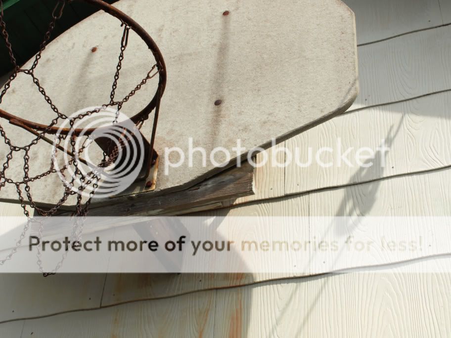
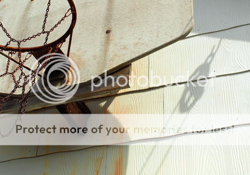
The second is definitely not quite so interesting. I think you should have played more with the element "shadows" than you did. I'm only guessing, of course, but I think there were some cool shadows there. That black top left corner bugs me, too... in composing, that should have been left out.
im to new to critique. #2 I like the idea alot. im a sports fan and i grew up playing basketball on any hoop available even if it had a bent rim. alot of rims were worn and rusty. my only thought would be bringing out the rust in the rim more. i appriciate the pic either way.
#1 was through glass looking down at Penn Station from the building I work in. I agree that the glass affected the shot...I'm going to have to try to get on the roof
#2 There were definitely some cool shadows, but the photo looked different on my monitor at home. On the computer I'm at now, the colors look almost faded with not much contrast. The shadows and rust on the rim looked much more pronounced. My work monitor is horrible, so that might explain it.
Any thoughts on what could be done to #2 in pp to make those colors and shadows pop?
My first step in pp (of Photo 2) would be to crop out that dark corner in the top left.
Then I'd look at the histogramme (in the "Levels" of Photoshop) and if there are any parts that look totally flat, not elevated at all (which I assume happens on the left side of the histogramme, the side that shows how many shadows there are), I'd push the little arrow until it meets the "foot of the mountain".
I might also feel inclined to up the saturation of the reds and of the yellows.
And then I'd apply Unsharp Mask to bring out the textures of the ring and the wood some more.
I cropped the image and increased the saturation of the reds and yellows. I also used the unsharp mask filter, but am not sure how to increase the levels on the left side of the histogram
Without cropping the original photo, what could I do to lighten up that top left corner?
I figure if I can learn to make this seemingly random photo of an old basketball hoop look pretty good, I should be able to take photos with good composition and make them look great.

")
![[No title]](/data/xfmg/thumbnail/36/36132-5bd4fa365c199003273e0ff128bf42f4.jpg?1619737384)