A couple of firsts....

Rahb

No longer a newbie, moving up!
Joined
Feb 28, 2006
Messages
258
Reaction score
28
Location
Mansfield, Texas
I'm timid sharing this, but I guess some feedback would only help me improve in areas I need to work on.

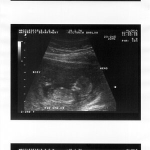
This is my first time expecting a child (my wife and I that is).

This is also my first time using a studio flash setup (bought a cheap setup for recording a weekly photo of the pregnancy....almost weekly).

We have done 3 photos, and I'm not sure what areas I should focus on improving on. I can't get her far enough away from the wall to get rid of shadows cast on the wall....

Any other areas I should concentrate on? I don't pose people well...

For what we are using them for (FB, Instagram, etc) these are fine, but a good place for me to start learning how to improve.

Fire away...(gently)

1) Raspberry - Canon 60D, iso 100, Sigma 17-50mm @23mm f9, 1/125
10830634_10203613360230643_5389603549009445737_o.jpg

2) Prune - Canon 60D, iso 100, Sigma 17-50mm @25mm f8, 1/100
10928934_10203613360310645_6780863143535896714_o.jpg

3) Lime (3photos) -Canon 60D, iso 100, Sigma 17-50mm @28mm f8, 1/200 (shutter was too fast causing flash sync issue...little bit underexposed on the right)
10915118_10203613360110640_6068374789390601008_o.jpg

10919442_10203613359310620_3974381020936703748_o.jpg

10365640_10203613359550626_7062347549543507445_o.jpg
 
they are all good photos capturing an important moment, #4 & 5 are best IMO, sorry not tech feedback.
 
The first thing that strikes me is that the location doesn't seem appropriate. It looks like a hallway or basement. Perhaps somewhere outside? The quality of light makes me think that perhaps your light source is too far away and/or not diffuse enough. Lastly as an artistic thought, considering the fruit theme, perhaps consider accessoring your wife in the colour of the fruit? I think that might help make a more cohesive image. This is definitely a unique take on materinity photos!
 
The first thing that strikes me is that the location doesn't seem appropriate. It looks like a hallway or basement. Perhaps somewhere outside? The quality of light makes me think that perhaps your light source is too far away and/or not diffuse enough. Lastly as an artistic thought, considering the fruit theme, perhaps consider accessoring your wife in the colour of the fruit? I think that might help make a more cohesive image. This is definitely a unique take on materinity photos!

She wants to do weekly photos, only space I had that I can leave set up was the upstairs living room (we use it as a workout room).

As far as lighting, it's using 2 soft boxes. They are about 10ft from her. Should I switch to umbrellas, or shoot direct? Move closer? It seems if I get them too close she gets blown out a bit and there are harsh shdows on the wall.
 
John (tirediron) has good advice, and is far more the expert than I.

I'm not really a "portrait" photographer, but a couple of things that struck me, apart from any issues about lighting, background, etc:

1. Consider having her dress in something besides white. It's so easy to end up blowing out the white and getting no detail. I LOVE John's idea of accessorizing in accordance with the fruit color, too!

2. Consider putting the actual date on the chalkboard somewhere, even if it's just a small notation at the bottom. Yes, you can easily figure that out, but how much easier--especially many years from now--if there were a date listed somewhere.
 
Wait until the watermelon stage.
 
As far as lighting, it's using 2 soft boxes. They are about 10ft from her. Should I switch to umbrellas, or shoot direct? Move closer? It seems if I get them too close she gets blown out a bit and there are harsh shdows on the wall.
10'???? No wonder! As a general rule of thumb, the working distance for a modifier should be 1.5x the size of the modifier, or less. In other words, if you're using 36" soft-boxes, they should be no more than 54" away from the subject. As an example, the image below is shot with a single speedlight driving a 50" Wescott box, and is so close that the edge of it was cropped out of the raw image.

Since you're doing this weekly, you could invest in a roll of seamless paper and just tape it to the wall for each shoot. That would create much more of a studio/professional feel.

If you're getting blown highlights when you move the strobes in, reduce the power! Moving the lights closer and reducing the power will also greatly reduce the strength of the shadows on the wall behind her (Read up on the inverse square law).

Eva%20(2).jpg
 
Read up on Inverse Square Law. I moved the strobes closer, and ran into minor fall off of light when it comes to the legs.

This is just a project se wanted to document each week, and she wants to keep using the white dress. As far as back drops, haven't purchased one yet, but as I continue learning and shoot other projects, I will look into incorporating one.

As far as flash and distance, and improvement? tried to get a little hint of shadow on the right right side of her face.

Getting closer, or still off?

10945821_10203665685178734_4585818938834258450_o.jpg


10960393_10203665685138733_7603206581298155863_o.jpg


10860894_10203665685098732_3863621671284094052_o.jpg
 
Hey, Rahb, welcome!

When John is talking about moving the light closer, it is understood that you would turn the power down proportionally. (inverse proportionality)

I see nothing fundamentally wrong with the wall as backdrop, but there is the base trim and her shadow. If you turn the light so it is more oblique to the wall, or flag it, then there won't be so much light going to make her shadow back there.

I have a different kind of suggestion; get the camera lower, about at her waist line, IMO. And the light is too strong, IMO.
 
Last edited:
This week I will move the left (key) flash more to her side, and turn the flashes down a notch.

We are just having fun with these weekly photos where we wanted to track her progress, and I figured I can learn how these strobes work. Just trying to lear, not trying to be a pro. Thanks for your suggestions. I'll work on camera angle this week also.
 
I am looking at these pictures on my work computer, so it's a low grade monitor that is no where close to being calibrated(multi-billion dollar companies never like to spend money on things you need.)

In every picture, the dress looks very blown out. In some, her face also looks too bright. I think that your flash is too strong.
Since she is set on wearing the white dress in all of the pictures, wear an article that is the same color of which ever fruit she will be holding? Maybe shoes or scarf... If it's a boy, maybe even a tie to make it silly. If it's a girl, maybe something more feminine like some dish soap o_O jk ladies lol
Just throwing out some ideas, there will be a lot of pictures in this photo album you put together, it would be nice to see something besides the fruit change in them.
 

Most reactions

New Topics

Back
Top