ViceOfFire
TPF Noob!
- Joined
- Oct 15, 2008
- Messages
- 80
- Reaction score
- 0
- Can others edit my Photos
- Photos OK to edit
Hi all, I'm new here, and new to photography (2 weeks young) in general. Allow me to start by asking you to please be as harsh as possible, as criticism is the only way I'll learn. The images have seemingly a lot of post, so I've included the originals.
Please bare in mind that I know the PP looks over the top on the first one, it was intended for the surrealistic look. And the symbolism I tried to convey was how we all rely on things to keep us sane (not necessarily medication), and then wake up one day and realize we've changed. Feel free to edit any of them, too.
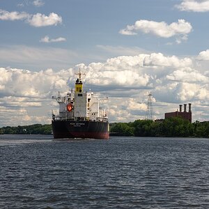
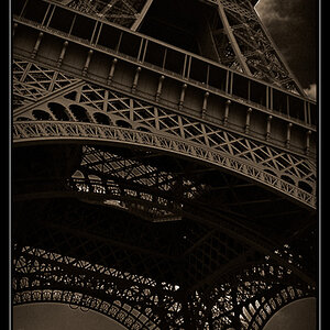
1) No Photoshopping whatsoever, just HDR in Photomatix, I understand if people dislike HDR.

Original

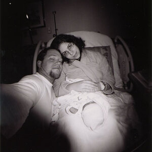
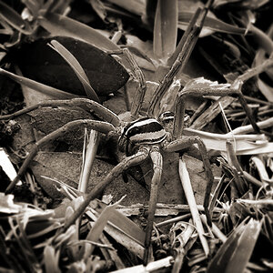
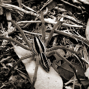
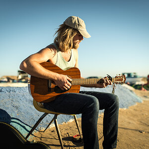
2) Slight levels adjustment, cropping and B&W conversion

Original w/ no cropping

Please bare in mind that I know the PP looks over the top on the first one, it was intended for the surrealistic look. And the symbolism I tried to convey was how we all rely on things to keep us sane (not necessarily medication), and then wake up one day and realize we've changed. Feel free to edit any of them, too.
1) No Photoshopping whatsoever, just HDR in Photomatix, I understand if people dislike HDR.
Original
2) Slight levels adjustment, cropping and B&W conversion
Original w/ no cropping
 . When you say reflector image, may I ask what exactly you mean? I know of reflectors used in photography (which I will need to make when I get a flash gun), but I don't understand "reflector image" in this context. If you would be so kind as to elaborate, that would be great. I understand what you mean how it would look better as a straight exposure, and that was my first thought, I wanted it to have a completely sterile look. I'll probably do a bit more playing around too.
![[No title]](/data/xfmg/thumbnail/31/31742-596f6bbc60b2ba7fed2cd25f5aacf41c.jpg?1619734985)