A CRITIQUE post from ME!!!!

Corry

Flirtacious and Bodacious
Supporting Member
Joined
Feb 5, 2004
Messages
21,168
Reaction score
110
Location
North Central Illinois
Website
corryttc.blogspot.com
Can others edit my Photos
Photos NOT OK to edit
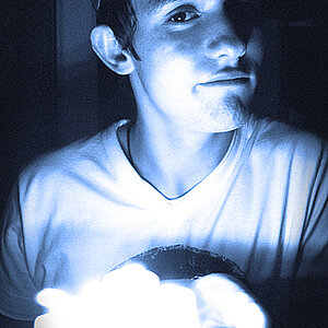
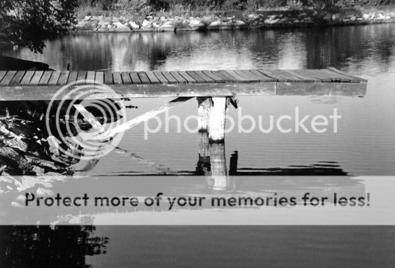
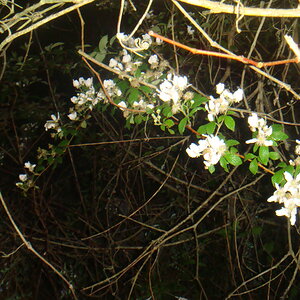
Wow. Amazing...not only an actual photo post from me, but a CRITIQUE post from me!!! Ok, is this any good??? What can I do to improve it? And do you like the full color or the desaturated version better?

Dock.jpg


DockDesat.jpg


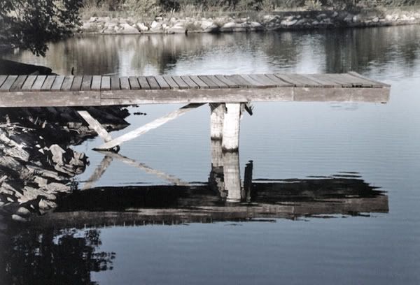
And just wondering...I saved these at the exact same size...why are they coming up different, and so small?? I saved them a lot bigger than this?
 
Corry, photobuck will resize them. You accidentally click the button to resize them. I've done it before :p

I really like the color in the first one, but the second want is just teasing me and makes me want to see it all the way in B&W. I think it would look great.
 
I can't find where it says to change the size in Photobucket. Here's the B/W version..I converted it to greyscale and slightly bumped the saturation.

DockBW.jpg


Hey, that one was fullsize...I'm so confused...
 
I vote for #1. The water yields a beautiful reflection and the colors are very pleasing. Nice work! :thumbsup:
 
I like both the desaturated one, and the fully black and white one. They're great shots!
 
The color shot is the best imo...I really like the colors...Did you sharpen in post-processing? This same shot taken at about a 45 degree angle looking out on the water would be cool too. Nice!
 
Didn't sharpen at all on this one. I resized and bumped the contrast a bit..I think thats it. I do have the dock at other angles (on my computer at home) but I don't think I inluded ENOUGH of the dock in the picture, so I didn't post any of them. I'll look through em again and maybe post one later.
 
I like the full colour one, I usually like B&W better but the blues at the bottom of the image are so vibrant and the reflections are just tasty!

Congrats on a great shot Corry
 
I like the half desaturated one the best. The white poles under it seem too glaring in the b&w, and the full color one seems too cheery for an old seemingly abandoned dock.
 
Holy Crap! My thread has been resurected! :)

That first one has no added saturation whatsoever. That is exactly how it came out. It was right around that time that I started desating a lot of my pics, cuz they just didn't look natural to me.
 
lol I didn't notice when I replied that this was an old post. I guess I must have been searching for something but absentmindedly thought this was a post at the top of the critique forum list and that I wasn't on a search results page. But I still stand by my opinion lol. :)
 

Most reactions

Back
Top