Guinness Man
TPF Noob!
- Joined
- Sep 22, 2009
- Messages
- 160
- Reaction score
- 123
- Location
- San Diego, CA
- Can others edit my Photos
- Photos NOT OK to edit
1

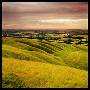
By guinnessman, shot with NIKON D5000 at 2010-03-01
2

By guinnessman, shot with NIKON D5000 at 2010-02-28
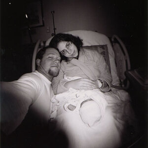
3

By guinnessman, shot with NIKON D5000 at 2010-02-25
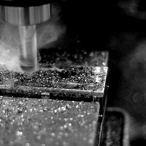
4

By guinnessman, shot with NIKON D5000 at 2010-02-25
By guinnessman, shot with NIKON D5000 at 2010-03-01
2
By guinnessman, shot with NIKON D5000 at 2010-02-28
3
By guinnessman, shot with NIKON D5000 at 2010-02-25
4
By guinnessman, shot with NIKON D5000 at 2010-02-25
") Really nice effect over all though in this one
Really nice effect over all though in this one
![[No title]](/data/xfmg/thumbnail/34/34077-2933006a1d00efe7d5967044e94e345e.jpg?1619736268)


![[No title]](/data/xfmg/thumbnail/42/42021-ffc326f5dc5b4c65ce53935e6e9e4338.jpg?1619739980)