A few from a wedding today

I think these are pretty solid. They'll love #8, it's what the ladies call "cute" or "adorable". I also like your idea for #2. I think I would have liked it a bit more with a shallower DOF thought. The background is a little on the busy end for me but it's still makes a nice creative photo. #3-#5 are obviously good shots so I'm not even going to mention them... or am I...
 
Honestly, I see some good stuff, but I think you "just missed" on quite a few of them.

1. This is fine. nothing really to complain about.
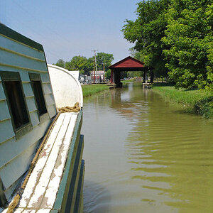
2. Cute idea, nice scene, but I feel like we're too close to them or something... I know what they're doing, but I feel like I lose some of the context somehow. Also his hands are kinda close to her face and the oars are kinda dominating.
3. Fine, but watch the framing. With dance shots you really want to get their heads up to the top of the frame and cut out any unecessary background stuff.
4. Someone else pointed out the floating bench thing- honestly I would have missed it, but good point.
5. The crop for me in this one was a little weird... or the framing. The space behind her head is fine, the space behind his head feels chopped. It literally feels like you twitched a bit when you took the shot.
6. The people in the shot might have been fine, but that overhead thing is a major distraction and ruins the shot utterly, IMO.
7. The framing feels a little awkward, which you could fix with a crop, but those ferns up front are really intrusive. A crop may fix them as well, though. I'd say play with it.
8. This one is very cute. The background is a little distracting (there's a LOT going on... some lady peeking through the trees there, etc.), but I think it works ok and probably reminds them of the scene. IMO this is probably the best shot of the bunch.
9. Cute. Nice moment. I think if you cropped in a bit on the right and maybe a hair on the top it would really pull it together.
10. Ok, I guess. Crop a bit.
11. Ok, I guess.
12. Nice moment, but so much of both of their faces are concealed that it feels like it doesn't quite work for me.

Really, overall... I think you handle the camera well technically... I think you have some framing and composition quirks. They totally feel like they're just off a LITTLE, though.
These, of course, are just my opinions. Offer void in Alaska.
 
Honestly, I see some good stuff, but I think you "just missed" on quite a few of them.

1. This is fine. nothing really to complain about. Glad you weren't ale to find anything to complain about.
2. Cute idea, nice scene, but I feel like we're too close to them or something... I know what they're doing, but I feel like I lose some of the context somehow. Also his hands are kinda close to her face and the oars are kinda dominating. To get farther away, I would have needed to stand in a flower garden... Not sure how the management would feel about that. ;) But I see what you're saying.
3. Fine, but watch the framing. With dance shots you really want to get their heads up to the top of the frame and cut out any unecessary background stuff. This is a brother-sister hug, not a dance shot.
4. Someone else pointed out the floating bench thing- honestly I would have missed it, but good point. I agree, it is a good point. The bench is actually hanging from chains anyway, so technically it is "floating" in some respects.
5. The crop for me in this one was a little weird... or the framing. The space behind her head is fine, the space behind his head feels chopped. It literally feels like you twitched a bit when you took the shot. I cropped this in on the right side, I'll post it below. I think it works better when it's more centered.
6. The people in the shot might have been fine, but that overhead thing is a major distraction and ruins the shot utterly, IMO. To each their own. Some like it, some don't. I appreciate the thought. It's an umbrella from, as it was a rainy day. I personally think it adds context to the photo, but I can see how it would draw a lot of attention.
7. The framing feels a little awkward, which you could fix with a crop, but those ferns up front are really intrusive. A crop may fix them as well, though. I'd say play with it. I recropped this as well. Got quite a bit tighter with it.
8. This one is very cute. The background is a little distracting (there's a LOT going on... some lady peeking through the trees there, etc.), but I think it works ok and probably reminds them of the scene. IMO this is probably the best shot of the bunch. I agree, the background is a bit busy. Lots going on in the childrens garden. Haha.
9. Cute. Nice moment. I think if you cropped in a bit on the right and maybe a hair on the top it would really pull it together. I'll work with different crops tonight. See what works and what doesn't. I do know that I like it the way it is right now. Fits very well with RoT.
10. Ok, I guess. Crop a bit. Crop/framing was intentional.
11. Ok, I guess.
12. Nice moment, but so much of both of their faces are concealed that it feels like it doesn't quite work for me. Only angle I could get without being in my Girlfriend's shot of the moment, or in someone's lap in the audience. I would have liked to be farther to the right, Ideally.

Really, overall... I think you handle the camera well technically... I think you have some framing and composition quirks. They totally feel like they're just off a LITTLE, though.
These, of course, are just my opinions. Offer void in Alaska.

Thank you for taking the time to give critique and offer insights. I appreciate it! Here are the other two: http://i.minus.com/jzdUhj2luaITP.jpg --- http://i.minus.com/jba0HXv9yTYxjV.jpg
 
He wears jeans to his weddings. The dude is fearless.
 
Thanks Ken! I try to be respectful of others opinions regarding my work. Of course, there are plenty of times when I DO flat out disagree with critique. Those times are seldom though.
 
BTW, the second link of the two you just posted... awesome.
 
Tyler the money shots are in that hour or two that the couple gives to you sometime during the wedding day(Just you and the couple with no interruptions). If you were to educate your clients about that during the contract signing and follow through the habbit on all your weddings, you're golden as their investment will shine on that session and your portfolio just becomes phat!

I call it the session within a session. Nice set for just starting out.
 
Great stuff wonderful set of photographs there are some eye caching photos callection. Specially 4th image is mindblowing !!
 
The expressions and connection in #5... That's my absolute favorite! Well done!
 
#1 of the first batch I would have liked a tiny touch of fill flash, their faces are a little dark to me, but I also don't know that this would have been feasible with the situation you were working with.
 
Very nice set! They look very familiar to me. I wonder why. :wink:

8 is by far my favorite. It would have been nice to have seen the background thrown a bit more out of focus, but that's just my forté. Not for everyone. Very nicely done, indeed!

Mark
 
Tyler the money shots are in that hour or two that the couple gives to you sometime during the wedding day(Just you and the couple with no interruptions). If you were to educate your clients about that during the contract signing and follow through the habbit on all your weddings, you're golden as their investment will shine on that session and your portfolio just becomes phat!

I call it the session within a session. Nice set for just starting out.

Thanks Cam. We were initially going to have more time in the Gardens for just the two of them, but rain came and cut that time short. I did make a distinct mention of that during the consultation, but things just didn't pan out the way we wanted due to the weather. 15 minutes before the ceremony started, we heard thunder rolling in. :O I wish I had more time! I really do! I offered to shoot some additional images after the fact (assuming it stops raining in Maine at some point), so hopefully they'll take me up on it.

Great stuff wonderful set of photographs there are some eye caching photos callection. Specially 4th image is mindblowing !!

Thank you Cpi! Glad you liked them.

The expressions and connection in #5... That's my absolute favorite! Well done!

Thanks Mommy Medic! I like 5 as well. :)

#1 of the first batch I would have liked a tiny touch of fill flash, their faces are a little dark to me, but I also don't know that this would have been feasible with the situation you were working with.

I agree, their sockets are kind of dark. I'll work on using some fill flash next time. Thank you!

Very nice set! They look very familiar to me. I wonder why. :wink:

8 is by far my favorite. It would have been nice to have seen the background thrown a bit more out of focus, but that's just my forté. Not for everyone. Very nicely done, indeed!

Mark

I couldn't imagine why they look familiar to you! ;) I shot 8 wide open if I recall correctly, I was actually quite surprised at how sharp it turned out. That Sigma 85 is no slouch! Thanks for looking bud!
 
Really good stuff, If I took these I'd be proud anyway and I'm very fussy! You mind I ask which lenses were used on these? Some stunning OOF rendering going on here! Sorry to always bring it back to bokeh, but I'm an addict! ;)
 

Most reactions

Back
Top