a few from my maternity shoot

luvtkngpics

TPF Noob!
Joined
Oct 16, 2008
Messages
17
Reaction score
0
Location
Pa
Website
amandasurdelphotography.blogspot.com
Can others edit my Photos
Photos OK to edit
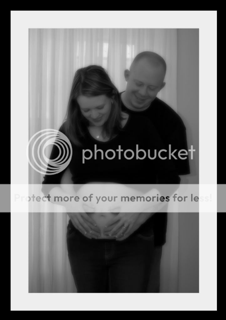
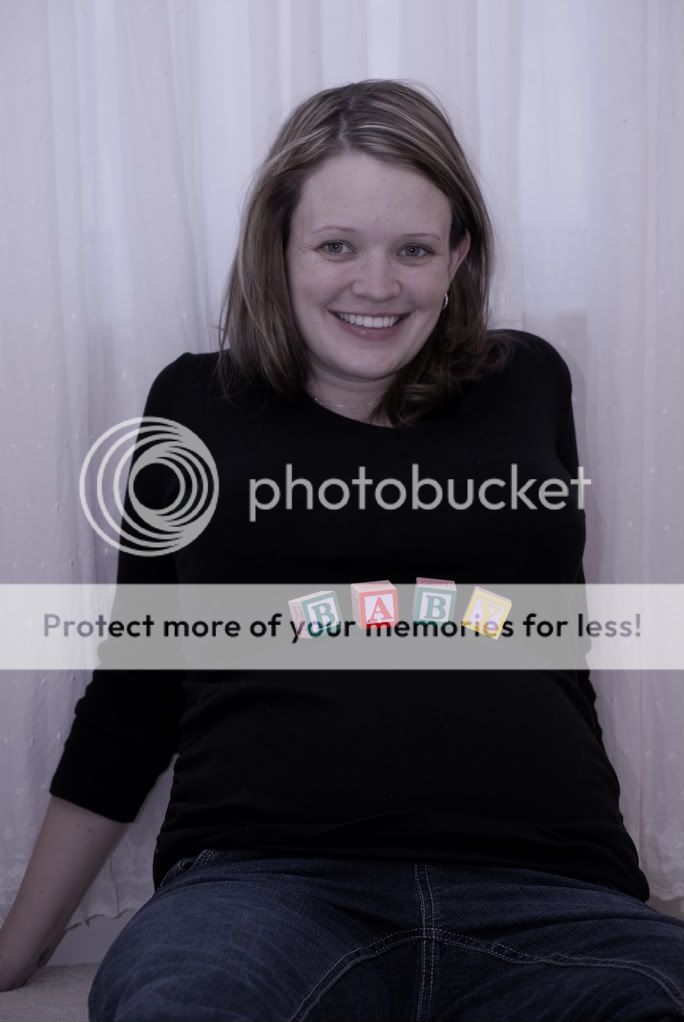
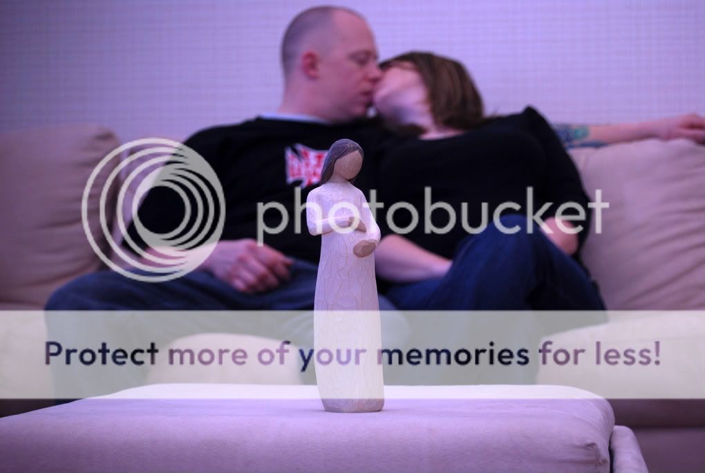
thanks to those of you who helped me out with my maternity questions. i gave it a try and this is what i got. let me know what you think. i'm not as impressed as i thought i'd be. any pointers would be appreciated.

DSC_0037-1.jpg


DSC_0067-1.jpg


DSC_0012-1-1.jpg


DSC_0033-1-1-1.jpg


DSC_0129-1.jpg


DSC_0101-1.jpg
 
I know a lot of people dont like selective coloring in photos but I think #3 would be so cute with selective coloring on the bow only.
 
The second one is basically a crotch shot an all together a very unflattering pose. The first one has way too much soft focus, I think. All the color hots seem to have some pretty serious white balance issues, and the black and whites don't have much contrast. The black also looks clipped on a lot of the pictures.
 
The second one is basically a crotch shot an all together a very unflattering pose. The first one has way too much soft focus, I think. All the color hots seem to have some pretty serious white balance issues, and the black and whites don't have much contrast. The black also looks clipped on a lot of the pictures.


is there a manual setting for white balance? i'm not really sure about any of that stuff. these pictures were just practice shots thankfully so i'm glad i'm getting some constructive criticism. how would i make the contrast better on the b&w's? do you mean the corners look clipped with black in a lot of the pics? i noticed that too and i know what the problem is. my lens is actually broken and it's putting a vignette look to them. i tried not to use that lens for much though. thanks for your help!
 
The second one is basically a crotch shot an all together a very unflattering pose. The first one has way too much soft focus, I think. All the color hots seem to have some pretty serious white balance issues, and the black and whites don't have much contrast. The black also looks clipped on a lot of the pictures.

i was going to say all the exact same things he said
 
is there a manual setting for white balance? i'm not really sure about any of that stuff. these pictures were just practice shots thankfully so i'm glad i'm getting some constructive criticism. how would i make the contrast better on the b&w's? do you mean the corners look clipped with black in a lot of the pics? i noticed that too and i know what the problem is. my lens is actually broken and it's putting a vignette look to them. i tried not to use that lens for much though. thanks for your help!


Yes there is a manual for setting white balance it came with the camera. Some of those shots are wayyyyy to soft for my liking anyway.

#1 is nice but to soft my my liking.

#2 is a crotch shot but other than the "baby" on the shirt there is no way to tell this is a maternity shot.

#3 Is a nice shot the white balance is off however. Selective color could be a good option on this for sure. Maybe would have benefited from a slight angle on her body. Also the crop is a little unflattering her hips go from side to side.

#4 is nice It probably would have been better if it were a little darker actually.

#5 Does nothing for me really.

#6 Decent shot a light behind him would have reduced the shadow behind him and helped the shot.

In general I would try and fix the stretch marks I know its a natural part of pregnancy but its still something I would try and fix.
 
Clipping is a histogram term. I meant that the black has fallen off the left side of the histogram and you're losing detail in the shadows. As far as white balance goes, I'm going to guess that you were on fluorescent white balance. Hopefully you were in a fluorescent room and did that in purpose. The problem is that the setting adds magenta to the light color to cancel out the green causes by fluorescent lights, but your flash is daylight balanced and therefore is causing the magenta caste. That's my take on the situation at least. I'm sure this all sounds like pig latin if you don't understand color temperature junk. Unfortunately, I'm on my way out the door to see a movie, so I can't explain better.
 
I like the fourth and sixth best
I've seen shots with the blocks spelling out 'baby' before and usually they have the mom sitting at an angle so the blocks run vertically on the belly, rather than across. I think this would help outline the shape. with the black shirt, you can't really tell she's pg.
the pic with the bow is a nice shot too, just not my style. but well done, I think.
 
This isn't technical advice I know, but I have to say I find all of them absolutely nauseating. I mean, they literally made me feel sick. So, I have to say the composition is a problem for me.

If this is what some people think is cute, then I guess you're right on, but I find them offensive, I'm sorry.

And, I am a woman, and I don't have kids.

I'm not trying to attack you! But, isn't there a more subtle way of doing this type of shoot? This is so in-your-face baby/mommy/daddy love each other soooo much!

I guess I better move on, since I guess this stuff works for everyone else. :er:
 
You're not trying to attack, but the BEST way to describe how you feel about this pictures is "nauseating" - are you for real? You ARE for real, and that's what makes your post nauseating (see how I used it there, I feel sick that someone would think the above post should even have been submitted).

As the OP indicated, he knows there are serious issues with the photos here; its kind of why we call this a BEGINNERS FORUM - something you seem to have missed in the whole being nauseated issue.

Christ almighty, some of you need to seriously get your heads out of your asses.

To the OP, yes you got issues here man. Try and do a search for other maternity shots. I'm not saying ape them angle-for-angle (although you could) - but see what other people are doing. Also, what lenses are you working with here, that can go a long way in getting some help here.

About the only one I would I would keep is #4.


The rest have some serious contrast issues, the poses are not very flattering, or you've got that dog gone on camera flash hitting them dead on. If you are SERIOUS about giving these guys materinity shots (and you can do it), see about getting them in front of a more flattering background, get that flash off-camera, and a more intriguing wardrobe.
 
1. Way too soft for my taste.
2. Kind of an unflattering snap shot.
3. I like it as a selective color shot (see the posted edit). It's a keeper.
4. Decent pic, I think it's a keeper.
5. The lighting is bad and the statue looks like a phallic symbol, not real flattering.
6. I would have done something more with the angle, and perhaps with the guy... have him kissing the belly or embracing her more and looking down in a more loving way... not looking like they are posing for a snap shot... if that makes any sense.
 

Most reactions

Back
Top