
JamesDD
TPF Noob!
- Joined
- Sep 21, 2008
- Messages
- 9
- Reaction score
- 0
- Location
- midwest
- Can others edit my Photos
- Photos OK to edit
hello all,
here are some of my fav pics i took from the summer, i would really like some input from you guys, thanks!
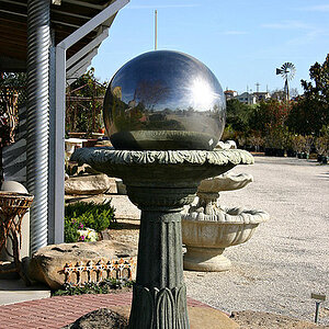
1.

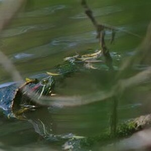
2.

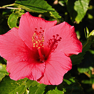
3.

4.

again just let me know what you guys think, your brutal honesty is appreciated!
here are some of my fav pics i took from the summer, i would really like some input from you guys, thanks!
1.
2.
3.
4.
again just let me know what you guys think, your brutal honesty is appreciated!
![[No title]](/data/xfmg/thumbnail/37/37123-508270c4d14bcf3f293bd90dfd8ba6b4.jpg?1619737883)

![[No title]](/data/xfmg/thumbnail/37/37603-739c5d9b541a083a12f2f30e45ca2b7b.jpg?1619738147)


![[No title]](/data/xfmg/thumbnail/37/37602-1ef8dbb1c2d0e4ff347ee65d328c3603.jpg?1619738147)