A few recent photos

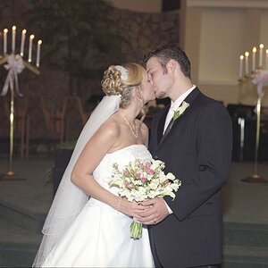
I do agree with Traveler. But this is still a really nice set! My favorites are #5 & #6. But I would lighten up on the texture layer in #6 a little, especially over her face. It still looks great as is though! :)
 
The rule of thirds was introduced in 1970 in Popular Mechanics magazine. It is made-up nonsense. There is much more to composition than overlaying grid lines on things. Much,much more. Stop by this website and read the first of the free articles on why the rule of thirds is utter nonsense,and why it must be eliminated. Canon of Design
 
The rule of thirds was introduced in 1970 in Popular Mechanics magazine. It is made-up nonsense. There is much more to composition than overlaying grid lines on things. Much,much more. Stop by this website and read the first of the free articles on why the rule of thirds is utter nonsense,and why it must be eliminated. Canon of Design

I was talking more about like in #3, the line between her dress and the skin. I personally hate the "rule" of thirds, I remember, but also remember not to let myself and my work be lead by it. :)
 
I do think its important to learn and understand the rule of thirds (as well as all the other general rules) so you understand why you did or did not use those rules for your work.
 
Yes, understanding the rule of thirds means learning that is has ZERO grounding in fine arts, in design, in composition. The "rule of thirds" was concocted by a writer whose blurb was published in a science magazine as a way to give a sort of "composition for dummies" type of slant to picture taking for geeky types. There was an earlier rule of thirds concept put forth by a hack painter, in reference to allocating 1/3, 1/3, and 1/3 of the area of a painting to foreground, mid-ground, and sky areas or near/middle/far zones, but there really is no rule of thirds as an ACTUAL, real, fine-art concept.

Overlaying red grids on images is ridiculous. The concept of red grids has no bearing at all on design. The elements and principles of design are the actual building blocks of composition. The rule of thirds is about as applicable as the Casper The Friendly Ghost is to astrophysics. The rule of thirds is about as valid as astrology is applicable to one's career success.

A person simply can NOT evaluate a composition by superimposing a one-third grid line on top of an image. That's just not valid.
 
Last edited:
Derrel I wasn't sure if you were being serious or sarcastic. The concept of thirds is one idea that can be useful in achieving balance in a composition. I don't think it means that's all someone should do in every composition. There are a number of elements of composition that go into it.

The only thing I got worthwhile out of that link was that I ended up looking at some publications the Metropolitan Museum of Art has available at no cost on their website. It seems otherwise to be about promoting videos and tutorials and making money, etc.
 
vintagesnaps said:
Derrel I wasn't sure if you were being serious or sarcastic. The concept of thirds is one idea that can be useful in achieving balance in a composition. I don't think it means that's all someone should do in every composition. There are a number of elements of composition that go into it.

The only thing I got worthwhile out of that link was that I ended up looking at some publications the Metropolitan Museum of Art has available at no cost on their website. It seems otherwise to be about promoting videos and tutorials and making money, etc.

The rule of thirds is a modern (1970) invention. it has no place whatsoever in design. the elements and principles of design are the building blocks of composing images, of sculpture, painting, drawing, photography, the fabric arts, of ALL arts. The "rule of thirds" is a shorthand method that ignores many facets of image-making. Overlaying of red grid lines on pictures is foolhardy. No, I am not being sarcastic.

I do not believe in "the rule of thirds" because it is built upon ignorance of the actual elements of design, and the principles of design. I studied art history and fine art and journalistic photography at the university level; not ONCE, as in NOT ONE,SINGLE TIME, was "the rule of thirds" mentioned. Seriously. I also do not believe in astrology, or numerology, or phrenology, ghosts, spirits, or ESP.

Popular culture is filled with "For Dummies" types of shorthand systems designed to condense things down so common folk can have a bit of confidence; the really hilarious thing is that type of image we see sooooooooo often now: portrait subject put off to the LEFT 1/3 side of a horizontal frame, looking LEFT, to the short side of the frame. You tell the button-pusher who shot it that it sucks, and they will say, "But I put her on a Rule of Thirds power-point! I learned about this is a class I took at the YMCA!" Uhhhhh, sorry, but no. Just no.

Overlaying red grid lines on top of portraits of young women, as a way to "evaluate" the shots? Sorry, but no, that does not work. At all.

How about taking Alfred Steiglitz's famous shot, The Steerage, and overlaying a red rule of thirds grid over that, then discuss it? Sorry...no connection at all with the composition.
 
Last edited:
I never heard of the "rule of thirds" until I came to this forum but the rule of proportion with credentials from thr Renaissance is The Golden Mean, Golden Section, Golden Ratio or just the "Divine Proprtion". However as this is constructed by a painter , architect or sculpter it might be a bit of a trick in photography which is just "capturing". Then again in the hands of a photoshop expert...
 
Ive always been intrigued by the Golden Ratio. Ive never attempted to use it though.

Ive always wondered if a lot of the photographs that have been found through history where it works, did the photographer actually intend for it to be used in the photo? Or did it just happen and was found later by someone over analyzing the image?
 
Being for or against any specific 'rule' or 'guideline' is sort of nonsensical, imo.
Making some dictat that something or other is useless because it doesn't fit "the elements and principles of design" is destructive without being helpful - like walking by a child's drawing and saying that sucks.
Or talking about Brando to a beginning actor/
Pretentious and unhelpful.

What is important is whether the image 'works' i.e. an image should be coherent - all the parts of it should fit together and support or balance what the photographer thinks the viewers should look at.
If important things are jammed up into a corner and there isn't any artistic reason and the rest of the image doesn't relate to the important stuff, or is even distracting, then the image falls apart as the viewer's eyes wander around.

Dividing an image into thirds is helpful and convenient for understanding- because people can think of center and sides, tops and bottom vs center; more divisions are silly and difficult to talk about.
Dividing a viewing space into thirds is convenient because you can consider the balance.

Understanding or using 'thirds' as a rough guideline until a new photographer can develop a better eye and understanding of framing and construction is a way to get to where a good photographer wants to be.
 

Most reactions

Back
Top