A lesson in composition: Ultrawide nightscapes

skiboarder72

No longer a newbie, moving up!
Joined
Jan 17, 2005
Messages
2,111
Reaction score
82
Location
Greenville, SC
Website
www.joshjonesphoto.com
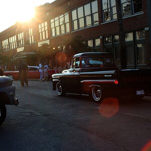
Went out with chris downtown for a few hours tonight with the new 10-20mm. Took a ton of picture but I think they came out pretty good. Let me know what ones you like the best!

1.
dsc0009fm8.jpg


2.
dsc0012if0.jpg


3.
dsc0016rm9.jpg


4.
dsc0019ha4.jpg


5.
dsc0025wr7.jpg


6.
dsc0032od0.jpg


7.
dsc0038oz0.jpg


8.
dsc0043fh4.jpg


9.
dsc0061ke5.jpg
 
6 and 8 are so clean
9 probably least favorite

but nice shots, i envy that lens (and ur skills with it)
 
6, and 8 are cool, I like that kind of stuff. I like the comp of 7, it pulls me in and makes me survey the landscape, there's a lot there. ron
 
Your shots are making my decision of a 10-20 and a 100-400L even more difficult.

I like 4 and 7 the most, number 9 really isn't doing it for me though.
 
To me, 8 is clearly the best, composition wise.

IMHO you should learn to watch the lines. With ultrawide lenses you easily get converging lines when you tilt the camera only slightly downwards or upwards. With buildings or anything rectangular in the image, this can be very disturbing, or a great effect, it really depends. So if you get converging lines, do not get them by accident, but get them the way you want them to converge.

1, 3 and 5 suffer the most from this problem.

Image 2 has potential, and so has 6. However, they do not seem composed carefully.
For 2 my tactics would be to either get some lines parallel to the frame, or at some very pronounced angle.
Number 6 is tilted clockwise and slightly off centre. In wide angle photography, slightly off something often has a very strong effect. so you have to be very precise when composing.

Also, one can see the limitations of the lens in number 6 (distortion/ bent lines). Not your fault, but you could correct this to some extent by software.
 
Hey, Alex, In #7 my eye wanted to reject lack of perpendicularity between the circular seating areas and the black building in the back. The building is straight so I bought it. I also liked the architectural element on top of the bldg which continued the circular pattern. I don't have a lens like this but I see some of the limitations now.

To get the foreground and the building perp would the bldg have to be in the center of the frame? ron

I think in #7 it is not so much of a problem. Not everything has to be perpedicular. the buildings on the left hand side are a bit tilted, true, but they are so far off the centre of attention that it does not hurt too much.

One can minimise problems by pointing the camera such that it points neither upwards nor downwards, so the horizon is dead centre then. this of course might not be ideal for other aspects of the composition so you need to either crop afterwards or use a TS lens right from the beginning ;)
 
Alex, so the up down is the main variable, allowing as much control over the circumstances as you're going to get...Thanks, Alex.....ron :D
 
Alex, so the up down is the main variable, allowing as much control over the circumstances as you're going to get...Thanks, Alex.....ron :D

well, depending on the geometry of the scene, also the left/right :p
 
2 and 6 are my favs. I really like the composition on 2, i tried a much of difference angles of those stairs but nothing turned out... I really need a wide angle
 

Most reactions

New Topics

Back
Top