A lighting test

JustJazzie

Been spending a lot of time on here!
Joined
Jan 21, 2013
Messages
3,793
Reaction score
1,732
Location
Bailey, Colorado
Can others edit my Photos
Photos OK to edit
It was suggested in my last post that I could achieve the same results easier by only bouncing the light off the wall and not bothering with the shower curtain to diffuse it. If that was the case, it sure would make my efforts easier! So, I went ahead and did a test. The only thing I changed was 1) Taking down the shower curtain, and 2) re-metering for correct exposure.
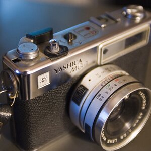
I found the only things in the house willing to hold still for this. Hopefully this test still translates onto larger subjects, since they are obviously not appropriately sized.

Strangely, I couldn't get my white balances to match just right, so I did the best I could so that I could examine the light and not the color difference.

Anyways, I thought I would post this for anyone who might be remotely interested.

15533734777_447aaf3a8b_b.jpg
Reflector in the same place
15098974304_85e9bd851b_b.jpg

Reflector as close as I could get it
15717154631_c12baa871b_b.jpg
 
Last edited:
I like number one better...mainly due to the harsher shadows in number two. It would look like to me that some fill flash/light would be necessary with the setup you have in the second photo. (I'm assuming that's the one with the curtain removed?)
 
I like number one better...mainly due to the harsher shadows in number two. It would look like to me that some fill flash/light would be necessary with the setup you have in the second photo. (I'm assuming that's the one with the curtain removed?)
I did have a reflector but I will try a shot moving it closer. Thanks.
 
The first one does look to be more evenly lit.
 
okay, updated the original post with a shot where the reflector is as close to the ladder as I could get it.
 
Last edited:
Still a little bit of shadow but it is much better than the second one.
 
Looks good

I've been down this road before
1 flash, then a 2nd, 3rd, 4th .... it never ends trying to make it match what the professionals do in basic portraiture.
 
Still a little bit of shadow but it is much better than the second one.

This. Part of it may be coming from the "pose" and the spherical nose... :) Both of which are easily fixed with a real person... :)
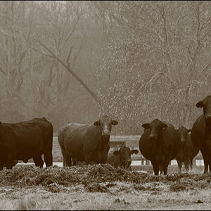
 
So what do YOU think? The light looks plenty soft to me.

So if you're happy with the softness, and you can do it without setting up shower curtains, then I'd call it a win.

As for the reflector...keep in mind that it's not always about getting it close as possible to make the light as even as possible. You usually want one side to be brighter than the other because that is what shows the viewer that it's a 3 dimensional subject. The key is that you are able to control the depth of the shadows, and thus the lighting ratio, by changing the position of the reflector.

With the reflector, I moved it closer trying to get it t match the light from the curtain as closely as I cold. That's why I put it so close in this case.

I think for the look I am trying to get, (more of a glamour look) It makes a big enough difference for me to keep it. BUT, I did find an easier way to set things up which enables me to move the curtain, and does not involve it being stapled to the ceiling. ;-)

That being said, I probably won't be using this setup on my boys again, since I think it creates a more "feminine" light.
 
first one looks boring! who cares about even if you end up with lack-luster?

#3 is good fill
 
I like #1 best.

Whatever you did there, do that again.
 
The first shot has very soft, almost shadowless lighting, which keeps dimensionality and shape very minimal, and can be good if that is the type of lighting desired. The second and third have higher lighting ratios, with crisper shadows and brighter highlights. For my taste, the second and third shots look a bit too bright in the highlights, and shot #1 is maybe three to four tenths 'under'.
 
Last edited:

Most reactions

Back
Top