Navigation
Install the app
How to install the app on iOS
Follow along with the video below to see how to install our site as a web app on your home screen.

Note: This feature currently requires accessing the site using the built-in Safari browser.
More options
You are using an out of date browser. It may not display this or other websites correctly.
You should upgrade or use an alternative browser.
You should upgrade or use an alternative browser.
a question
- Thread starter Al Blanco
- Start date
- Joined
- Dec 16, 2003
- Messages
- 33,896
- Reaction score
- 1,853
- Location
- Edmonton
- Website
- www.mikehodson.ca
- Can others edit my Photos
- Photos NOT OK to edit
Firstly, is that one of your shots? If not, please change it to be just a link. Forum rules say that we can only display images that are ours.
So what about this image do you like? What do you want to do in Photoshop? To me, it looks like this one has very little processing done to it.
So what about this image do you like? What do you want to do in Photoshop? To me, it looks like this one has very little processing done to it.
Al Blanco
TPF Noob!
- Joined
- Dec 31, 2005
- Messages
- 31
- Reaction score
- 0
- Can others edit my Photos
- Photos OK to edit
Firstly, is that one of your shots?
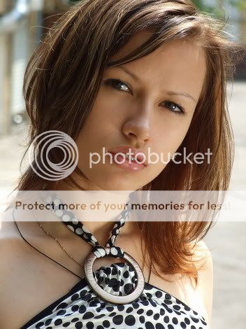
Yes, sure. Why not? It is my picture and I have made it a week ago in Moscow. The name of the girl is Rita
")
So what about this image do you like? What do you want to do in Photoshop? To me, it looks like this one has very little processing done to it.
Well, firstly I prefer black and white photography – at least I think that a portrait should be black and white.
And you said that ‘this one has very little processing done’. So it needs some processing
. What can be done from your point of view? Actually, I would love to make photos like this
http://club.foto.ru/gallery/photos/...rds&next_photo_id=416580&prev_photo_id=239225
How it can be made? I came here because it senseless to ask another Russians about anything
We are not able to explain things. Garbz
No longer a newbie, moving up!
- Joined
- Oct 26, 2003
- Messages
- 9,713
- Reaction score
- 203
- Location
- Brisbane, Australia
- Website
- www.auer.garbz.com
- Can others edit my Photos
- Photos NOT OK to edit
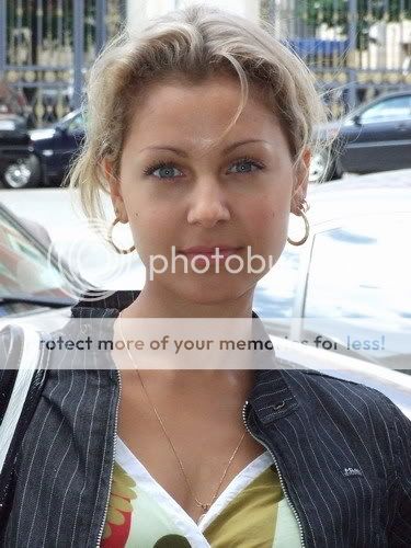
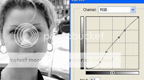
Firstly the photo is high-key. Meaning the majority of the frame is white. The difference is simple. You were shooting down on Rita. Looks like the camera level is about tip of the head-high. In the linked photo the camera appears to be chest / shoulder high shooting up. That changes the perspective a bit (more flattering in my opinion).
There is very flat lighting on the photo you linked, whereas the photo you took has a defined light source (flash or reflector?) at the bottom right. A bigger reflector will give you the softer look.
Ok now as for the post processing here's an attempt. You didn't specify if your pictures are ok to edit so just pm me and I'll remove this:

The image on the left is a simple desaturation, not good IMO.
The image on the right was converted to black and white using the channel mixer with 100% red, 0% green and 0% blue. This gives the skin a flatter colour, removes blemishes, and brightens the skin while darkening the hair. Then the curves tool was used to remove mid-tone contrast, and darken the shadows. The lips were burnt slightly since they nearly disappeared when I did this. The background was dodged to remove the distraction. Finally a layer with a very deep dark green was applied as a Colour Dodge layer with an opacity of 38%.
That's my take on copying the post production anyway. I couldn't do any more since the shoulder would disappear. The lighting you used kind of blew her shoulder out a bit.
Now share the lighting you used, Flash or reflector?
There is very flat lighting on the photo you linked, whereas the photo you took has a defined light source (flash or reflector?) at the bottom right. A bigger reflector will give you the softer look.
Ok now as for the post processing here's an attempt. You didn't specify if your pictures are ok to edit so just pm me and I'll remove this:
The image on the left is a simple desaturation, not good IMO.
The image on the right was converted to black and white using the channel mixer with 100% red, 0% green and 0% blue. This gives the skin a flatter colour, removes blemishes, and brightens the skin while darkening the hair. Then the curves tool was used to remove mid-tone contrast, and darken the shadows. The lips were burnt slightly since they nearly disappeared when I did this. The background was dodged to remove the distraction. Finally a layer with a very deep dark green was applied as a Colour Dodge layer with an opacity of 38%.
That's my take on copying the post production anyway. I couldn't do any more since the shoulder would disappear. The lighting you used kind of blew her shoulder out a bit.
Now share the lighting you used, Flash or reflector?
Al Blanco
TPF Noob!
- Joined
- Dec 31, 2005
- Messages
- 31
- Reaction score
- 0
- Can others edit my Photos
- Photos OK to edit
Garbz,
thanks a lot for your detailed answer.
But it is not connected with the fact that the linked photo is high-key? Actually, I like high-key photos and would love to know how to make them.
I had been trying to add the inscription ‘my pictures are OK to edit’ for a good half of hour but failed.
Are there any rules in what proportions one needs to use red, green and blue? Say, it is a portrait. It is always more red or are there exceptions?
Have I understood it right that first two steps are
1. Converting into black and white with the channel mixer.
2. Using the curves tool for improving contrast ?
what if I try to do it with some other photo of mine and then ask you to comment the results?
I used a portable reflector (and yes, a small one – 60 cm.) and another girl was holding it
thanks a lot for your detailed answer.
Firstly the photo is high-key. Meaning the majority of the frame is white. The difference is simple. You were shooting down on Rita. Looks like the camera level is about tip of the head-high. In the linked photo the camera appears to be chest / shoulder high shooting up. That changes the perspective a bit (more flattering in my opinion).
But it is not connected with the fact that the linked photo is high-key? Actually, I like high-key photos and would love to know how to make them.
Ok now as for the post processing here's an attempt. You didn't specify if your pictures are ok to edit so just pm me and I'll remove this
I had been trying to add the inscription ‘my pictures are OK to edit’ for a good half of hour but failed.
The image on the right was converted to black and white using the channel mixer with 100% red, 0% green and 0% blue.
Are there any rules in what proportions one needs to use red, green and blue? Say, it is a portrait. It is always more red or are there exceptions?
This gives the skin a flatter colour, removes blemishes, and brightens the skin while darkening the hair. Then the curves tool was used to remove mid-tone contrast, and darken the shadows.
Have I understood it right that first two steps are
1. Converting into black and white with the channel mixer.
2. Using the curves tool for improving contrast ?
what if I try to do it with some other photo of mine and then ask you to comment the results?
Now share the lighting you used, Flash or reflector?
I used a portable reflector (and yes, a small one – 60 cm.) and another girl was holding it
Mike_E
No longer a newbie, moving up!
- Joined
- Jan 26, 2007
- Messages
- 5,327
- Reaction score
- 266
- Can others edit my Photos
- Photos OK to edit
Hi Al! If you click the spot in the upper left hand corner called User Cp and then click Edit Profile you will find at the bottom of that page the place to enable the 'it's ok to edit'.
I have used here a plug-in for photoshop by Alien Skin called Exposures. The film I mimicked is Ilford 200SFX.

There are a number of others to choose from.
Hope you like it.
mike
I have used here a plug-in for photoshop by Alien Skin called Exposures. The film I mimicked is Ilford 200SFX.
There are a number of others to choose from.
Hope you like it.
mike
Garbz
No longer a newbie, moving up!
- Joined
- Oct 26, 2003
- Messages
- 9,713
- Reaction score
- 203
- Location
- Brisbane, Australia
- Website
- www.auer.garbz.com
- Can others edit my Photos
- Photos NOT OK to edit
High-key means the majority of the frame is bright with some defining features darker and standing out, like in my edit the hair, eyes and dress. The opposite effect is low-key and an example low-key shot would be this self portrait http://farm1.static.flickr.com/208/492348759_17864e4dc8_o.jpg. You photo is already high-key to a degree with the main subject standing out from a light background, just that I personally find the background wasn't light enough. It wasn't a distraction though so it didn't matter too much. If you would have shot from a slightly higher angle the entire background would be sand, or from a lower angle the entire background would be sky which would be blown to white or close to it.
There's no rules for using the channel mixer as such it depends on each photo. If the subject has some dark skin and you are trying to bring out the defined nuances like wrinkles it may help to give a lot of weight to the blue channel. If you a photographing a red-head it may also help to bring the blue and green up a bit to prevent the hair going bright white when making a black and white picture. Red and green also darkens blue skies, but if you want to lighten the sky it would help if you use a bit of blue. It really depends on the picture.
The steps are not as important as the experimentation. I chose to convert to black and white first because I knew the contrast would change when I picked the red channel to work with. Mind you the process of adding the green colour dodge also changed things quite a bit so I may have left the contrast to the last step too. There's many paths to the same result when post processing.
Sure go for your life. I'd be happy to comment. Post them here or PM/email me or both. It would help for you to get other opinions too since photography is a very personal thing and what my look good to me may not be the same to you.
Also the reflector is good, but the small size has created a very defined shadow of her nose on the left which is possibly distracting, but inevitable given the equipment. I use a similar sized home made one and often make similar shadows. Also there is a second catchlight in her right eye which could be photoshopped out.
Mike that's a great filmgrain effect there. I'll have to check it out, cheers.
There's no rules for using the channel mixer as such it depends on each photo. If the subject has some dark skin and you are trying to bring out the defined nuances like wrinkles it may help to give a lot of weight to the blue channel. If you a photographing a red-head it may also help to bring the blue and green up a bit to prevent the hair going bright white when making a black and white picture. Red and green also darkens blue skies, but if you want to lighten the sky it would help if you use a bit of blue. It really depends on the picture.
The steps are not as important as the experimentation. I chose to convert to black and white first because I knew the contrast would change when I picked the red channel to work with. Mind you the process of adding the green colour dodge also changed things quite a bit so I may have left the contrast to the last step too. There's many paths to the same result when post processing.
Sure go for your life. I'd be happy to comment. Post them here or PM/email me or both. It would help for you to get other opinions too since photography is a very personal thing and what my look good to me may not be the same to you.
Also the reflector is good, but the small size has created a very defined shadow of her nose on the left which is possibly distracting, but inevitable given the equipment. I use a similar sized home made one and often make similar shadows
. Also there is a second catchlight in her right eye which could be photoshopped out.Mike that's a great filmgrain effect there. I'll have to check it out, cheers.
hyakuhei
TPF Noob!
- Joined
- Jun 5, 2007
- Messages
- 162
- Reaction score
- 0
- Location
- UK
- Website
- hyakuhei.blogspot.com
- Can others edit my Photos
- Photos OK to edit

Here's my attempt to make it look similar to the effect you like.
Simply boosted the red channel and chopped out the green, switched to gray scale, adjusted the levels and there you go. I like this more than some other B&W examples because she still has that amazing depth in the eyes. Just my $0.02 :-D
Al Blanco
TPF Noob!
- Joined
- Dec 31, 2005
- Messages
- 31
- Reaction score
- 0
- Can others edit my Photos
- Photos OK to edit
If you click the spot in the upper left hand corner called User Cp and then click Edit Profile you will find at the bottom of that page the place to enable the 'it's ok to edit'.
Thanks a lot, Mike – every time I just hadn’t gone so far to the bottom
I have used here a plug-in for photoshop by Alien Skin called Exposures. The film I mimicked is Ilford 200SFX
Yes, it really looks like a film picture. A very interesting effect.
**********
High-key means the majority of the frame is bright with some defining features darker and standing out, like in my edit the hair, eyes and dress. The opposite effect is low-key and an example low-key shot would be this self portrait http://farm1.static.flickr.com/208/4...864e4dc8_o.jpg.
Aha, I see.
You photo is already high-key to a degree with the main subject standing out from a light background, just that I personally find the background wasn't light enough. It wasn't a distraction though so it didn't matter too much. If you would have shot from a slightly higher angle the entire background would be sand, or from a lower angle the entire background would be sky which would be blown to white or close to it.
So there is a considerable link between a key of a photo and a level and if the camera level was lower I would have a more high key of the picture…
There's no rules for using the channel mixer as such it depends on each photo. If the subject has some dark skin and you are trying to bring out the defined nuances like wrinkles it may help to give a lot of weight to the blue channel. If you a photographing a red-head it may also help to bring the blue and green up a bit to prevent the hair going bright white when making a black and white picture. Red and green also darkens blue skies, but if you want to lighten the sky it would help if you use a bit of blue. It really depends on the picture.
I see. I am to going to experiment. Indeed, it would be strange to have some strict rules. My grandmother was a very light blond and at all pictures she turned out a very dark brunette
. Sure go for your life. I'd be happy to comment. Post them here or PM/email me or both.
Great – I’ll try to do it right away, in my next post. I am going to try two methods – with curves and levels as Hyakuhei suggested.
Also the reflector is good, but the small size has created a very defined shadow of her nose on the left which is possibly distracting, but inevitable given the equipment. I use a similar sized home made one and often make similar shadows .
It seems that I have to buy a bigger one…
Also there is a second catchlight in her right eye which could be photoshopped out.
Yes, now I see it too.
******
Hyakuhei, I like your version very much too. It is really closed to what I want to get.
You said that you ‘adjusted the levels’. It gives the same effects as using of curves, or there is some difference?
Al Blanco
TPF Noob!
- Joined
- Dec 31, 2005
- Messages
- 31
- Reaction score
- 0
- Can others edit my Photos
- Photos OK to edit
And now here are my first pitiful attempts in photoshopping
I took this picture.
I think that the light is bad (I didn’t use any flash or reflector) but it is interesting if it is possible to do something with it anyway.
Firstly I had set the red channel at +105 and the green one at -5.

Then I tried two alternatives.
At the first one I used ‘levels’.
And here I used ‘curves’
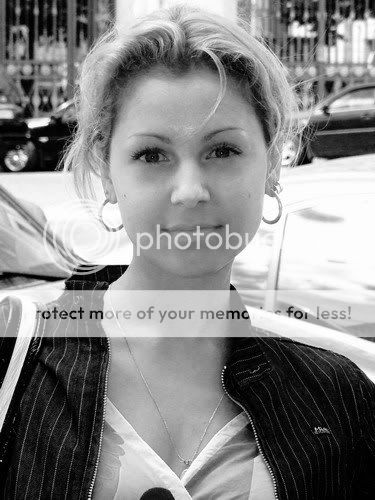
And why it is so bad? . The skin is so grey and rough. I have already made mistakes at first steps or it can be improved a bit later?
I took this picture.
I think that the light is bad (I didn’t use any flash or reflector) but it is interesting if it is possible to do something with it anyway.
Firstly I had set the red channel at +105 and the green one at -5.
Then I tried two alternatives.
At the first one I used ‘levels’.
And here I used ‘curves’
And why it is so bad?
. The skin is so grey and rough. I have already made mistakes at first steps or it can be improved a bit later?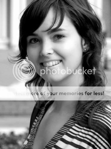
GwagDesigns
TPF Noob!
- Joined
- Jun 11, 2007
- Messages
- 173
- Reaction score
- 9
- Location
- Washington
- Website
- www.gwagdesigns.com
- Can others edit my Photos
- Photos NOT OK to edit
I think the first and third phots are good, but the second one, i think the background is a bit distracting, your other ones have a good DOF, and make the image more focused on the model.
Garbz
No longer a newbie, moving up!
- Joined
- Oct 26, 2003
- Messages
- 9,713
- Reaction score
- 203
- Location
- Brisbane, Australia
- Website
- www.auer.garbz.com
- Can others edit my Photos
- Photos NOT OK to edit
No no no. The key of a photos just describes the light. I just applied it to your specific situation above. You were shooting at a beach in the first photo right? You have sand on the floor, something like trees a fence possibly in the middle, and a sky above. To make it more high-key you remove the dark trees / fence in the middle. It has nothing to do with how low or high you shoot. I only said that because if you were on your knees shooting upwards you would have only sky in the background which would be white. Or if you shoot down from a ladder you'd only have sand in the background which would also be white.
The Levels and curves tools are very similar with curves being much more powerful with a steeper learning curve. In fact all levels settings can be easily mimicked in curves. hyakuhei chose in his edits to preserve some of the midrange, whereas I used curves to push the midrange out by adding contrast like the image linked on the russian page. It does create a nice effect but hayakuhei's image is significantly more natural.
The Levels tool put in too much contrast, the curves tool you've deepened the black too much for my tastes. But I hope you can see from your experiments that they do similar things. The levels gives you 3 curve points. the top bottom and middle. Also note that the end points can be moved too.
One other thing is the background is just as important as the foreground. The lighting is least of the problem in the 2nd image. The background is a mess, and the front on shot is plain boring. But I guess it was a snapshot anyway
The 3rd one is much better. The pose is interesting, the background is far less distracting. The edit looks better too. Still a tad too much contrast if you are aiming for an image like hayakuhei's edit. Her skin may be a tad on the darker side and blends in a bit wit the rest of the image.
One other thing. You mentioned you may want to go back and change things you can adapt this workflow using layers. When using curves levels, channelmixers or other image adjustments rather than doing it form image -> adjustments click the add adjustments layer in the layers palate. This means that if you get to the end and realise you added a bit too much contrast you can simply go to the curves or levels layer and edit it.
Groupcaptainbonzo
TPF Noob!
I do not do portraits... Don't know why... just don't. But I have to say that you have access to some really pretty and very natural "Girl next door" Models.
You also appear to have a very natural style. For what it's worth, I like them very much.
Can't see anything wrong with colour, But if you prefer mono then that is the way for you to go. As an aside I thik that Ilford SFX 200 is probaly the worst film on the market for any application(IMO). Though funnily enough the Mimic filter delivers a pleasant result..
Al Blanco
TPF Noob!
- Joined
- Dec 31, 2005
- Messages
- 31
- Reaction score
- 0
- Can others edit my Photos
- Photos OK to edit
I think the first and third phots are good, but the second one, i think the background is a bit distracting
Yes, I thought that it would be interesting to try to do something with it, but now I see that it is better to use more successful pictures.
************
No no no. The key of a photos just describes the light. I just applied it to your specific situation above. You were shooting at a beach in the first photo right?
No, it looks like a beach because of there was sand or something like this on the ground indeed (or maybe it was asphalt with a color of sand – I don’t remember exactly). It was shot in a Moscow yard. One can even see a water pipe in the upper left corner.
You have sand on the floor, something like trees a fence possibly in the middle, and a sky above. To make it more high-key you remove the dark trees / fence in the middle. It has nothing to do with how low or high you shoot. I only said that because if you were on your knees shooting upwards you would have only sky in the background which would be white.
Yes, I got it in the same way. I just expressed myself badly. I meant that if the level of the camera was lower more sky would be in the frame and the key would be higher too.
Or if you shoot down from a ladder you'd only have sand in the background which would also be white.
Funny enough that there was a ladder there indeed and I made several pictures. I’ll take a look at them and try to use for an experiment.
The Levels and curves tools are very similar with curves being much more powerful with a steeper learning curve.
I see. The curve tool just allows more manual opportunities. OK, then I’ll try to learn the Level tool first and then the curves one.
One other thing is the background is just as important as the foreground. The lighting is least of the problem in the 2nd image. The background is a mess, and the front on shot is plain boring. But I guess it was a snapshot anyway
Yes, I had just met the girl on the street but later we had a photo session and I’ll use the photos for my experiments (she gave me her permission to post the photos in the Net too).
The 3rd one is much better. The pose is interesting, the background is far less distracting. The edit looks better too. Still a tad too much contrast if you are aiming for an image like hayakuhei's edit. Her skin may be a tad on the darker side and blends in a bit wit the rest of the image.
Great. Actually, I made it a bit too contrast just to make it seen that I processed the picture
One other thing. You mentioned you may want to go back and change things you can adapt this workflow using layers. When using curves levels, channelmixers or other image adjustments rather than doing it form image -> adjustments click the add adjustments layer in the layers palate.
Yes, I’ll remember it and come back to it a bit later.
Garbz, thanks a lot – I’ll continue my attempts in the evening and will try to consider you remarks.
****************
I do not do portraits... Don't know why... just don't. But I have to say that you have access to some really pretty and very natural "Girl next door" Models.
thanks! However it takes time to meet them
My method is just walking along the streets Most reactions
-
 392
392 -
 304
304 -
 272
272 -
 270
270 -
 265
265 -
 213
213 -
 192
192 -
 179
179 -
 165
165 -
 155
155 -
 143
143 -
 134
134 -
 133
133 -
 121
121 -
 94
94

![[No title]](/data/xfmg/thumbnail/34/34041-c8aed4d2c55b167d1ec03d9cfbaca453.jpg?1619736250)