A recent baby shoot x

jemmy

TPF Noob!
Joined
Apr 17, 2006
Messages
847
Reaction score
0
Location
queensland, australia
Hi all,

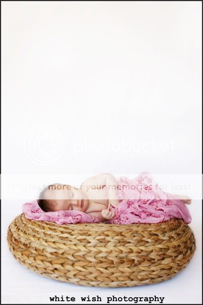
I haven't posted for a while, so here goes. A recent little princess I had the pleasure of photographing. Comments and constructive criticism always appreciated. x jem x

1.

sienna1.jpg


2.
sienna2.jpg


3.
sienna3.jpg


4.
sienna4.jpg


5.
sienna5.jpg


6.
sienna6.jpg


7.
sienna7.jpg


Thanks for looking. Sorry about the poxy logo/watermarking... thought i would give it a go but it looks CRAP! but i couldnt be bothering uploading them again without them! xx
 
Number 2 and 5 are great, but they look like poor photoshop extractions, and there's excess empty space.

I don't like number one, the vertical frame is conflicting with the infant's horizontal pose. The horizontal pose itches my eye to look toward the right, but the vertical frame enforces an irritating confinement. Also her eyes lack contrast.

Number 6 is a bad angle, it doesn't flatter the infants body shape, it compress the shape especially on the face where you can only see little tidbit of her nose.

BTW is it just me or does infants really need flat lighting? They got the best skin FFS.

Oh, let me just mention again that I really like number 2.
 
first i was a little gutted, but after reading your past replies to other posts phototron, i feel much better. you certainly are a man/woman who tells it like it is? thanks for your comments but i guess i dont agree with them all. but you gave cc, so i cant complain too much.

leeleemelis... thanks for your comments. i know the polkadots are full on, but being a polkadot kind-a-girl, when i saw the fabric, i had to have it. i certainly knew that not everyone would x cheers x
 
first i was a little gutted, but after reading your past replies to other posts phototron, i feel much better. you certainly are a man/woman who tells it like it is? thanks for your comments but i guess i dont agree with them all. but you gave cc, so i cant complain too much.
Yeah I always forget to mention what everybody is doing right. But any criticism is sour, it takes great skill to sugar coat them in a way that works.

Actually I was trying to mention the positive things, but guess like I said, criticism is just sour. And positivity is not enough to sweeten it.
 
I really love 4 and 5... 4 is more natural pose and I love the white space in 5... Number 2 just looks a little odd to me.. NOt sure why..
 
I think you did a great job jemmy! My favorites are #3 and #4.

However, Im not too sure about #6 and #7. #6 looks like the baby is a little too stiff and straight, so the angle is just sort of odd. Just my opinion. In #7, I would position the feet a little closer together and maybe change the angle on that one too.

Overall, I like the series a lot. I always look forward to seeing your work. Good job. :thumbup:

NJ
 
thanks for those who took the time to comment. i agree that #2 looks weird.. i had some creases in the white b/g and tried to smooth them out and brighten the white a little... then it made the edges of the heart look stuuuupid?! i certainly have lots to learn in the photoshop area and am hoping to take a course next year.

#6 she was pushing her little feet on mums tummy while staring right into her eyes... theres actually something that i really like about that shot?

thanks for looking
 
i like /love 3 and 4 great pics i also am not keen on two but cany really explain why
 
Hi Jemmy,
Cute baby:)
#1: Love it. I love the polka dot background. I have been trying to experiment with different patterned material as backgrounds as well. Too bad fabric doesn't come very wide. The oof hand is a little bit distracting, but I'm thinking that it may just be because of the cropping. Right now the photo is divided perfectly into 3rds, I wonder how it might look if you just cropped off some from the bottom? Just underneath her hand?
#2: Love the idea of this one, but for right now I don't think it works. You're right, there's something about the edges that seem a little weird. I think it just looks like she floating. Also, I know it's tough, but I think having her more centered on the heart would look better especially because of the float factor. I wonder how this might look if you were able to get completely over her, instead of just a little over her. Does this make sense?
#3: Adorable! The white background is a little stark though. What if you ps'd it to be just a tad pink like the thing she is laying on? Then she would look like she was more surrounded? Not sure if it would look good, but worth a try;)
#4: The mom will love it, but just from a critique aspect, the white blanket is distracting. I would have loved to see this angled more as well.
#5: Man, these kinds of shots are SUPER hard to do! Looks pretty good, but the blanket is hiding part of her face. Try tucking it down farther next time. Also just not a fan of the whole floating thing:)
#6: This angle just doesn't work. You can't tell that the baby is looking at her mom and it really makes the babies body look truncated. I think it would have looked better if you stepped to you left and did it:) Love how Mom's arm disappears into the black as well!
#7: Another one mom will love because it shows off her cute little toes, but something about the composition of it isn't really working. I don't really like how they are dangling there and the right foot is too close to the edge of the frame:(

Overall, I think Mom will love them:) Don't get discouraged. Newborn photography is REALLY hard to do. I'm still working on my technique too!
 
oh im not discouraged at all. mum loved them and cried at the viewing! so i must be doing something right... i guess different photos appeal to different people for different reasons. i am happy with where i am at.
 
Sorry, I didn't mean it like you should be or anything. I just thought you sounded like you were based off your response to Phototron's critique.
Glad Mom loved them:)
 

Most reactions

Back
Top