Peanuts
TPF Noob!
- Joined
- Jun 16, 2005
- Messages
- 2,905
- Reaction score
- 85
- Location
- Canada
- Website
- www.brittanyesther.com
- Can others edit my Photos
- Photos NOT OK to edit
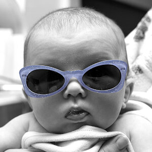
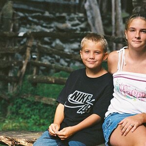
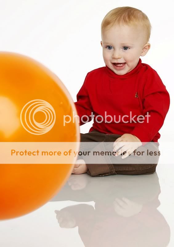
Finally got around to it. Oy that was fun ") . Luckily I had my little half brother (who is edging on one. What a sweetheart) come over and do some of those corny, yet somewhat adorable shots. Unfortunately he didn't nap earlier that afternoon so he was a little bit in a crumby mood near the end, but I can understand. I would have broken into tears long before him if I were in his shoes.
. Luckily I had my little half brother (who is edging on one. What a sweetheart) come over and do some of those corny, yet somewhat adorable shots. Unfortunately he didn't nap earlier that afternoon so he was a little bit in a crumby mood near the end, but I can understand. I would have broken into tears long before him if I were in his shoes.
I essentially used the flat 'beauty' lighting set up, primarily because I had 15 minutes to set up, and still don't quite understand the entire additive nature of light concept, and wasn't going to risk having too much contrast. So any hints/tips/suggestions for the next time would be wonderful.
I will add maybe 3 more to this thread in the next 24 hours when they are edited.
Critique of any type is asked for I think between the web and photoshop I lost a touch of contrast/saturation, so those will be checked prior to printing.
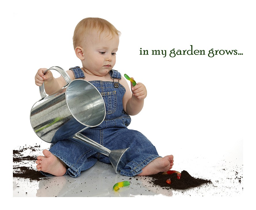
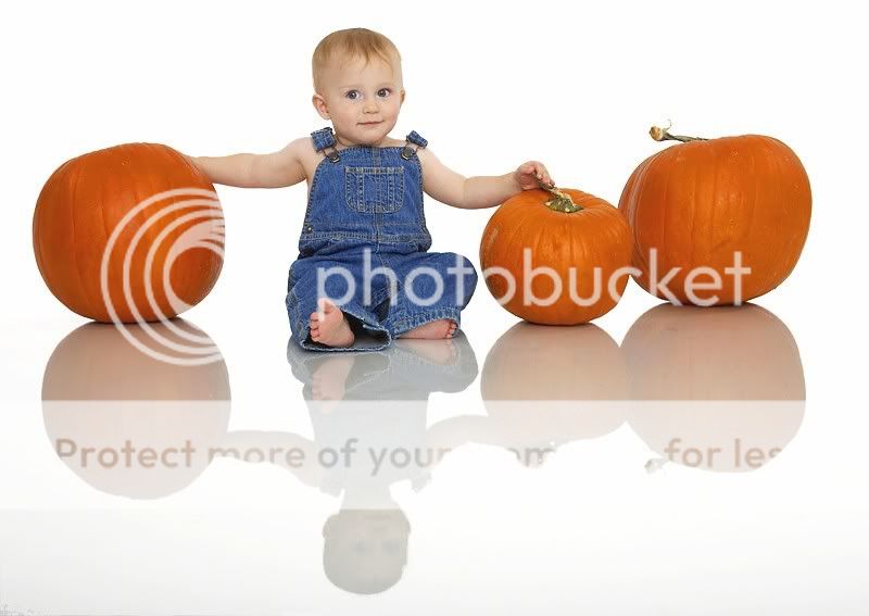
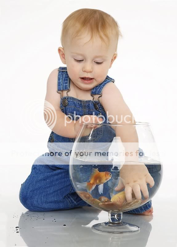
1.

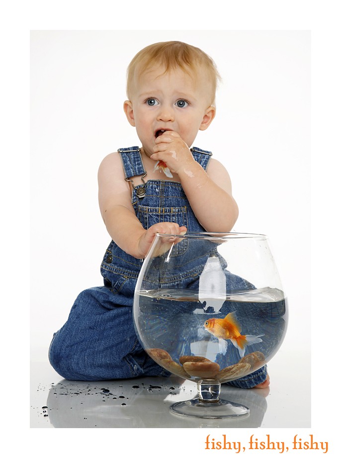
2. No fish were harmed in the making of this photograph
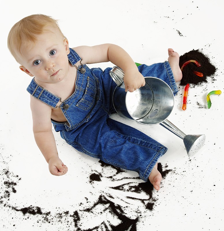
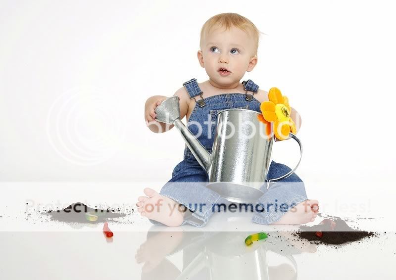
3.
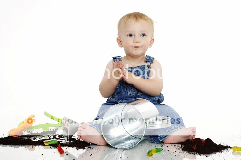
4.
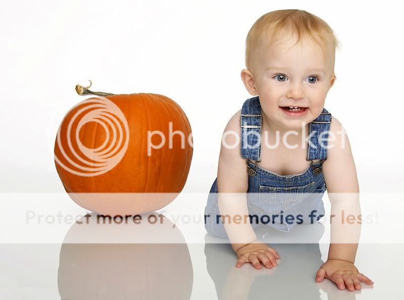
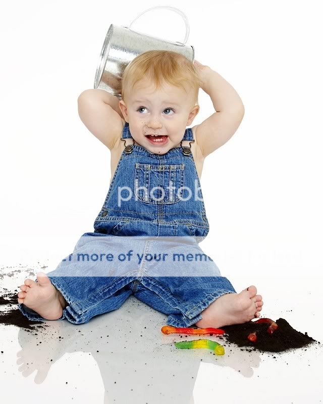
5. The final straw. He looks like a carbon copy of his father in this shot, so I 'aged' it a bit. (If one of the grammar people could inform me whether it would be correct to put an apostrophe after the 's', that would be lovely)

. Luckily I had my little half brother (who is edging on one. What a sweetheart) come over and do some of those corny, yet somewhat adorable shots. Unfortunately he didn't nap earlier that afternoon so he was a little bit in a crumby mood near the end, but I can understand. I would have broken into tears long before him if I were in his shoes.I essentially used the flat 'beauty' lighting set up, primarily because I had 15 minutes to set up, and still don't quite understand the entire additive nature of light concept, and wasn't going to risk having too much contrast. So any hints/tips/suggestions for the next time would be wonderful.
I will add maybe 3 more to this thread in the next 24 hours when they are edited.
Critique of any type is asked for
I think between the web and photoshop I lost a touch of contrast/saturation, so those will be checked prior to printing.1.
2. No fish were harmed in the making of this photograph
3.
4.
5. The final straw. He looks like a carbon copy of his father in this shot, so I 'aged' it a bit. (If one of the grammar people could inform me whether it would be correct to put an apostrophe after the 's', that would be lovely)


![[No title]](/data/xfmg/thumbnail/32/32160-4e45e524b050f1afae9fd21bf696d61b.jpg?1619735234)
![[No title]](/data/xfmg/thumbnail/34/34124-fcd12598382b4477643ef3dde2d6751d.jpg?1619736294)