Abandoned crane in Berlin

I

Iron Flatline

Guest
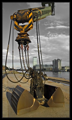
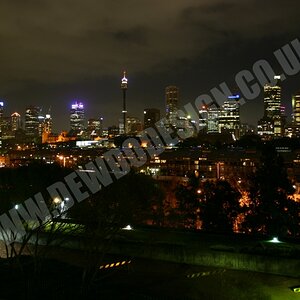
Ok, I need some help. I have a picture that is not particularly interesting, but I have the feeling that in the hands of someone with more Photoshop skills, this might actually be a good picture. My goal was to go for something cold and industrial.

Behala%20Kran%2001.jpg


I just can't seem to get the coloration right, nor the contrast, the light, the hue... ever have days like that? Where every little switch you slide seems to make it worse, and you just can't stop yourself?

So, what do you think I should do?

Not only is this ok to edit, I've even provided links to my .psd files and the raw data. It's a CR2 file.

Click here to download the .psd file Warning: 88 MB

Click here to download the .cr2 file Warning: 11 MB

You'll note that I did some perspective cropping, so the original RAW file is a little different. The .psd file includes all my layers, but won't allow you to undo my perspective crop, or some adjustments to the shadow/highlights setting.

Whatever changes you make, please explain them to me. I need to learn, getting a little tired of my same old tricks.
 
First, it's really cool that you posted the raw files. I like editing other peoples photos.

I also took pictures of the same crane when I was in Berlin in May. Here is one of mine:
189188535_06206813cf.jpg


I'l start on your photo, see if I can do anything with it.
 
Awesome, love it. I like that you had some light. My image was taken in late July, at around 10 PM - hence the weird light. If you shot the crane, I assume you also turned around and got the Oberbaum Bruecke... :D

1153869647.jpg
 
Alright here is my try at it:
228785637_7e4047c75b_b.jpg

A crop, level and curves adjustment, some selective color work and a little viginetting.
 
Yes I got the bridge :)
189188797_e98295a8a5_o.jpg


But I like your version much better. I should have stuck around for a night shot.
 
Another stab, but now not a crane shot, but I noticed a cool framing in the image. So see what ya think.

BehalaKranRAW.jpg
 
Hey, thanks guys. I have to say, I really like both the cropped versions.

Remi, you coloration (and the light vignetting) help, but what really puts the emphasis on the crane is the cropping of the long space in front of it. I like that a lot.

Kevin, just focusing on the area underneath the crane is also a really good call! I'm going to try and tweak that in color.

Thanks guys.

Anyone else want to take a stab at it?
 
Hey, that's pretty cool.

The NSP layer is a called Nik Sharpener 2.0. It's pretty nice. On one hand the sharpening creates some noise, but you apply it like a layer mask, with a mouse or a wacom pen. You can either wipe it over large swaths, or just run it along the edges of something that might need sharpening. I like the tool a lot. What's esp. cool is that you can first select what the display mode is. So it might be for a screen, or for an Epson printer, or whatever else. Then you can tell it from how far the image will be viewed. Is it a 5x7 inch photo being viewed at arm's length, or is it 4x5 feet poster and hanging on a wall, being viewed from 6 feet away. The Pro version will even let you sharpen for building size prints being viewed from 80-100 feet away!
 
You know, I've never actually done selective coloring. I've never found the right image to apply it to. How did you go about doing it? A layer converted to b&w, then cut through so the color shines through from behind? What method do you use?
 
Hey Iron Flatline,

The easiest way to accomplish this is duplicate the layer, desaturate, and then erase so color shines through, which I think you already stated, so you were on the right track! This picture has a lot of choices in editting!
 
I'm addicted to it. What I usually do is use "colour range" under Select.
Along with that and the other selection tools I just copy and paste the selection into the B&W.
Cutting thru seems like a good idea too!
Thet would give more flexability to get it just right.
I'll try that.
Are there any other nifty ways of doing it that you know of?
 
Nah, there are some people like Arch on here that really know their way around the program.
 
This is what I arrived at with a little bit of tweaking in the Gimp (since I don't run Photoshop due to my Linux habit).

I tried adjusting levels, but it looked wretched. So, I reverted to the original, then adjusted the color balance (Gimp's Image->Colors->Color Balance.. menu) in each shadows, midtones, and highlights. The overall impression I got was that the image was too cool, too much blue. I adjusted mostly toward green, yellow, and red (magenta-green ratio, yellow-blue ratio, and red-cyan ratio, respectively) to bring out some warmth to contrast with the cool tones overall.

It's perhaps a bit overdone (or perhaps under) but I think it illustrates a way of treating it that preserves the overall cool industrial tone you're looking for, while bringing out a bit of warmth to add some balancing color contrast.

On the other hand, I may be waay off base; if I am, feel free to ignore :lol: I'm a BW film guy, so most of my color balance issues are caused by my scanner thinking too much about what color my print should be, and said issues are resolved with "Colors->Desaturate." So, I don't have a lot of experience in this area lol.
 

Attachments

  • $crane.jpg
    $crane.jpg
    97.4 KB · Views: 108

Most reactions

Back
Top