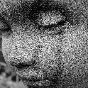
That's pretty subtle. I'm really trying to see the difference, but the photo is pretty monochromatice to begin with, so it is hard to see extreme differences. Thanks for doing this.
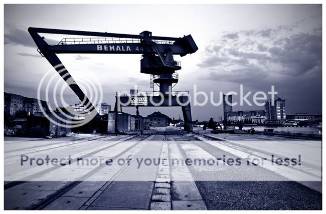
Awesome, love it. I like that you had some light. My image was taken in late July, at around 10 PM - hence the weird light. If you shot the crane, I assume you also turned around and got the Oberbaum Bruecke...
Actually I really like the light. It adds to the mood of the picture. It's a great shot too. I won't bother trying to edit it as my Photoshop skill are mediocre but everyone did a nice job.
That's pretty subtle. I'm really trying to see the difference, but the photo is pretty monochromatice to begin with, so it is hard to see extreme differences. Thanks for doing this.
I didn't really intend anything extreme, as the original and my interpretation of your intent are pretty close. I tried to bring out some of the warmer colors, while leaving an overall cool cast. If you look at the ground and the buildings, they're a tad warmer (reddish, or minus-blue-ish) than the original. The sky is also more of a magenta color than the original cold blues. I didn't want to go overboard, though, so, yeah, I tried for a bit subtle.
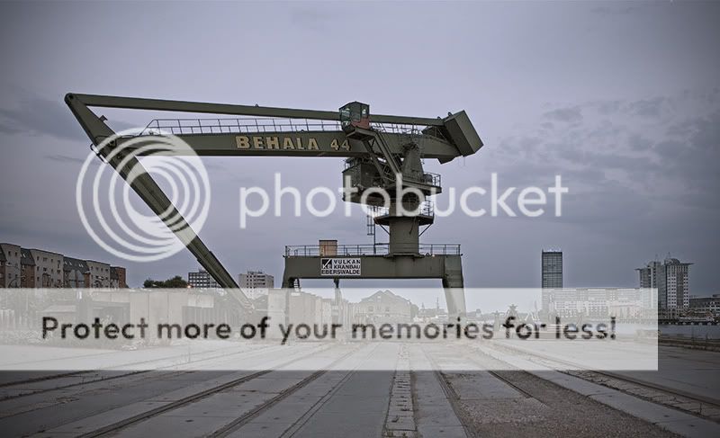
^^^ Well I think that's the best yet! I tried to have a play with it but couldn't come up with anything. I think it might have been better if you had a much lower POV to make the most of the converging lines on the ground and maybe moved the the left a few feet.
i don't think i took very many pics of this crane when I was in Berlin, but I did take a lot of the Oberbaumbruecke.
here's my edit. I did some levels adjustments, created a new layer, and put in black-to-transparent gradients. i then changed the opacity of the gradient layer.
I thought i'd go for something different. So with the theme of making it cold looking, i went for a Tri-Tone image using black, blue (pantone 2728c) and pantone cool grey (1c)...... did a load of other things, including a few curves adjustments, layer masks, shadow highlights, sharpening and vignetting.... i think i quite like it.
Its not the best but I think it may hit the look you wanted. Now that i really look at it it may need some contrast, not shure but something wasnt quite right.

 :lmao:

![[No title]](/data/xfmg/thumbnail/30/30867-a58aa3d7c15d0b48498a201af3a68a8f.jpg?1619734485)
![[No title]](/data/xfmg/thumbnail/30/30868-01a498267fd96ce5b2d98347458d3903.jpg?1619734486)
![[No title]](/data/xfmg/thumbnail/30/30870-c7febc7c14dc6447653c2ae2355ffc61.jpg?1619734488)
![[No title]](/data/xfmg/thumbnail/37/37097-8fae54adbc44059a8189fcf5e7bb8f76.jpg?1619737881)
![[No title]](/data/xfmg/thumbnail/30/30869-817b4d4e7585860fab4b08558512787a.jpg?1619734487)