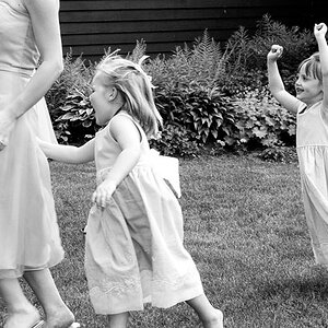
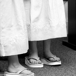
Thanks Jonboy I meant to add to this one, if anyone wants to further critique or suggest things feel free. As I said in the second part I feel these are the weaker of the two posts, so any suggestions for improvemnt would be most helpful
#2 here really grabs me, I can't say exactly why. I did notice however a little bit of black bleeding into the frame area on the right side. I also really like the contrasting in 3#. Nice job : )
Thanks photo gal I didn't even notice the frame in the second, that's terrible I'll have to clean that one up...funny thing is I'm not sure how it happened....I didn't burn or color any part of that shot...
Of the two series you posted, I think the 2nd and 3rd one of this series is much better than the rest. They both fit the lines and form of abstract without distracting and influencing objects around them. With the 3rd the best of all 6.


") I meant to add to this one, if anyone wants to further critique or suggest things feel free. As I said in the second part I feel these are the weaker of the two posts, so any suggestions for improvemnt would be most helpful
I meant to add to this one, if anyone wants to further critique or suggest things feel free. As I said in the second part I feel these are the weaker of the two posts, so any suggestions for improvemnt would be most helpful  I'll have to clean that one up...funny thing is I'm not sure how it happened....I didn't burn or color any part of that shot...


![[No title]](/data/xfmg/thumbnail/39/39286-ae386da044402acf92e55d8b68c26af3.jpg?1619738956)

![[No title]](/data/xfmg/thumbnail/34/34138-0ecadfd41de9ae178e53528e0eb1a32c.jpg?1619736310)