Ilan
TPF Noob!
- Joined
- Aug 22, 2014
- Messages
- 20
- Reaction score
- 0
- Location
- Toronto
- Can others edit my Photos
- Photos OK to edit
Hi! I would like some advice please on how to make my product photography look better. Here is what I have right now:
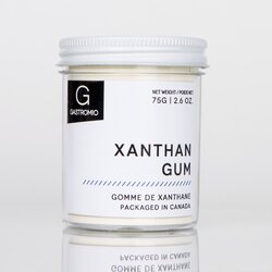
Below is the photo before I changed the RAW settings on Photoshop. This one is straight from the camera, cropped. The label is white IRL.
View attachment 83532
I'm using two lights at the front left and front right (ALZO 85W CFL daylight bulbs, 5500K, 91 CRI) with white/black umbrellas. I also have a silver reflector on the right of the jar.
The photo was shot with a 18.0-55.0 mm f/3.5-5.6 Nikon lens with a 55mm zoom. 1/20 sec; f/7.1; ISO 200. Spot metering. Used a very stable tripod with a 2 second delay. Focused on the X or A of xanthan... don't remember. I used the bottom focus point.
The photo isn't as sharp as I'd like it to be and the colours don't look great. I used manual white balance.
How can I improve?
Thank you!
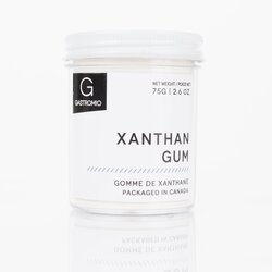
UPDATE: I removed the reflector from the right side and I added a flash angled at 60 degrees (so a lot hitting the white ceiling). Newest photo below. Still not great, but the background is whiter..
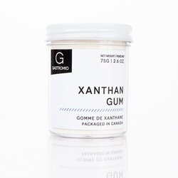
UPDATE 2: Same photo as above, with processing, looks decent..

Below is the photo before I changed the RAW settings on Photoshop. This one is straight from the camera, cropped. The label is white IRL.
View attachment 83532
I'm using two lights at the front left and front right (ALZO 85W CFL daylight bulbs, 5500K, 91 CRI) with white/black umbrellas. I also have a silver reflector on the right of the jar.
The photo was shot with a 18.0-55.0 mm f/3.5-5.6 Nikon lens with a 55mm zoom. 1/20 sec; f/7.1; ISO 200. Spot metering. Used a very stable tripod with a 2 second delay. Focused on the X or A of xanthan... don't remember. I used the bottom focus point.
The photo isn't as sharp as I'd like it to be and the colours don't look great. I used manual white balance.
How can I improve?
Thank you!
UPDATE: I removed the reflector from the right side and I added a flash angled at 60 degrees (so a lot hitting the white ceiling). Newest photo below. Still not great, but the background is whiter..

UPDATE 2: Same photo as above, with processing, looks decent..

Last edited:



![[No title]](/data/xfmg/thumbnail/40/40356-883c642c8d24d2709b359f9c8b196fcf.jpg?1619739437)
