Nutcracker33
TPF Noob!
- Joined
- Jun 26, 2008
- Messages
- 19
- Reaction score
- 0
- Location
- Toronto
- Can others edit my Photos
- Photos OK to edit
first time poster here in TPF

just started shooting for just a week, so i am a total beginner with this, and i am still learning the camera ...
all these are shot with Canon Digital Rebel XTi w/kit lens, in manual setting
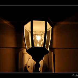
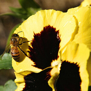
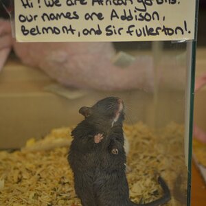
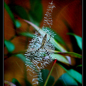
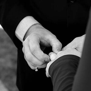
1.
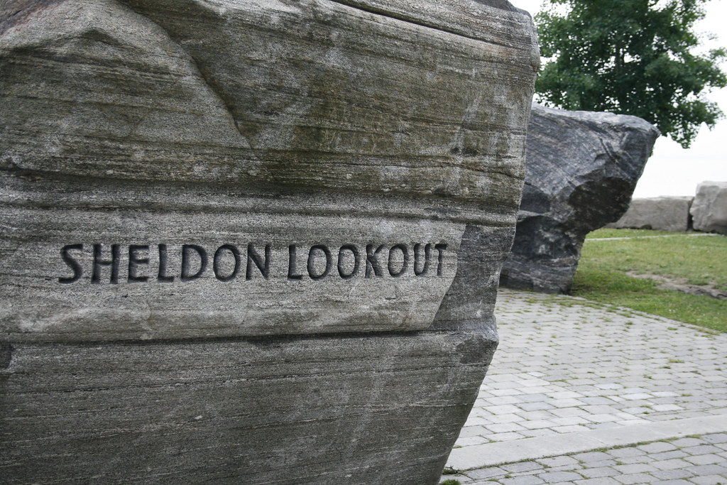
2.
3.
most recent ones
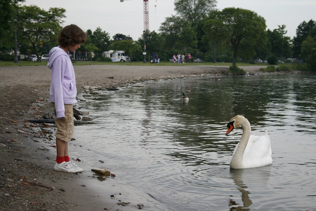
4.
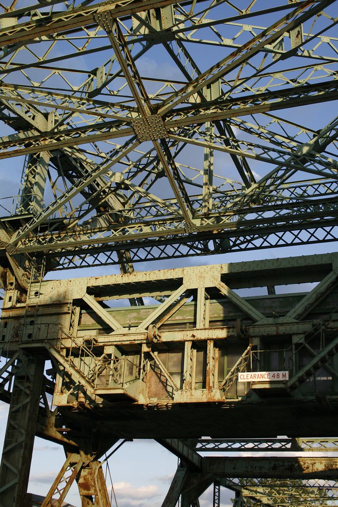
5.
6.
more here
http://www.flickr.com/photos/tomothen00bphotos/
C and C, very welcome
just started shooting for just a week, so i am a total beginner with this, and i am still learning the camera ...
all these are shot with Canon Digital Rebel XTi w/kit lens, in manual setting
1.
2.
3.
most recent ones
4.
5.
6.
more here
http://www.flickr.com/photos/tomothen00bphotos/
C and C, very welcome
")

![[No title]](/data/xfmg/thumbnail/34/34116-b81991a4a8a532509a981cadbacd573c.jpg?1619736286)


![[No title]](/data/xfmg/thumbnail/33/33360-ff0b69685c94740bde3f53b6d7aa9af1.jpg?1619735924)