OP
OP
- Joined
- Mar 29, 2016
- Messages
- 14,984
- Reaction score
- 8,428
- Can others edit my Photos
- Photos NOT OK to edit
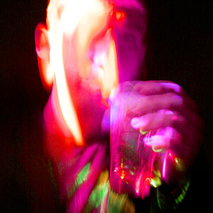
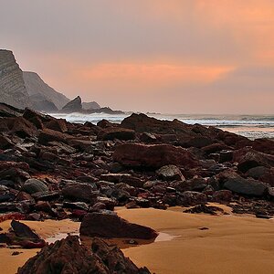
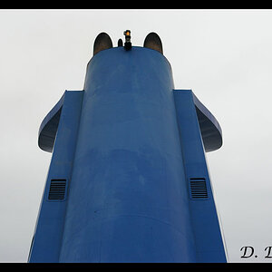
Over-processed, as Gary mentioned...yeah, my feeling as well. I try to avoid using that description most days, but if the shoe fits...
Guess I need to ask which shoe you're trying to fit??? All images were fully processed in LR, all of the images were single files, no composites (except for #3 a panorama), no presets, the sliders and tone curves on all the images are basically the same, maybe a tweak here and there. There is some variance between the images where selective dodging and burning took place, primarily because of the wide dynamic range from top to bottom, but other than that??? The "new ideas" I referred to earlier in the thread involve using sliders, tone curves and adjustment brushes. I'm in a bad area for signal and internet or I'd attach a clip of the the Develop panel. So how is it that you consider it "over-processed"?
The K1 was rated at 14.6 stops EV, the K1 ii appears even higher. I've heard claims of 16 stops, but I haven't verified it, which might also be some of the "over processing" look you seem to be seeing as the location I was shooting in, was a perfect spot for it to show off.
")
 Helen trip07092018_691.jpg
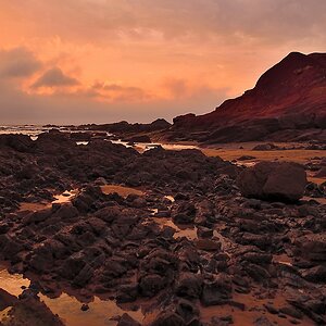


![[No title]](/data/xfmg/thumbnail/38/38725-bdf734721ecaad862bb3e3a856c81df5.jpg?1619738702)