Another one

BoblyBill

TPF Noob!
Joined
Oct 30, 2006
Messages
2,860
Reaction score
40
Location
in the eye of a tornado
Can others edit my Photos
Photos OK to edit
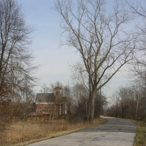
This was from my storm chase today. My mom likes clouds and storms so she went with me.

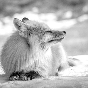
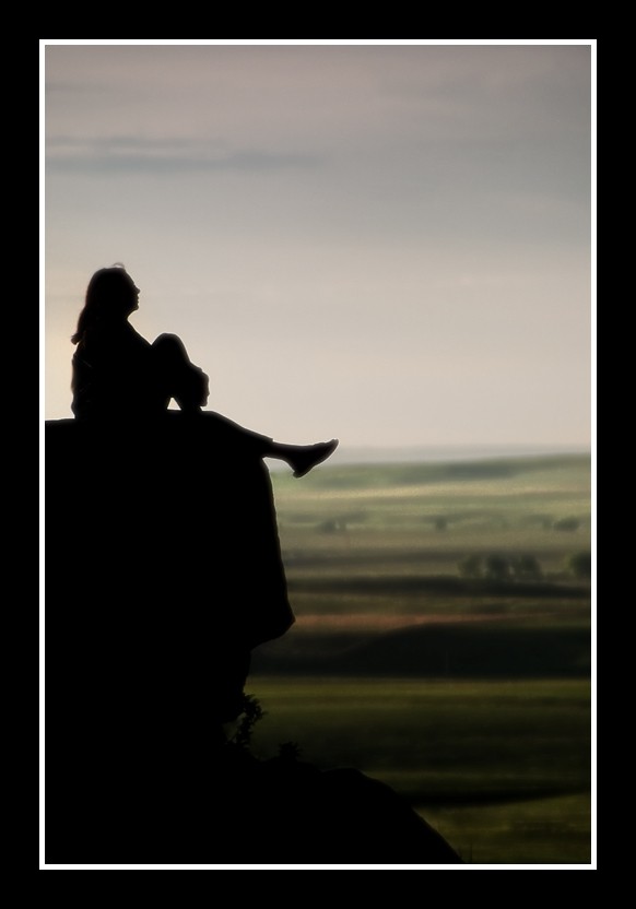
Does THIS border work? I purposefully made her blend in with the rock and blurred it just a bit does work?
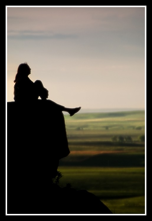
508903052_ef51c81e3d_o.jpg
 
Beautiful silhouette--many people attempt this kind of look and can never successfully pull it off.

The border helps but I think the thickness is a bit much. I find my eye being distracted and jumping back and forth between the sihouette and the border. Try a thinner border and I think you'll be much more successful.

Wonderful job though :wink:
 
BLAST!!! ME and TOO fat borders... note to self... if I think the border is OK thin it down by half or so... LOL... Thanks for the critique. I'll make sure I thin the border on the next attempt.
 
Beautiful silhoutte, I agree with the border. The landscape almost looks painted on..
 
Beautiful silhoutte, I agree with the border. The landscape almost looks painted on..


Grrr... borders... LOL... When you say the landscape almost looks painted on what do you mean by that... In a negative way or positive?
 
well, the border is a bit... on the heavy side ;) if it was not black and the image was different it would work .. well that was a pretty useless statement, wasn't it? ;)
 
well, the border is a bit... on the heavy side ;) if it was not black and the image was different it would work .. well that was a pretty useless statement, wasn't it? ;)

LOL... seriously love your sense of humor...
 
Depends on what you were going for....:) I like the painted look personally, makes it look softer..but if you were intending to be able to really see the landscape..then bad...:)
 
Here's my final edit what do you think?

510014417_34425bc049_o.jpg


is the border to much? Just kidding...

is this better?

509997778_1ea37e5b17_o.jpg
 
Yes better. The first edit is AMAZING haha. Seriously this picture captures what many try to get but can't. I can't. Also what kind of blur did you soften this with? gaussian? Whatever you did it is beautiful and i'd enter it in a contest.
 
Here's my final edit what do you think?

510014417_34425bc049_o.jpg


is the border to much? Just kidding...

well, that is actually a very interesting concept!!! ... and this is not my humour now ;) :)
 
well, the border is a bit... on the heavy side ;) if it was not black and the image was different it would work .. well that was a pretty useless statement, wasn't it? ;)

I think that Alex was saying that the border is so dark and so thick that it draws the eye too much but that if it was not so much darker or it were thinner, it would be less of a drag on the simplicity of the image.
 
I think that Alex was saying that the border is so dark and so thick that it draws the eye too much but that if it was not so much darker or it were thinner, it would be less of a drag on the simplicity of the image.

Thanks Lew... I'll give that a try next time.
 
I think it's lovely. The positive and negative space play together well and the background gives it the needed context.

The blur you applied gives the background that painterly look. It's great!
 

Most reactions

Back
Top