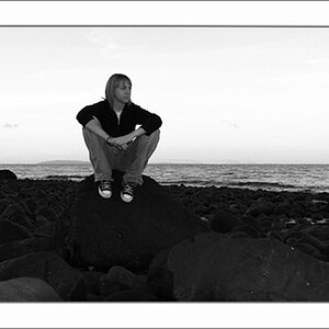
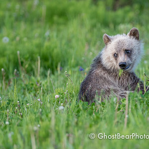
Oh, I like them both, Aga. Don't mind the pixelation in the first one, either. It is so much like a painting with all those very smooth colours - it could even do with some layer that would make it even more "impressionist painting"-like, I say.
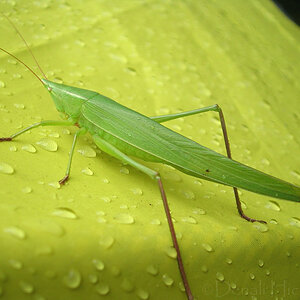
The second might well find it's way into the Themes, where you'd have to decide if you would want to put it into "The Colour Green" or rather into "Textures". Fits both.


")

![[No title]](/data/xfmg/thumbnail/39/39473-02c5070f4f13c145d9e4e3f13d9eec0f.jpg?1619739043)
![[No title]](/data/xfmg/thumbnail/39/39472-acea19526f2c08f92fd1e95a92191bc2.jpg?1619739043)


![[No title]](/data/xfmg/thumbnail/39/39471-60497f63216ffba784d91a339e9e917e.jpg?1619739043)