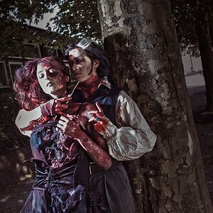
In 1 and 2 I think the black is too black... like it fades into the background or just appears empty space rather than hair, suit jacket, or whatever it is.
I'm not sure how much experience you have with internet forums, but there is some ettiquette involved. If you post links instead of pics, most people will not follow the link, they'll simply ignore the post. If you post full size originals, most people will not click on them and wait for them to load. This is simply how it is, good or bad, like it or not. By "fighting the system", so to speak, you risk alienating those who can offer the most.
On the internets, and for C&C there is no need to post larger than 800x600 (ish) at 72 dpi/ppi. If you want to show amazing detail at 100%, it is customary to post a 100% crop.
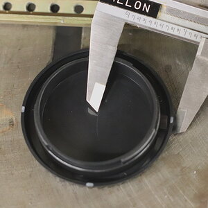
1)excessively contrasty--no detail in the blacks
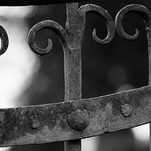
2)too contrasty, as above
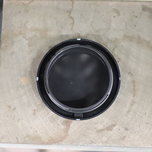
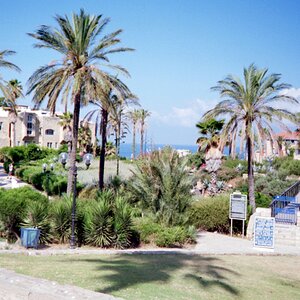
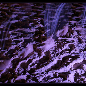
3)AH, color!
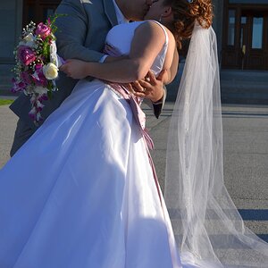
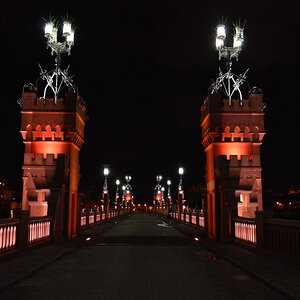
4) I absolutely loathe the fake lens flare centered right on the subjects. I like contre jour shots, but the faked flare just ruins the shot and looks cheap.

")
![[No title]](/data/xfmg/thumbnail/34/34041-c8aed4d2c55b167d1ec03d9cfbaca453.jpg?1619736250)