Architecture Shots - Any opinions?

throughmylense

TPF Noob!
Joined
Jun 24, 2005
Messages
4
Reaction score
0
Hi,

I have also started taking some architecture shots for a client and would love to hear some opinions.

www.hawkinsphotography.com.au

Thanks in advance guys!

CRW_0012.jpg


Canon 10D 17-40L f18 2sec

CRW_9970.jpg

Canon 10D 17-40L f22 2sec

CRW_9788.jpg

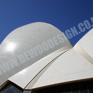
Canon 10D 17-40L f16
 
ok... if those are supposed to be rather pictures to the catalogue or something like this you should be very careful with the angle. Simple viewer just don't want to see such an original angle like in the first and the last one. Those are rather arty pictures. So make sure what your customer wants... artsy pictures to hang on a wall or catalogue photos.
While in the second one I don't know what to pay attention to. hmm to the table? To the wooden wall on the right? Actually the pole in the center grabs my atention imidiately. I see the architecture is very very nice, but if you have a chance, go there again and reshoot. And try to concentrate on one whole object to show... for example the table, and use the light from above....from the glass ceiling.
 
Hi there and welcome.

You've got a good eye for the form of the shot, but there's a couple of things with each I'd say could be improved. That said, you've given a nice clean light airy ambience to them, which is presumably what you were trying to achieve?

1) That white bit on the LHS annoys me.
2) I want to see the whole table and there's something wrong with the sky?
3) I really don't like the angle! It's personal, but the diagonally bisected door does nothing for me and that lovely ceiling has good enough angles already.

Hope you find these comments constructive?

Rob
 
I don't like how the last picture is on an angle... it makes me feel like i have to turn my head to see the architecture better.
 
Hi Guys,


Thanks for the replies - I really appreciate the feedback.

Funnily enough with the angles - I hear what you say. The weird thing is, though, every magazine and client of mine that has seen the pictures wonders why they like them so much over normal housing styled shots. When I mention the angle, you see a lightbuld appear above their head like it has just dawned on them.

I am with you, though, in that your typical architecture styled shots shouldn't need the angle - especially with all the angles around the ceiling.

As for the sky looking a little bit strange - it is because this is a blended exposure using about 6 shots combined into 1 - so that the sky wasn't blown out and the entertaining area still showed detail. Still haven't perfected it yet, however the 8x10 print I have for the client does look a lot more "normal" than the digital image!

The white in the corner - got you - I need to get rid of that!!!

The subject matter - yes I hear what you are saying here. The client was a builder, however we decided to make the table quite dominant as well to give it a more "lifestyle" feel. I do see what you mean about the pole in the centre!!

Thanks again everyone - I really appreciate the feedback!!

Lyndon.
www.hawkinsphotography.com.au
 

Most reactions

New Topics

Back
Top