
Derrel
Mr. Rain Cloud
- Joined
- Jul 23, 2009
- Messages
- 48,225
- Reaction score
- 18,941
- Location
- USA
- Website
- www.pbase.com
- Can others edit my Photos
- Photos OK to edit
As gryph mentions, good focus and good exposure are a given these days: any decent camera can in light like this, nail focus and get a proper exposure. But composition and framing cannot be automated.
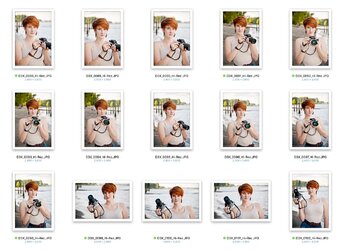
A good way to evaluate composition is by viewing thumbnails or reduced-sized images. I took the liberty of taking the three portait images posted in this thread, and making reduced-sized versions, so that you can see the composition as a whole, at a glance, and free from the beautiful and pleasing details of the subjects. Many times we're mesmerized by great eyes, or a cute smile, or some other thing we see in a proiminent way in a full-sized image. But when we see a thumbnail of an image, the overall "gestalt" of the images becomes what we see.
For example:
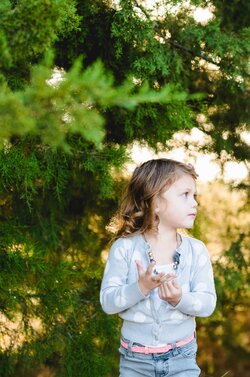
 in the Avaav shot, we see her cute gesture with hands to the face and a cute flower headband, but we can see that she's riding very,very low in the frame, and the orange and yellow background posts are distracting, and the overall backdrop is cluttered and the tilt becomes more prominent. She has a major flaw, a figure/ground attachment, where the dark, half-barrel flower planter attaches to the side of her head. In the full-sized image, these things tend to be less obvious.
In the second shot, beanbean,
 , the boy's right hand looks a bit awkward, and the hand grasping the baseball cap looks claw-like, with the three fingers showing. He is however, in a dynamic pose, and he fills up most of the frame, and overall the image seems balanced, and has good eye movement through the frame. Backdrop a bit busy, but workable!
In the last portrait, this is the best example of how the SMALL-sized image allows us to look at the image, in its entirety, to evaluate it. Seen large, the amazing eyeballs, with the photographer's reflection clearly visible in the eyes, is nice!

But what we see here is an example of a portrait composition that just does not work well. The bright yellow OOF background element, right in an upper corner, and then the side of his head and his ear cropped off...the left side of the frame mostly empty, him slammed into the lower and right side of the frame. When seen large, the details engage the viewer...the eyes, the face, etc. But seen small...this is a good way to evaluate compositions--as "an entirety", or "as a whole".
You'll be able to evaluate and work on your posing, framing, and composition if you download your takes to the computer, and then open the folders, and make about 250-pixel tall images for your image previews, and look at them at that size. Deliberately eliminating the cute details, the engaging eyes, and so on, will allow you to "see" the images in a new way.
I think you will also find that if you view images at 250-pixel size, you can make fantastic CROPS more easily than if working on a large image, so in Lightroom, I prefer to make my crops on a SMALL-size image. For me, it just works better, compressing the image down to its total "gestalt", when making the crops or evaluating the framing.
A good way to evaluate composition is by viewing thumbnails or reduced-sized images. I took the liberty of taking the three portait images posted in this thread, and making reduced-sized versions, so that you can see the composition as a whole, at a glance, and free from the beautiful and pleasing details of the subjects. Many times we're mesmerized by great eyes, or a cute smile, or some other thing we see in a proiminent way in a full-sized image. But when we see a thumbnail of an image, the overall "gestalt" of the images becomes what we see.
For example:
In the second shot, beanbean,
In the last portrait, this is the best example of how the SMALL-sized image allows us to look at the image, in its entirety, to evaluate it. Seen large, the amazing eyeballs, with the photographer's reflection clearly visible in the eyes, is nice!
But what we see here is an example of a portrait composition that just does not work well. The bright yellow OOF background element, right in an upper corner, and then the side of his head and his ear cropped off...the left side of the frame mostly empty, him slammed into the lower and right side of the frame. When seen large, the details engage the viewer...the eyes, the face, etc. But seen small...this is a good way to evaluate compositions--as "an entirety", or "as a whole".
You'll be able to evaluate and work on your posing, framing, and composition if you download your takes to the computer, and then open the folders, and make about 250-pixel tall images for your image previews, and look at them at that size. Deliberately eliminating the cute details, the engaging eyes, and so on, will allow you to "see" the images in a new way.
I think you will also find that if you view images at 250-pixel size, you can make fantastic CROPS more easily than if working on a large image, so in Lightroom, I prefer to make my crops on a SMALL-size image. For me, it just works better, compressing the image down to its total "gestalt", when making the crops or evaluating the framing.
Last edited:
")

![[No title]](/data/xfmg/thumbnail/34/34039-a3bf38301d5ee5f8b658c43a86558500.jpg?1619736250)
![[No title]](/data/xfmg/thumbnail/34/34040-14af4007923299ad46d35fc110d0faad.jpg?1619736250)