Ariel Rios Courtyard

Tuna

Fotoğrafçı
Supporting Member
Joined
Apr 1, 2004
Messages
1,092
Reaction score
1,167
Location
Virginia
Can others edit my Photos
Photos NOT OK to edit
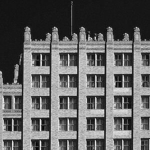
Ariel Rios Federal Building, Federal Triangle, Washington, D.C.

After staring at an image for too long, I always have trouble "seeing" it. So, here it is for your inspection and dissection - and to help me "see" it better please critique on aesthetic or technical aspects.

Leica IIIc, 50mm Elmar, Ilford HP5 B&W film.

Tuna

ArieRiosCourtyard246.jpg
 
I don't know if I should be critqueing or not. But what I would like to see is a little less foreground. I think if the bottom of the shot were based more where the horizontal line of the pillar and grass run, or just below the persons feet, it would give you the opportunity to add a little more of the upper section of building.

I can't seem to stop staring at the rest of the building? Even with the person in the photo, I am focusing on the building itself. It seems like the 2nd floor is a little whiter than the 1st floor. I think that would add some nice highlights to the picture? I guess maybe I find the person a little distracting. I think the building is the center of attention and I would like to see more of it.

I think the bw is perfect! The shadows are strong, but only where they should be. Lots of detail! The little bit of grain, which I'm guessing is from the film, really adds to the historic feeling of the building! Very nice shot.

Sorry if this doesn't make sense.
 
ding ding ding! we have a winner. i love it. there are many things to focus on in this picture, and you see it as that. there is not distracting objects, just many subjects. very, very nice. i kind of wish that the light at the top left of the photo wasnt cropped on the top, and/or the tree on the right, but that's the only thing i could think of.
 
Excellent photo. Im just nitpicking for critique.

Wish I could make out more of the first lamps in the photo but then you would have to give up some of your foreground and I like the foreground it helps convey how open it is verse the woman walking across it. Contrast looks really good and photo is extremelly sharp. My only thing is some of your shadows seem to be towards the dark side.

What time of day was this shot?
 
I agree that there is a litte too much foreground, other than that is pretty much fine. Only thing is my attention is immediately drawn to the person in the picture. But that could just be my ADD acting up.
 
Thanks for the comments and critique.

Jake - it appears you like architecture - this building and the surroundings would definitely lend itself to that. I may go back someday to re-shoot just for the architecture.

Vmann - shot around 3-4 P.M.

All of you, in some manner, have commented on the extra foreground in the image. Loss of some detail at top, cropping closer to the feet, liking the extra space... Instinctually, this is how I cropped and set in-camera. So, in this negative, there isn't anything else to show - and to crop closer to the feet would take away some of the focus on the woman and (more importantly, for me) ruin the balance of the existing composition. Agree? Disagree?

Tuna
 
That depends if the photograph is of the woman or the building?

I don't really 'see' the bottom of the image even though it's there, (dead space) so it destracts me and I would like rid of it, push the focus more onto the building. I'd remove the left hand side of the image so the lamp is right in the corner, to balance the fact that the top is missing, as you don't have the top on the negative, and then I guess you'd have to remove the right hand side of the image to bring the person back away from the edge... (I might change my mind if I saw it cropped my way though)

Having said all that I like it just the way it is.

(I'm sure someone as new as me poting critique when you've never seen my work isn't too popular - my photo's are coming as soon as I get five minutes, and I'll look forwards to your observations.)
 
alexecho said:
That depends if the photograph is of the woman or the building?


why can't it be of both?


i like the foreground space. i dont think i would like it as much if it were cropped more on the bottom. the more i look at this, the more i like it. the dark on the right, the columns leading to the light side on the left, and that lady, oddly misplaced in the middle of it all. yes, i definitely like this image.
 
thebeginning said:
why can't it be of both?

It can. It is. But my personal taste is for one thing or another in the image to hold your attention the most, so that shows in my question... It was a direct response to the crop/don't crop forground debate. (In my opinion) Leave it and the person competes for your focus, crop it and it becomes a picture of a building with a person in it...
 
IMO, this is a picture of both. It would hurt the image to make it 'a picture of a building with a person in it' i think. the person adds just as much if not more to the image than the building does, but that relies on personal opinion for most people.
 
There is a story being told here. The photo is not of the person nor is it of the building. The interaction of the person in the environment is where the story lies. Obviously, many crops can improve, ruin, distract or contradict what is actually happening. The dark area created by the trees in the background, the repetitive arches, the position of the persons feet as she walks all lend to the story. Looking at the photo I feel like the story is complete but I want to know more, it invokes an emotion and peeks my interest. I only touched on all the elements leading to my interpretation of this photo (the brick, the clothing, shoes, lights were not mentioned but play a part).
 

Most reactions

New Topics

Back
Top