At the Park B&W Pics - C&C

FemFugler

TPF Noob!
Joined
Nov 12, 2009
Messages
288
Reaction score
2
Location
Canada
Can others edit my Photos
Photos OK to edit
It's been a while since i really posted on here. I've just been a little busy with family stuff(my grandma died a couple weeks ago) and school has been hectic.

Anyway i went to the park yesterday i was looking for smaller birds actually(chickadees, blue jays, robins etc) for a project at school, but i didn't really have any luck finding any. I did come across a park that hadn't been to in awhile and i had completely forgotten that there was geese there and what not. I also discovered that it's a great place to shoot some pics.

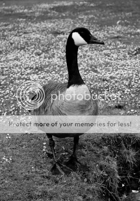
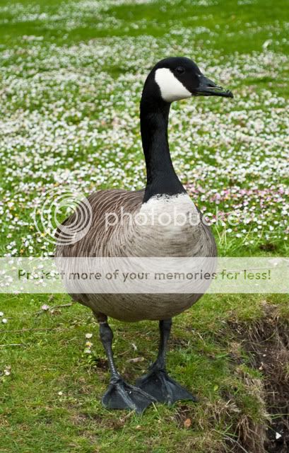
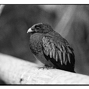
Anyway here are the picture. They're in black and white. I don't know what is with me and black and white but let me know if you want me to post the colour ones.
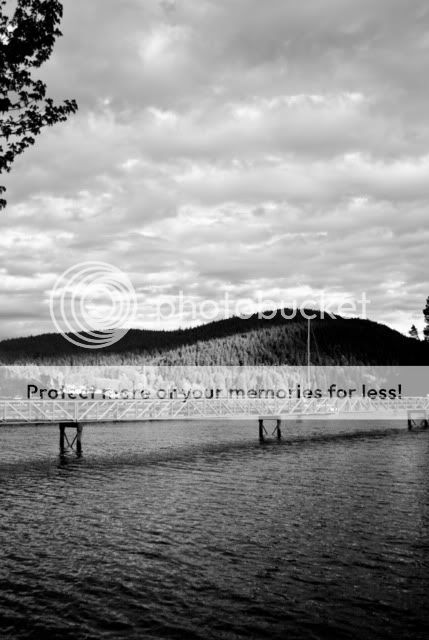
CanadianGeese275.jpg


CanadianGeese277.jpg


CanadianGeese360.jpg
 
I dont know what is on both ends of that bridge, but I think it would look nicer if #1 was taken horizontally. I also like the goose, but probably would look better in color with those flowers (or whatever it is) in the backgroun.
 
I dont know what is on both ends of that bridge, but I think it would look nicer if #1 was taken horizontally. I also like the goose, but probably would look better in color with those flowers (or whatever it is) in the backgroun.

Isn't that the fun thing about it though? It keeps you wondering. It could have so many outcomes and where the bridge leads to.
 
Oh and here's the goose in colour.... I think i like it in colour better actually. :)

C&C appreciated
CanadianGeese360-2.jpg
 
No Comments? That's.... nice.
 
The 1st shot is awesome. Great textures and nice contrast. I particularly like that the bridge aligns where the water meets land.

The 2nd shot doesn't really interest me.

The goose is just a goose. The background is just the ground, and it's very mundane. The color adds nothing.
 
There's not much depth in #1 & #2, so they feel flat and unengaging. To fix this, you might try including a foreground subject -- the easiest is a stone or a piece of driftwood. It helps pull the viewer into the picture.

#3 is a picture of a goose, and it's certainly better in color because the black contrasts with the green lawn, but the photo needs something more.
 
No Comments? That's.... nice.
Heh, sorry. I would comment again earlier, but I spent whole weekend on driving between universities and finishing last business here and there before the summer.

Ok. Now I can compare b&w and color goose. I thought the color might be more interesting, but after all it makes from this picture even more ordinary pic of a goose. I guess some playing with colors could help, but I don't have any good ideas at this moment.

If it goes about #1 and what is on both ends.. your "marketing" doesn't convince me. ;) I just like landscape photography.
 
Thanks everyone for your input.

I have some more pictures .... mainly of the geese which i may put on in another thread if i like them. I just put these few on because these were my faves and i didn't feel like editing them all(i shot in raw + i shot like 300 pics that day.... i went a little overboard on the Canadian geese....lol)

Anyway thanks again everyone. I'll maybe have a reshoot on Tuesday or Wednesday when it's supposed to be sunny. :)

Thanks
No Comments? That's.... nice.
Heh, sorry. I would comment again earlier, but I spent whole weekend on driving between universities and finishing last business here and there before the summer.

Ok. Now I can compare b&w and color goose. I thought the color might be more interesting, but after all it makes from this picture even more ordinary pic of a goose. I guess some playing with colors could help, but I don't have any good ideas at this moment.

If it goes about #1 and what is on both ends.. your "marketing" doesn't convince me. ;) I just like landscape photography.

Ha it's ok. Thanks for the comments :)


Oh and i forgot to add that i think my fave initially was the first but the more i look at it, the more the B&W annoys me. It's not that i don't like the B&W, it's how i did it on it. I think i need to adjust the darks and lights a bit. I think the big light spot in the middle in the trees is just kind of annoying...
or what do you guys think?

Ps, sorry if my typing is screwed up i had my computer(touchpad on laptop) has been acting up and i got pissed and punched the keyboard a few times so there may be some random letters in places....
 
Last edited:
its not a goose, its a bustard, and its tasssstyyyy,

i also shoot them with a shotgun :p:p
 
I might have shot #1 & #2 in the bottom side being the long side.

#1 has nice shadows.

#3 it's a nice photo of a very annoying bird.
 
I like the light spot on that forest, and again I think it would make a better impression if it was shot horizontally.

Btw. Yesterday I was driving back to my university through a storm. It was late afternoon, so right after the storm the Sun started setting down giving awsome colors. I regret that I still didnt buy a DSLR camera.
 
Sorry to hear about your grandma.

The first pic is pretty cool, would love to see some other crops or shots you got of it
 

Most reactions

New Topics

Back
Top