Th0r4z1n3
TPF Noob!
- Joined
- Aug 16, 2015
- Messages
- 28
- Reaction score
- 8
- Location
- NW Ohio
- Can others edit my Photos
- Photos NOT OK to edit
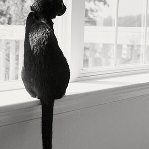
I was up at the lake the other day, and came up to the pier just in time to grab this shot. It was really overcast, an the b&w looked really "white" so I added the vignetting to offset the abundance of white. Grain just because I like the grainyness of old b&w film. ")
Feedback?

Feedback?


![[No title]](/data/xfmg/thumbnail/36/36395-66eaff4565ecf4245f13a9c469a9273b.jpg?1619737548)

![[No title]](/data/xfmg/thumbnail/36/36393-86ce601930c671b92b6df002b7fcbd0b.jpg?1619737548)