Ayla

rallyxe

TPF Noob!
Joined
Jul 18, 2005
Messages
204
Reaction score
1
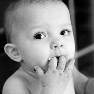
Hey all, I haven't been here for a while but would like some critique on pretty much everything with these three photos. I'm going to make a portfolio and apply for some jobs at some photography places hoping to get a job. I have no formal experience or qualifications in photography so really do need to know what you think and whether or not they are good enough for a portfolio

peek_a_boo_by_rallyxe.jpg


International_Lolly_Day_by_rallyxe.jpg


gimme_dat_ding_by_rallyxe.jpg
 
#1 The focus, lighting and composition aren't really up to scratch. The shot says to me "child obscured by door" which probably isn't what you were going for.

#2 The eyes aren't too bad, but there's a blown out bit towards the top right hand side, the colour balance is off and the lighting is so flat it looks as if her face is flat.

#3 This one is much better as there's no distractions in the background, the side lighting gives some depth to her face, the eyes are lit much better and the colour is more natural, but still a bit too desaturated/overexposed.

Generally, sorry, no they aren't good enough for a portfolio (as they appear here). A portfolio requires demonstation of control of medium and technique and most of all a show of variation. (a job-hunting portfolio anyway)
She's obviously a good subject - alert, emotive, great eyes. I think you need to concentrate on composition and lighting principally. For printing as an 8x10 or say A4 print, the focus on the eyes must be perfect and the shot must be well arranged.

I generally recommend using the camera vertically as people are generally vertical, and portfolios are generally vertical.

I would suggest going out on a sunny day with a gold reflector and getting some shots which are nicely lit, sharply focussed and have more attention to detail.

Apologies for harshness, but it is the critique forum. Feel free to question/disagree with anything I've said.

Rob
 

Most reactions

New Topics

Back
Top