B&W shot.

milkshake

TPF Noob!
Joined
Jul 17, 2005
Messages
21
Reaction score
1
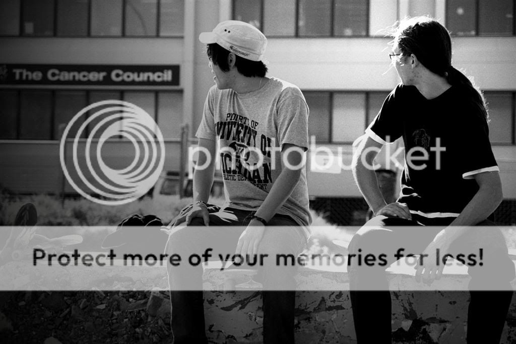
Hey all, this is just a candid shot i took of two of my mates. I put the gradient look and the B&W via PS. I used f/5.6 and a shutter of 1/250 or 1/500s my memory is a bit blurry. Kodak Max 400.
Just a general critique on composition, mood, and what not.

00007Large.jpg
 
The composition of the image is ok, there is nothing technically wrong with it as you didn't cut off anyones hands, arms, head, etc. I did however notice a few hot spots on the person on the right. These were on top of his head, his right leg and arm. The guy on the left exposed much better.

Overall I believe the B&W conversion was done nicely and with both people looking it makes me wonder what was happeningin that direction. The jury is still out on the gradient effect. One interesting item is it appears they may be looking at the Cancer Council sign on the building in the back.

when you pull it all together it can convey quite a message.

Nice work.
 
thanks heaps for the critique... yea the comp was just a "stock" one i suppose, because thats where i was sitting when they where both looking in that direction... how would u have composed it better if i may ask? im looking for any advice i can get.
 
Looks great, the blown out areas add to it. The "Cancer" sign is very distracting, you should clone it out. Good otherwise.
 
i actually like the cancer sign... to me it adds meaning, re-directs the focus from the people to the cancer council.
 
it is hard to say how I would have composed this shot differently as I am not familiar what that area. Overall I would have played with the angles. Perhaps I would have tried the shot more from the right.
 
milkshake said:
i actually like the cancer sign... to me it adds meaning, re-directs the focus from the people to the cancer council.

now that you have received some feedback, what does the image say to you. was it your intent for the viewers to focus on the sign? are you trying to convey a message?

btw, welcome to TPF!
 
to me, it looks like they are looking at something cool pass by and you missed it in your frame.
Also, I don't really like it that you put a gradient on it to make it darker on the left...
I think if there was something in the frame that they were looking at it would be a lot better.
 
hey all, thanks for all your comments.

Good point LittleMan, this is a spot that we skate at, they where looking at skateboarders, but it was a very spare of the moment shot, because i found it interesting that they where both holding the same pose at exactly the same time. I liked it how it looked like they where looking at the cancer council sign.

Jon Mikal i am trying to spread some sought of awareness of the council, because it is something, along with alot of other things that i feel very strongly about. I added the gradient because i thought it added a more emotion to the picture, to me it is showing the youth taking an interest in something that is not normally associated with them, especially skateboarders.

thanks for all your advice once again, its great to hear other peoples oppinions. Keep them coming.
 

Most reactions

New Topics

Back
Top