vonnagy
have kiwi, will travel...
- Joined
- Sep 8, 2003
- Messages
- 3,759
- Reaction score
- 30
- Location
- -36.855339, 174.762384
- Website
- www.vonnagy.com
- Can others edit my Photos
- Photos NOT OK to edit
Follow along with the video below to see how to install our site as a web app on your home screen.

Note: This feature currently requires accessing the site using the built-in Safari browser.
 Nice one, overall!
Cuervo79 said:I can't make heads or tails afther the third stair, I like contrast of the white flowery things but I wish I could see more of the stairs, the uper left corner could use a little bit of more exposure cause it looks weird, that only the flowery things have that contrast, besides the trees would look better with a little bit of more contrast instead of being all gray

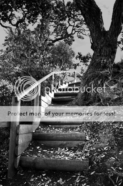

vonnagy said:
)