
Tolyk
TPF Noob!
- Joined
- Aug 10, 2006
- Messages
- 531
- Reaction score
- 7
- Location
- Calgary, Alberta
- Can others edit my Photos
- Photos OK to edit
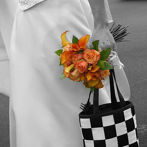
I had tagged this onto a gallery post, but I decided I wanted more indepth critique on it.
Tv: 1/1000; Av: 9.0; ISO: 200; Focal: 50mm


I would like to know is if the composition is correct, and if not how I could do it better? Should I have included the entire flower? I know I cut part of the top petal off, was that a mistake? And just anything else anyone thinks I could improve upon. Thanks")
Tv: 1/1000; Av: 9.0; ISO: 200; Focal: 50mm
I would like to know is if the composition is correct, and if not how I could do it better? Should I have included the entire flower? I know I cut part of the top petal off, was that a mistake? And just anything else anyone thinks I could improve upon. Thanks

![[No title]](/data/xfmg/thumbnail/33/33359-a5cf76b8e843e82b3831650af6dfa6b3.jpg?1619735923)
![[No title]](/data/xfmg/thumbnail/33/33357-bd174890e33fb2a7f7338b9278e6dad2.jpg?1619735920)


![[No title]](/data/xfmg/thumbnail/39/39290-dfb3e819bd94a7f30797638ae1ae27cf.jpg?1619738958)
