Beautiful Bride in Garden Setting!

twocolor

No longer a newbie, moving up!
Joined
Feb 26, 2008
Messages
1,044
Reaction score
227
Location
Utah
Website
www.twocolorphotography.com
Can others edit my Photos
Photos NOT OK to edit
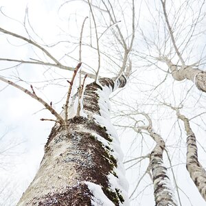
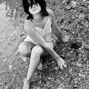
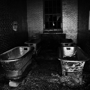
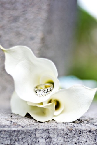
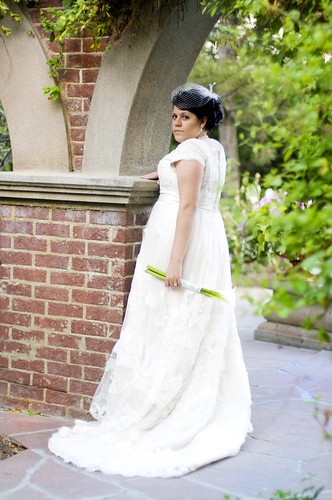
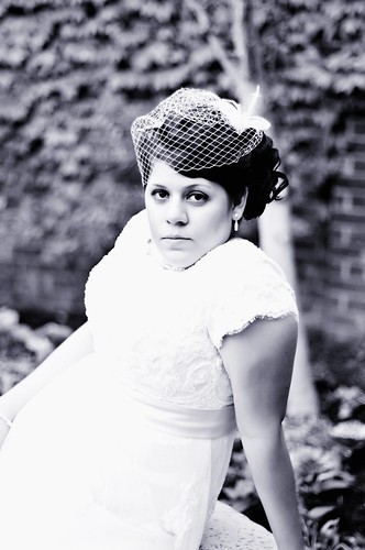
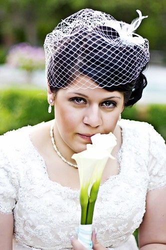
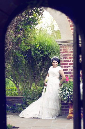
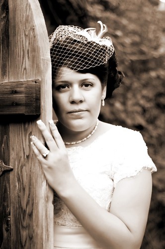
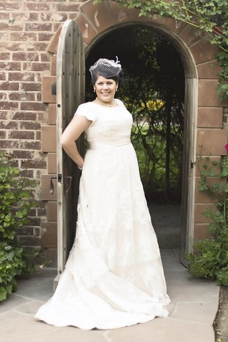
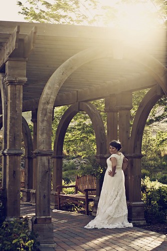
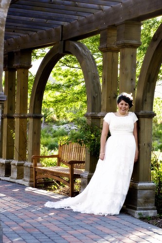
Here is a bride shot at Thanksgiving Point Gardens. They have 55 acres of beautiful themed gardens. My favorites were shot in what was called The Secret Garden.

1.
4712113930_635a1ab364.jpg


2.
4711474051_bf89690455.jpg


3.
4711473971_06bff563f5.jpg


4.
4712113674_bd6cb18ce1.jpg


5.
4711473801_7a42f12709.jpg


6.
4712113542_ca010b8150.jpg


7.
4712113450_c932733950.jpg


8.
4712113358_baa182423c.jpg


9.
4711473503_8fd87d1092.jpg


10.
4712113184_18ca540370.jpg


11.
4712113110_c39571758f.jpg


12.
4712112982_0786965819.jpg


13.
4712112830_6af4786fc6.jpg


Countdown to Maternity Leave:
8 days . . . 6 Portrait Sessions!
 
Many of these look overexposed to the point that you have lost the details in the highlights, IMO at least.

She looks very annoyed in #3 as well as #5. In #4 I think the pose is a little awkward. She could use some direction in posing her feet in #8.

I find #10 technically pleasing and a good shot. I like #11 also.

I'm no pro so that's just my .02

Thanks for your .02. As far as the overexposed, all my shots SOOC are exposed perfectly. I take each shot into photoshop and decide what is to be the "attention grabber" in each photo. If it's her eyes, than I will push my highlights to draw attention to her eyes. If it's the dress, than I make sure every bead and every piece of lace is perfectly shown. I mentioned in my last post, that that's just my style . . . maybe not for everyone, but I love it!

#3 & #5, I was going for dramatic . . . maybe missed it a little. #8 I put her feet that way . . . I wanted your eyes on her boots. This photo was intentionally shot to showcase her boots.
 
I really like the B&W and the sepia. The sepia gives her almost an ethnic look. And I got the boots thing! I like it!

5 and 7 bug me a bit because it appears she has no neck at all. I think her neck might be a bit short, but this is not really flattering.
Overall I really love your shots and would make a little victory dance if my photo's looked anything near this...
That was my 0.2
 
The very first thing I thought was that dress is not very flattering on her. Shelooks like a bit of a big girl, but not too big. But I feel like that dress makes her appear bigger. Something about the high waist line. But of course, that has nothing to do with you.

The second thing I thought was that alot of her smiles look very apprehensive. Whether they are supposed to look happy or moody or whatever, they still all look like an apprehensive version of that. Again, that doesn't have to much to do with you. I suppose that it's the photographer's job to draw out good expressions, but she strikes me as a person who is maybe uncomfortable with her self and very difficult to get genuine looks out of. So, no foul there.

The third thing, which has already been mentioned are the very, very blown out highlights. Now, whether you blew them out in camera, or captured them perfectly and then blew them out in post makes little difference. Now, you've already stated that it's your style, so I understand that anything I say doesn't really matter. But. The blown out highlight are very distracting. If I take a perfectly focused shot, then gaussian blur the whole thing, and then someone says 'you missed focus', I can say 'No I didn't. I did that on purpose in post', and that would be true. But it doesn't matter if the bottom line is that the whole photo is blurry.

Blown out highlights are very rarely good looking, with the exception pretty much only being very well done high key photography. As far as doing to it draw attention to the bride's face, no amount of removing detail from the dress will do that. Blown out highlights will almost always be the first thing that grabs your eyes' attention. So by making them blown out, you are in fact diverting more attention away from the bride's face. If they were perfectly exposed in camera, it would be very easy to push the whole dress very far to the right without actually losing it.

Now, I'm not trying to be harsh or a jerk, (but that seems to be how everyone takes it anyways). But don't let "Style" be your Get Out Of Criticism Free card. I understand the importance of style, and ultimately, you're free to do anything that makes you happy. But when style goes against what is generally believe to be desirable, especially in matters that are typically not matters of style, perhaps it's time to reconsider. I think that if you showed some of these to a panel of experienced photographers, there would be a a general consensus that the highlights are blown out and that it's not a desirable look. So, again, you could relegate that to Style and dismiss it, which is perfectly your right. But at what point does Style become a moot point?

I'm not in any way trying to be insulting or call you a bad photographer or say that your photos suck or anything. So don't take it that way. But too often on this board and others, I see people dismiss valid critiques because "that's just their style". And this has been my feeling on the subject the whole time. You just happen to be the person that I'm actully typing it to.

As for other critique, I think 10 is most definitely the best image, but I would of course, like to see more highlight detail. 12 and 13 are also quite nice. I like the lens flare in 12, it's nice and even, and not filled with purple and green polygons. And I really like the way the the body/dress line continue and finish the S curve that is started by the bridge beam.
 
the title grabbed my attention, it time you got your eyeware checked out. H

Maybe one day we will actually see a positive contribution from you in this forum. Perhaps you have mistaken this as a teen chat room? If not I personally think you and your cluttered :drool:website:drool: ought to check one out so you could fit it a little better.
 
I agree with the comemnts about over-exposure, but if that's your style, that's your style. They're not the way I would have shot them, but at the end of the day, if you're happy with your work and the customer likes them, that's ALL that counts!
 
NIce photos, they do need a bit more PP I feel. Seem a little washed out or lacking contrast, other than the last one.
The Bride is lovely, I think she's gorgeous.
 
the title grabbed my attention, it time you got your eyeware checked out. H

Maybe one day we will actually see a positive contribution from you in this forum. Perhaps you have mistaken this as a teen chat room? If not I personally think you and your cluttered :drool:website:drool: ought to check one out so you could fit it a little better.

yeah "maybe" but I'm positive you need to upgrade your specs, I'm also positive you post these and the dozens of others for critique knowing they are below par. If you'd like more positives be sure to let me know, y'all, now where's that chat room gone, oh look, its in the garbage next to twocolours SOH. H

Hey now, don't pull me into this. I've done and said nothing to deserve that comment.
 
The very first thing I thought was that dress is not very flattering on her. Shelooks like a bit of a big girl, but not too big. But I feel like that dress makes her appear bigger. Something about the high waist line. But of course, that has nothing to do with you.

The second thing I thought was that alot of her smiles look very apprehensive. Whether they are supposed to look happy or moody or whatever, they still all look like an apprehensive version of that. Again, that doesn't have to much to do with you. I suppose that it's the photographer's job to draw out good expressions, but she strikes me as a person who is maybe uncomfortable with her self and very difficult to get genuine looks out of. So, no foul there.

The third thing, which has already been mentioned are the very, very blown out highlights. Now, whether you blew them out in camera, or captured them perfectly and then blew them out in post makes little difference. Now, you've already stated that it's your style, so I understand that anything I say doesn't really matter. But. The blown out highlight are very distracting. If I take a perfectly focused shot, then gaussian blur the whole thing, and then someone says 'you missed focus', I can say 'No I didn't. I did that on purpose in post', and that would be true. But it doesn't matter if the bottom line is that the whole photo is blurry.

Blown out highlights are very rarely good looking, with the exception pretty much only being very well done high key photography. As far as doing to it draw attention to the bride's face, no amount of removing detail from the dress will do that. Blown out highlights will almost always be the first thing that grabs your eyes' attention. So by making them blown out, you are in fact diverting more attention away from the bride's face. If they were perfectly exposed in camera, it would be very easy to push the whole dress very far to the right without actually losing it.

Now, I'm not trying to be harsh or a jerk, (but that seems to be how everyone takes it anyways). But don't let "Style" be your Get Out Of Criticism Free card. I understand the importance of style, and ultimately, you're free to do anything that makes you happy. But when style goes against what is generally believe to be desirable, especially in matters that are typically not matters of style, perhaps it's time to reconsider. I think that if you showed some of these to a panel of experienced photographers, there would be a a general consensus that the highlights are blown out and that it's not a desirable look. So, again, you could relegate that to Style and dismiss it, which is perfectly your right. But at what point does Style become a moot point?

I'm not in any way trying to be insulting or call you a bad photographer or say that your photos suck or anything. So don't take it that way. But too often on this board and others, I see people dismiss valid critiques because "that's just their style". And this has been my feeling on the subject the whole time. You just happen to be the person that I'm actully typing it to.

As for other critique, I think 10 is most definitely the best image, but I would of course, like to see more highlight detail. 12 and 13 are also quite nice. I like the lens flare in 12, it's nice and even, and not filled with purple and green polygons. And I really like the way the the body/dress line continue and finish the S curve that is started by the bridge beam.


Thanks for the feedback. You've given me a lot of food for thought. I'm not going to say I agree with it 100%, BUT it's been on my mind alot the last few days. Thanks for honestly speaking your mind. It is refreshing, and next time I do some photoshop work, I'll see if I can't keep some of my "style" while adhering a little more closely to the standards of the industry!

Truly, thank you!
 
I like the high key of these photos, and I think she will be extremely happy with these!! LOVE the ring shot.

And you must be from around me! :) I have never been to Thanksgiving Point... not sure why... but I must visit there soon. Looks beautiful!
 
Hi, there,

Nice garden though, but as my opinion, most of these photos looks too static for me. May I ask you why did you do skin retouch or postprocessing especially on the face? Now the skin looks like some kind of plastic. What about natural makeup? Or maybe thats me :)

BTW, 5th photo is missing her neck. If I had to choose one, it would be 8th. IMHO :)
 

Most reactions

Back
Top