Beautiful examples of technically terrible images

Snakeguy101

TPF Noob!
Joined
Dec 5, 2010
Messages
717
Reaction score
63
Location
Gainesville
Can others edit my Photos
Photos OK to edit
I hear a lot of people treating certain photography rule as if they are the law. Things like "rule of thirds" "shoot away from the sun" and "avoid motion blur" are good starting points for most photos but I wanted to post a few examples of broken rules so that you may be able to begin to experiment with new techniques that do not follow the traditional cookie cutter molds.

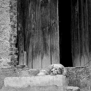
This image has a terrible exposure and a centered composition and it takes my breath away.
http://images.nationalgeographic.co.../cache/art-student-williams_61720_990x742.jpg

This image has cropped half the boat and is not showing the subjects face. Also what a terrible angle to photograph someone from... right? Wrong.
http://images.nationalgeographic.co...10/cache/tour-guide-vietnam_61079_990x742.jpg

Here is one that I took that is not a great photo admittedly but those "distracting foreground elements" (the bubbles in this case) add to the photo more than detract from it.
67623_3990537248073_597951412_n.jpg


Here is one where the people are so blurry they are barely recognizable.
Istanbul Picture

You do not have to like the images that I provided to understand the point. Learn the "rules" to break them.

If you have any more examples either from yourself or that you have found online then please share them.
 
The first one would be more appealing to me if her feet were completely in the picture. It's just that the rest of the photo keeps me interested. That's not to say that the photo could be "better" in my opinion. Also, the exposure is great considering film and digital limitations.

The second one is great composition. Just unorthodox.

The third follows the rule of third and the bubbles add context.

In the last the blurry people are to help convey the hustle as bustle of the city.

You chose bad examples to illustrate your point.
 
None of those examples are close to "technically terrible" IMO. They all show good overall balance and are composed to lead your eyes around the whole image. The b&w national geo shot being the weakest.. but still.
 
^^^^^^ I agree ...the image of the boat is great ...... I hate all these so called photo rules, I think they are there for those that do not have a clue about what makes a good picture. The boat picture is an example of what I am talking about .... The image is great and does not need rules
 
^^^^^^ I agree ...the image of the boat is great ...... I hate all these so called photo rules, I think they are there for those that do not have a clue about what makes a good picture. The boat picture is an example of what I am talking about .... The image is great and does not need rules

They aren't rules! They are guidelines.... and the thing is, you have to know when and how to bend / break them to do so successfully.

An image like the boat may not follow some rules, but that does not keep it from being well composed. A study in shapes and colors can follow any or no rules. It works, it works!

The Art student... it would have been better for me if the bottom of the image wasn't clipped... and I would bet the exposure was intentional! And it works... IF it works, and was intentional.. it is NOT terrible, it is art! (and we all have our own ideas of art.. what we like, and what we don't)

The diver shot? I think it has too much dead space to the left.... if it had been shot vertically, it would have much improved it. Yes... the bubbles add context, but the color and exposure is still bad. This is not one that would end up in the NatGeo images.... the others are! IF the foreground bubbles were sharp, and the image was better exposed / focused... maybe.... as it is just too jumbled
 
Last edited:
... right? Wrong.
.
Your analysis of the photos is pretty much wrong on all accounts.

The girl (main subject) isn't centered in the frame, and the high angle used with the boat is an attention grabbing perspective and the photo has strong leading lines.
 
I was trying to put the images into terms of why someone following the typical rules would not shoot that image. I agree that there are deeper composition concepts that each image follows but the sayings that are being thrown around in today's photography world go against each of the ones that I posted. If you guys have better examples I would love to see them. These were just ones that I could think of off the top of my head.
 
I think the point is that you can always do an ex post facto analysis of any given image, and get a strong idea of how it works. Then you can riffle through the little binder of "rules of photography" and pick out a couple that are pretty close, and then you can exclaim "See? By following the rules of photography, the photographer has succeeded in creating a great photograph!"

This isn't how it works at all, and performing such ex post facto analysis, and so exclaiming, does not make it so.
 
I was trying to put the images into terms of why someone following the typical rules would not shoot that image. I agree that there are deeper composition concepts that each image follows but the sayings that are being thrown around in today's photography world go against each of the ones that I posted. If you guys have better examples I would love to see them. These were just ones that I could think of off the top of my head.


An image is either well composed or not. If it happens to follow some "guidelines" based on an individuals perspective, whether it be intentional or not, it is still either a well composed image or it isn't a well composed image. Whether or not the image maker used "arts design" to create it, naturally create great compositions, or are just lucky is irrelevant. Elements of arts design are simply tools used to create or describe what is seen.
 
I think the point is that you can always do an ex post facto analysis of any given image, and get a strong idea of how it works. Then you can riffle through the little binder of "rules of photography" and pick out a couple that are pretty close, and then you can exclaim "See? By following the rules of photography, the photographer has succeeded in creating a great photograph!"

This isn't how it works at all, and performing such ex post facto analysis, and so exclaiming, does not make it so.

hmmm.... for once, I agree with you! (Just don't tell anyone! Shhhhh!) :lmao:
 
Stopped clocks and all, Charlie, it's bound to happen sometimes! Don't let it get to you!
 
Stopped clocks and all, Charlie, it's bound to happen sometimes! Don't let it get to you!

Don't worry, I won't! It probably won't happen again for a really long time, anyway! ;)
 
There are no "rules" of photography. There ARE however, elements and principles of design. The "rules" of photography are mythical...constant reference to "rules" of photography shows a misunderstanding of the subject matter. Using the word "rules" indicates an unfamiliarity with the subject field.

Many people who blog and write about various subjects appear to be not fully aware of the basic terminology affecting the fields which they are blogging about. The original post in this thread is a good example of writing about a subject from a less-than-learned, less-than-conversant, and less-than-defensible position.

The idea that "rules" exist is a fallacy--a shorthand way of conceptualizing design and composition.
 
If you want an example of terrible images and broken "rules", I can link you to my image album when I first started. lol

or...you can look at any of the beginner threads on here...

or use your own examples

etc..

etc..
 
Let's look at the second example provided in the original post: http://images.nationalgeographic.co...10/cache/tour-guide-vietnam_61079_990x742.jpg

Now, let's take one of the absolute MOST-basic web pages we can find that deals with something that truly does exist: the elements and principles of design.

Elements and principles of design


ELEMENTS of design: line,shape,direction,size,texture,color,value (tone).


PRINCIPLES of Design:balance,gradation,repetition, contrast,harmony,dominance,unity.

Sooooooo....what can we say about the sample photos? HOW were these actual "tools" used? When we discuss say, the outcome of an NFL football game, we don't say things like, "Yeah, the Raiders QB was unable to fill that inside straight, and so the fourth down pass attempt he threw fell incomplete because he didn't understand how to properly grout the tile."
 

Most reactions

Back
Top