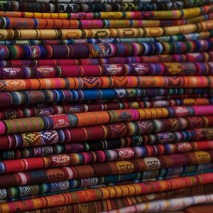
tom the first one is impactful powerful photograph... i dig this kinda stuff, you'll probably get heaps more posts adoring that photo
but I am loving number 2 as well, for me it just needs to be lightened up a bit and a bit of a saturation boost. Its almost like an abstract painting and my eyes are very drawn to it. Nice textures there too! though 1 is my fav, 2 ain't far behind! Good work Tom, its great to see your pics here!
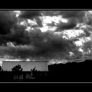
Hey nice group of pictures you have here, Tom. The last one would have to be my favorite of the bunch. I like how the clouds interact with the bell tower. The angle you took for this picture is also nice because it forces me to look up where all the action is and not to the ordinary scene in the lower left side. Good work!
harper- very good point (no pun intended) at first i was gonna suggest a free transform to straighten the orientation, but something made me hesitate to say so, cause something in the photo was happenin for me- just didnt know what it was. it was just as you said- angle draws the eye to the clouds.
good call,
and now i appreciate this photo even more
Hey nice group of pictures you have here, Tom. The last one would have to be my favorite of the bunch. I like how the clouds interact with the bell tower. The angle you took for this picture is also nice because it forces me to look up where all the action is and not to the ordinary scene in the lower left side. Good work!
good point harpper, I missed that one. My nitpick with this one that its a bit dark for me, My prefence would be to see the building gleaming white rather than off grey. But looking at it again, its alot more interesting composition than i first realised.
If you know La Alhambra in Granada in South Spain, you will know that your two photos don't represent it. They may have been taken there, and they may express a thing of their own, but they don't show what La Alhambra is or is like.
I go with Mark, the shot of the window is a bit dark.
I like the green leaves in the other, but that's because THAT kind of green is my all time favourite colour.
But I miss to see more of La Alhambra as it is in these. They could have been taken anywhere in South Spain. But that's just me here... no need to listen.
Since I know that the places down there are all painted in bright white, I too would have liked to see a white church against that blue sky with the wonderful clouds, but apparently one of the clouds shrouded the sun when you were there, so... hm. Well. Force majeure.
The first two are the ones that grab me, also. On the second one, I'd cropt that black line off the right and I agree that I would like to see it lightened a little.
On the first one, I would crop it square. The main focus is that wonderful beam of sunlight, but it's a little lost in the size of the image. The columns act as a framing device, but there's still some image left outside that frame. You could come in on each side and still have the columns frame, but the sunbeam would have more prominence.
I've noticed that too about other critiques. People point out things that I miss, but that's just the benefit of having a lot of people look at your work. I've learned a lot just by critiquing people's work.

")