Beginner's Critique - Pass it on

Can't really find anything wrong with it. I'm not a fan of selective coloring but I like it here. If anyone has an experienced eye then go at it. I'm just keeping the thread going.

Here's something easier to critique.

d0108.jpg
 
Great exposure. Could maybe use a little more saturation. I think there might be just a bit too much water. I would suggest a crop taking 1/3 of the water out would improve this one.

here's mine:
2347015464_06cb0b8854_o.jpg
 
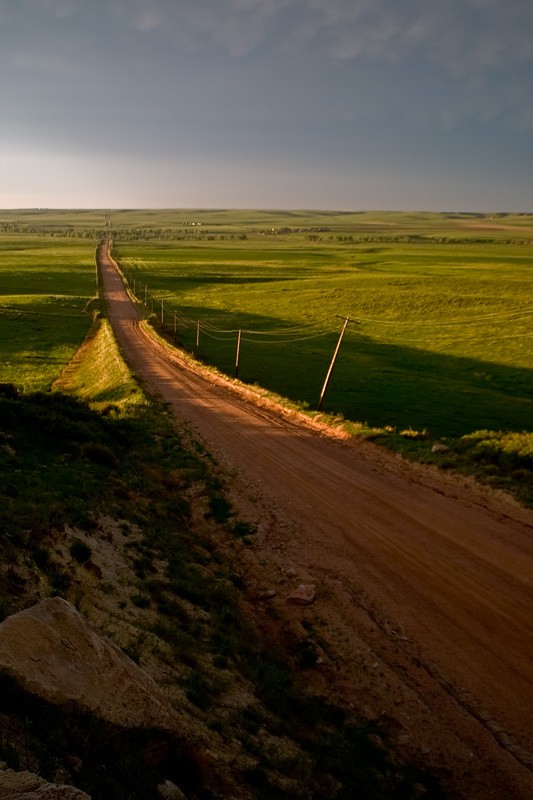
Hmm... the only thing I can think of would be to bring the colors out a bit more in the dark area on the left side of the photo. Perhaps maybe crop up a bit too. Other than that, the photo has a lot in it I like, the road leading the eye up to the left side of the photo, but the bent pole keeps my eye from running off with it, and keeps my attention on the center. The road also gives a great depth to the photo.

Here's one of mine, I posted it elsewhere but I like it. I cropped it just a bit, and did some minor pp to it.

2611317083_3fd99f30ed_b.jpg
 
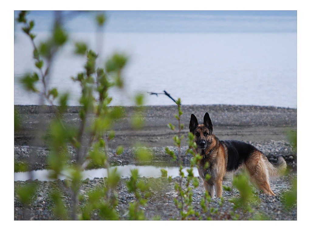
i like the use of DOF in this photo. there seems to be a tad too much shrubbery/branches and water in this picture, and it seems to be open space. i would probably crop a portion of the water and a small portion of the blurred foreground on the left-hand side of the picture. lastly, i would suggest perhaps taking out the black stray branch sticking out too; it serves as a bit of distraction. lovely german shepherd and fur details.

mine:

2516910105_a15ed7a1f6.jpg
 
This is a really cool picture thereforeiamx. coming from a beginner, i just see some very overexposed part of the steps at the bottom of the photo. Maybe it would have been better to hang the camera a bit more over the first overhand so there wasn't the overexposed floor and railing. I dont know what kind of space you were working with on top though to move around. Just some thoughts.
Here is a picture i took at a house fire last night in my town. No really any color to comment on. Just a recent one i had taken.
IMG_3154.jpg
 
great shot, DanV1317, i like these kind of shots, but it will be nicer if you can find a more detail part of the sky.. great catch though !

here is mine, from my first night shoot

2603484988_51a3df99d7.jpg
 
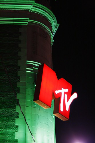
Well I'll try to keep the ball rolling here... I like the way you have framed it, but the power line/cord in the bottom left is distracting and so is purple light in the bottom right.

Tear it apart.
358967834_3c68ea9e7e.jpg
 
Very cool picture. I really like the star effect and halo from the sun. I've tried this many times with little or no success. The glare on the bottom right side is a bit distracting. Great exposure.
My pic, My daughter

2616621452_2aabeea597.jpg
 
Not sure how i feel about the shadow on her face. Try that shot again if you can with a flash and see if you get better results.
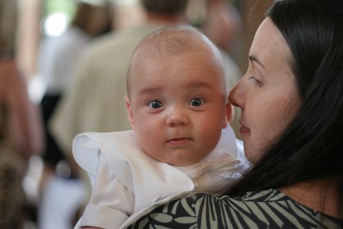
This is of my nephew at his Christening. I left hotshoe in car and I can't stand popup flash so i just used 50mm with the natural lighting. Extremely well lit church.
2622644975_476cf65b4f.jpg
 
Last edited:
Overall, I think it's a pretty good picture. He seems a little dark to me (but that might not be saying much as I tend to like pictures brighter and more towards the over-exposed end of the spectrum). Maybe a little fill light on his face in PP?
I think a little color saturation would help as well.

Of course, this could all be my computer/monitor. But I think it's a great picture and he sure is cute!
I like eyes to pop a little more, but that OBVIOUSLY is only my preference as I know a lot here do not like the eyes to pop. I don't mean, over-done popping where they look freaky, I just mean some overall sharpening would most like do the trick.:mrgreen:


Now, let me have it. This was taken with my Sigma 10-20mm and the lens is new to me. Hell, using a wide angle of any kind is new to me (photography is new to me! D'oh!). No filters for this lens yet.
2620366575_63fb090718.jpg
 
I like the shot. Not sure exactly why it doesn't pop tho. The blue sky is wonderfull but the main subject seems a bit drab compared to the background. I'm sure it has to do with the time of day it was shot. I'm also thinking this might be one of the few shots were the rule of thirds can be thrown out I would like to see the steeple centered and then the railing brought up to the first third if you still wanted to kind of keep with the rule.:)

Here's my shot

Shorebirdsandfinches058_edited-2.jpg
 
nice! i like the DOF although i think the picture may have come out better if taken from a lower angle so that the background would not have been as distracting with the geese in front of it. actually maybe if there was more bokeh it would have been perfect, since the colors blend a bit.

my camera is still being shipped =[
 

Most reactions

Back
Top