Blackbelt94
TPF Noob!
- Joined
- Jun 17, 2008
- Messages
- 79
- Reaction score
- 0
- Location
- Canada EH!
- Can others edit my Photos
- Photos OK to edit
Follow along with the video below to see how to install our site as a web app on your home screen.

Note: This feature currently requires accessing the site using the built-in Safari browser.


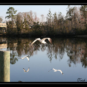
Personally, I feel that picture is caught between landscape and a portrait of the seagulls. It seems that there was not much sun on the day that it was taken. If it was me I would have taken the picture from further away with a stronger anchor (of if I had, used the seagulls as the anchor), either on the top left corner with 1/3 of the picture as the ocean or at the right lower corner with 2/3 of the ocean.
Hope I was able to help a bit.
Here is mine:
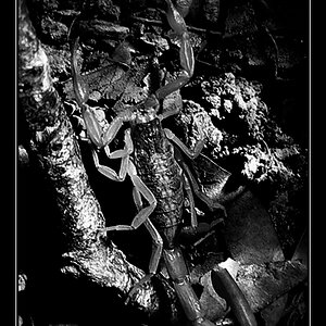
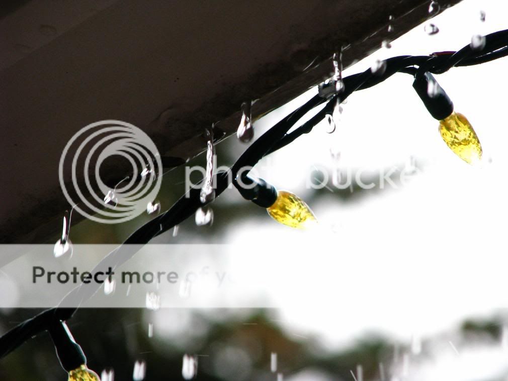
Focus is lacking D:
Personally, I feel that picture is caught between landscape and a portrait of the seagulls. It seems that there was not much sun on the day that it was taken. If it was me I would have taken the picture from further away with a stronger anchor (of if I had, used the seagulls as the anchor), either on the top left corner with 1/3 of the picture as the ocean or at the right lower corner with 2/3 of the ocean.
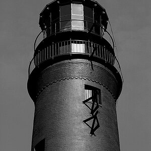
I like what you were trying for here but it came out overexposed in the upper right hand corner. I would have tried spot metering the shot and then I would have done an AEB of this and then found out what worked the best . Chances are they have all failed , but the fun is in tryingnice picture perhaps a little out of focus ( or maybe you were just a little close) but great photo.

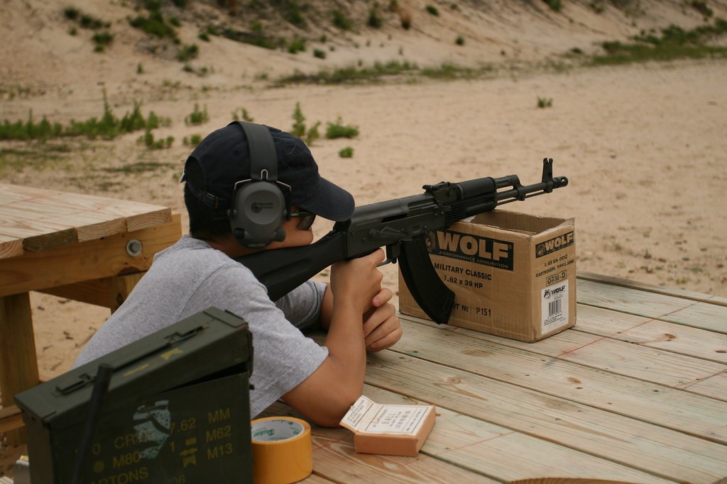
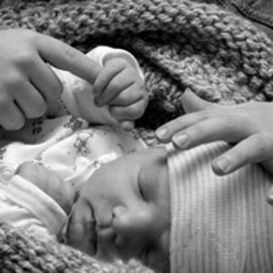
I'm new to this. I haven't critiqued a photo in about 15 years either. I'd prefer to see your friends face. I don't like the roll of tape & box of bullets sitting on the shelf either. It just looks messy, maybe a different placement of them. And the green box is cut off. Little things. Otherwise the color is good, very even.
Here's mine

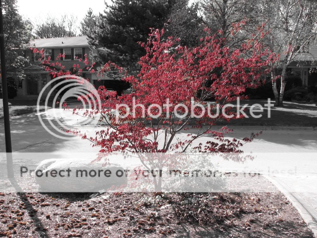
looks so dead for me, it's like a movie without emotion.
here's mine, critique harsh:
![[No title]](/data/xfmg/thumbnail/42/42280-60cc6d4893a2f440eac7dd2248e733a9.jpg?1619740088)