Behind the Mansion At Night

DramaDork626

TPF Noob!
Joined
Jun 21, 2005
Messages
294
Reaction score
0
Location
NJ
Website
www.dramadork626.deviantart.com
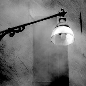
Olympus Digital, nighttime, flash
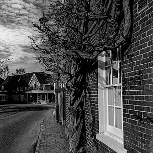
Ok, i didn't too many of these shots, cuz being the little wuss I am I am very afraid to be outside at night alone. This is the back of the mansion on my campus. That is the site of the love scene in "A Beautiful Mind" when they are there pointing at the stars n such. This is just another one of my funky angles. I like taking pictures from unusual angles. Tell me what yall think of the composition
banistermansion.jpg
 
Dont care for all the foreground... I think I would crop this differant or shoot again not allowing for so much. It just doesnt seem to add anything to the subject... the mansion where the lights are on.

Also that light on the right side that looks to be on the other side of the fence is a bit distracting.
 
I don't mind the foreground, but that light on the far side of the fence does bother me.
 
I had started to do a really quick reply to this, a simple "I don't really like it because XX," and then I looked at it some more.

Ok, first off, I still don't like it. But there are (a) some good things about it; (b) some things which can be improved; (c) some things which can be learned. So while I say, overall, I don't like this picture, here are some more thoughts:

First off, as it's shot this picture isn't particularly -of- anything. It's a side shot of the back end of a building. Unless the picture goes specifically with something - text, say, about the building, there's just not enough a subject there to draw my attention and hold it. If the building is the thing, I'd move around - maybe towards the front of it.

Subject is so important, and can make up for a lot. Look, we've all shot lame subject-less photos (check my site today for the lead image - not really -of- anything). So there's nothing to be upset about. The easiest thing you could have done here is wait a couple of minutes and let someone pass by in the light. You could end up with an interesting silhouette, or a blurred figure, or something, which would add a specific point of interest here. That point of interest is key -- it's giving the veiwer something to look at.

You've also got two things in the frame which annoy me: that light over the fence, and the upstairs window. Burn down at least the upstairs window, and compose the image differently to avoid the back light. I tried briefly to crop some of it out, but it ended up horribly vertical. So when you're shooting, as you look through the lens sometimes think to yourself whether or not you want to, and if there are ways, to simply the elements of your photo.

That said, Blue Coyote Laughing had a great post (http://bluecoyotelaughing.typepad.com/bcl/2005/09/a_change_in_sig.html) about cluttered graphical elements a still yielding strong pictures. Check out here thoughts.

I think this could also be in black and white, and might benefit. Also, try a longer shutter speed -- I don't know what you have here, but a longer speed might make some of the lights more interesting and would yield more detail in the image.

There's a lot of technical corrections/improvements that can be made. I actually like the foreground here - I think the leading lines/textures are interesting. But the big thing is subject - work out what you're shooting, the thing you want to photograph, and concentrate on how to emphasize it.

Hope some of this helps...
 
I dunno why, but people here don't seem to like shining lights. I think they look pretty. I would have shot from the front of it, but that would have meant going down the stairs where there were NO lights, and there was no one around so that would not have been safe for my own well being lol. Plus, there really is no way to get a shoot front shot because there is a wall with a fountain in the way (it is not an attractive fountain...not worth takin pictures of). The point of this was to play with angle and challenge what people consider to be a "proper" angle. Since it seems my lifes purpose is to challenge any rules people set heh.
Though I do respect other opinions. Thats why I post here.
 
I dunno why, but people here don't seem to like shining lights. I think they look pretty.

The primary offender isn't even part of what you're shooting - the highest point of contrast in the frame is a streetlight far off from the subject you're shooting. It distracts the viewer.

Challenging rules is a good thing, and photography (and art in general) is an excellent venue for this....
 
I don't know...something just don't work well, maybe the angle or the light.
 
I do like this picture, but that one light that is flaring is kind of distracting.
 

Most reactions

Back
Top