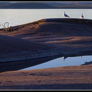
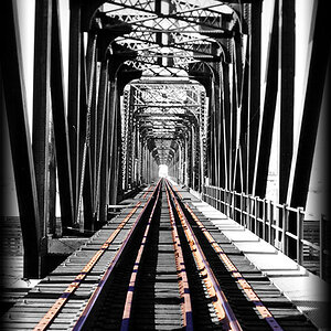
i loved the first. im personally fond of straight lines and 90 degree angles and S*&t like that. the picture makes me uneasy and i tend to cock my head to one side. any pictures good when that happens
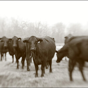
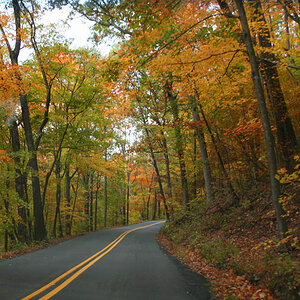
The first one is great. It may be a trifle underexposed ergo dark in the shadowed bits but I think neccesarily so. And it benifits the composition. By far my favorite. The 2nd is too busy for me. To many conflicting lines. perhaps too abstract? I cant remember anything in the picture once a look away. #3 is nicely abstract. I like the rough weather beaten look of it. But unless its my monitor the lighting or develping seems patch in spots? or at least the contrast differs accross the middle.


![[No title]](/data/xfmg/thumbnail/37/37521-5e19cc15e190997d963ed09c3c13ca9c.jpg?1619738129)


![[No title]](/data/xfmg/thumbnail/32/32926-ec27ecead8c80d803404500d8f888dbf.jpg?1619735754)