Optimum Clarity
TPF Noob!
- Joined
- Jan 10, 2017
- Messages
- 21
- Reaction score
- 4
- Can others edit my Photos
- Photos NOT OK to edit
@DanOstergren I appreciate your sentiment and I wholeheartedly concur, but I gave my opinion and any comments to me after that were ignored, I was not here for a lesson, just to comment my opinion.
One person's rudeness is nothing to get upset about.
As Ghandi said, Be the change you wish to see in the world.
@DGMPhotography Thanks for your opinion of my opinion, but my opinion is nonetheless a valid one in spite of your attempt to pretend otherwise.
As long as you have a camera you have the ability to improve and I hope you continue to do so. Accepting critiques is a step towards that goal.
")

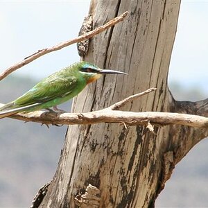
![[No title]](/data/xfmg/thumbnail/38/38737-350089c7ae87f5c983c5362b9b78b671.jpg?1619738703)


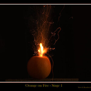
![[No title]](/data/xfmg/thumbnail/42/42059-61b97bbebb00e6276672551f4e3b3e43.jpg?1619739995)
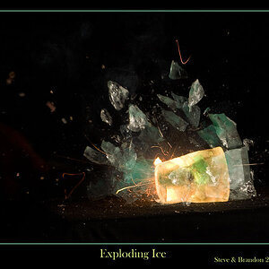
![[No title]](/data/xfmg/thumbnail/38/38736-5bc266b035e23faf5ad942bdd97466a8.jpg?1619738703)