
bishopsmead
TPF Noob!
With this - I'm after a straight like it/don't like it.
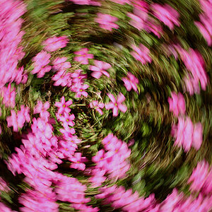
This is a long exposure of the edge of a slipway while the tide comes in. For me I like the colour, simplicity and abstract quality. However I would like to know if it works for others too.
Please critique honestly.

Shot settings: 25s f/21.9 at 22.0mm iso100 tripod 2 ND filters Polariser
This is a long exposure of the edge of a slipway while the tide comes in. For me I like the colour, simplicity and abstract quality. However I would like to know if it works for others too.
Please critique honestly.
Shot settings: 25s f/21.9 at 22.0mm iso100 tripod 2 ND filters Polariser

")

![[No title]](/data/xfmg/thumbnail/37/37522-f67b10bc5ee534f9bc21ee94917445b9.jpg?1619738129)


![[No title]](/data/xfmg/thumbnail/32/32926-ec27ecead8c80d803404500d8f888dbf.jpg?1619735754)
![[No title]](/data/xfmg/thumbnail/32/32930-09414fc020c2a60a456ff59a05c5ef8f.jpg?1619735759)