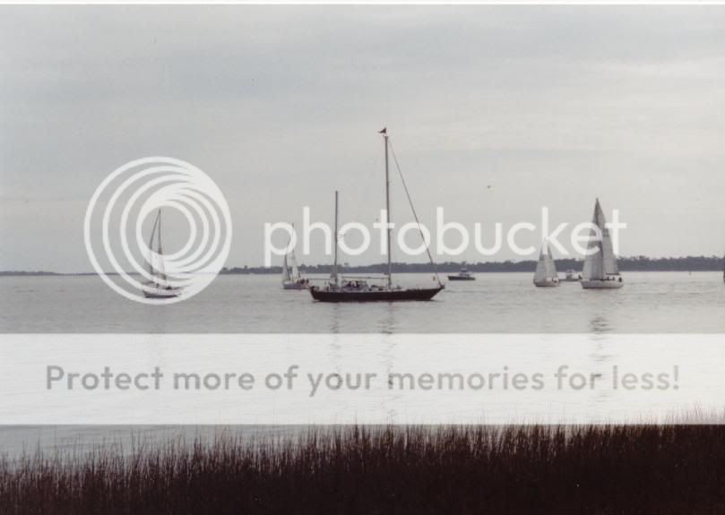
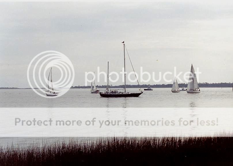
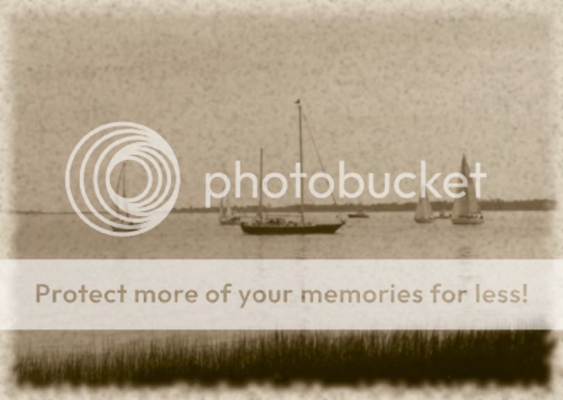
I like number three's look but it's obvious that those boat don't belong in an old photo. Saying that I like number two but the grass needs a bit of attention.
I do like what you did with the third one but, like tmpadmin said, it doesn't really look old.
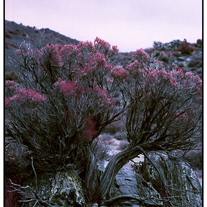
When I see a photo of a place I want to feel like I'm there. Like I'm transported to a place I would like to be. I get that from the second photo.
To see the grass and looking across the water gives a sense of place, like your standing on the shore, which is what "transports" you.
Sorry if that sounds a little on the odd side, but that is how I look at it.
It's too bad the sales wern't colorful. The overcast sky with the stark white sales, lack of color IMO makes what could be a terrific photo fall short. Maybe saturating the sky some or bring out the grass's neutral brown could help. The place has potential but the depth is lacking. Number 3 would be great if they had an exibit of an old skipper ship.


![[No title]](/data/xfmg/thumbnail/37/37603-739c5d9b541a083a12f2f30e45ca2b7b.jpg?1619738147)

![[No title]](/data/xfmg/thumbnail/31/31757-4f5257d19be4e34c6bdcbd2519380d53.jpg?1619734994)