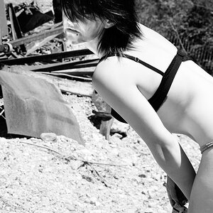
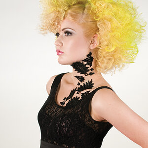
I don't like the crop...it's too close on the top & bottom and that makes it seem too wide on the sides. Also, the side spaces are not even.
Is the background or outdoor location significant? While it is out of focus enough, I think it's still distracting (or at least noticeable)...which is OK if it's got a purpose, but if not, I would have preferred a more 'plain' background.
It is definitely cropped too tightly. It needs room to breath. I think a different location for it would have worked better. It's mostly the rails that are distracting from the subject. The image is well lit and is good and sharp.


![[No title]](/data/xfmg/thumbnail/37/37604-7ad625e983f92f880eb65a264eeef5e4.jpg?1619738148)